Link: https://brownstone.org/articles/the-myth-of-the-disease-ridden-red-states/
Graphic:
Excerpt:
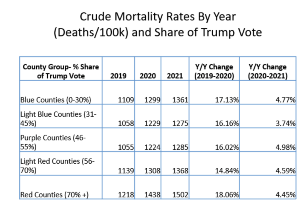
Another way of looking at this is to look at the Year over Year change of rates within each group. As you can see from the chart below, the percentage change remains pretty consistent among each individual grouping, with 2020 seeing the largest change rate, and 2021 seeing a small but significant change rate from 2020 (meaning overall mortality was still quite elevated relative to 2019).
In summary, when we take a historical view and higher level view while maintaining these same groupings, these stark differences in Covid-19 mortality rates do not seem to translate into overall morality rates. Why?
At the risk of this analysis turning into another pile-on pointing out the New York Time’s errors, I’d like to offer a more benign explanation. It’s one that has plagued journalists and reports throughout the pandemic. Why is it that everything is framed in Red and Blue? One simple reason: the availability of the data. Leonhardt is using data that is easily accessible and is already formatted for easy analysis.
This is what is called an availability bias. It’s essentially creating a hypothesis or completing a study based on a specific set of data, purely for no other reason than that the data is there. Just because the data is available does not mean it’s the best data to use to try to answer a question.
Author(s): Josh Stevenson
Publication Date: 3 June 2022
Publication Site: Brownstone Institute