Sex Bias in Graduate Admissions: Data from Berkeley

Link: https://science.sciencemag.org/content/187/4175/398

Graphic:

Excerpt:

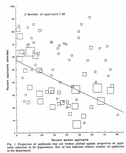
Examination of aggregate data on graduate admissions to the University of California, Berkeley, for fall 1973 shows a clear but misleading pattern of bias against female applicants. Examination of the disaggregated data reveals few decision-making units that show statistically significant departures from expected frequencies of female admissions, and about as many units appear to favor women as to favor men. If the data are properly pooled, taking into account the autonomy of departmental decision making, thus correcting for the tendency of women to apply to graduate departments that are more difficult for applicants of either sex to enter, there is a small but statistically significant bias in favor of women. The graduate departments that are easier to enter tend to be those that require more mathematics in the undergraduate preparatory curriculum. The bias in the aggregated data stems not from any pattern of discrimination on the part of admissions committees, which seem quite fair on the whole, but apparently from prior screening at earlier levels of the educational system. Women are shunted by their socialization and education toward fields of graduate study that are generally more crowded, less productive of completed degrees, and less well funded, and that frequently offer poorer professional employment prospects.

Science 
 07 Feb 1975:
Vol. 187, Issue 4175, pp. 398-404
DOI: 10.1126/science.187.4175.398

Author(s): P. J. Bickel, E. A. Hammel, J. W. O’Connell

Publication Date: 7 February 1975

Publication Site: Science

Opinion: Amid a Pandemic, a Health Care Algorithm Shows Promise and Peril

Excerpt:

In the midst of the uncertainty, Epic, a private electronic health record giant and a key purveyor of American health data, accelerated the deployment of a clinical prediction tool called the Deterioration Index. Built with a type of artificial intelligence called machine learning and in use at some hospitals prior to the pandemic, the index is designed to help physicians decide when to move a patient into or out of intensive care, and is influenced by factors like breathing rate and blood potassium level. Epic had been tinkering with the index for years but expanded its use during the pandemic. At hundreds of hospitals, including those in which we both work, a Deterioration Index score is prominently displayed on the chart of every patient admitted to the hospital.

The Deterioration Index is poised to upend a key cultural practice in medicine: triage. Loosely speaking, triage is an act of determining how sick a patient is at any given moment to prioritize treatment and limited resources. In the past, physicians have performed this task by rapidly interpreting a patient’s vital signs, physical exam findings, test results, and other data points, using heuristics learned through years of on-the-job medical training.

Ostensibly, the core assumption of the Deterioration Index is that traditional triage can be augmented, or perhaps replaced entirely, by machine learning and big data. Indeed, a study of 392 Covid-19 patients admitted to Michigan Medicine that the index was moderately successful at discriminating between low-risk patients and those who were at high-risk of being transferred to an ICU, getting placed on a ventilator, or dying while admitted to the hospital. But last year’s hurried rollout of the Deterioration Index also sets a worrisome precedent, and it illustrates the potential for such decision-support tools to propagate biases in medicine and change the ways in which doctors think about their patients.

Author(s): VISHAL KHETPAL, NISHANT SHAH

Publication Date: 27 May 2021

Publication Site: Undark Magazine

Towards Explainability of Machine Learning Models in Insurance Pricing

Link: https://arxiv.org/abs/2003.10674

Paper: https://arxiv.org/pdf/2003.10674.pdf

Citation:


arXiv:2003.10674
 [q-fin.RM]

Graphic:

Abstract:

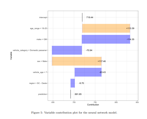
Machine learning methods have garnered increasing interest among actuaries in recent years. However, their adoption by practitioners has been limited, partly due to the lack of transparency of these methods, as compared to generalized linear models. In this paper, we discuss the need for model interpretability in property & casualty insurance ratemaking, propose a framework for explaining models, and present a case study to illustrate the framework.

Author(s): Kevin Kuo, Daniel Lupton

Publication Date: 24 March 2020

Publication Site: arXiv

How Costly is Noise? Data and Disparities in Consumer Credit

Link: https://arxiv.org/abs/2105.07554

Cite:


arXiv:2105.07554
 [econ.GN]

Graphic:

Abstract:

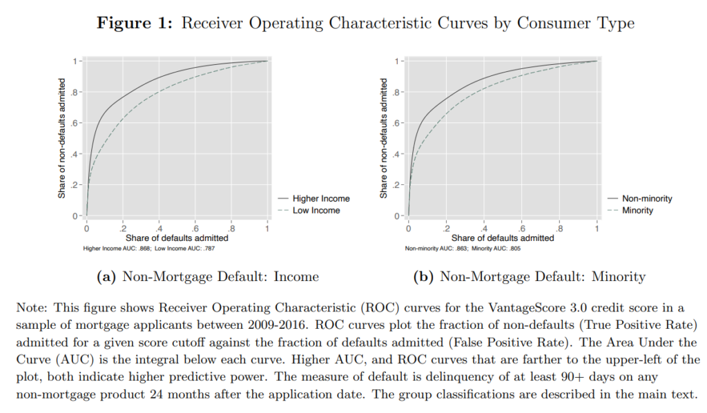
We show that lenders face more uncertainty when assessing default risk of historically under-served groups in US credit markets and that this information disparity is a quantitatively important driver of inefficient and unequal credit market outcomes. We first document that widely used credit scores are statistically noisier indicators of default risk for historically under-served groups. This noise emerges primarily through the explanatory power of the underlying credit report data (e.g., thin credit files), not through issues with model fit (e.g., the inability to include protected class in the scoring model). Estimating a structural model of lending with heterogeneity in information, we quantify the gains from addressing these information disparities for the US mortgage market. We find that equalizing the precision of credit scores can reduce disparities in approval rates and in credit misallocation for disadvantaged groups by approximately half.

Author(s): Laura Blattner, Scott Nelson

Publication Date: 17 May 2021

Publication Site: arXiv

Bias isn’t the only problem with credit scores—and no, AI can’t help

Link: https://www.technologyreview.com/2021/06/17/1026519/racial-bias-noisy-data-credit-scores-mortgage-loans-fairness-machine-learning/

Excerpt:

But in the biggest ever study of real-world mortgage data, economists Laura Blattner at Stanford University and Scott Nelson at the University of Chicago show that differences in mortgage approval between minority and majority groups is not just down to bias, but to the fact that minority and low-income groups have less data in their credit histories.

This means that when this data is used to calculate a credit score and this credit score used to make a prediction on loan default, then that prediction will be less precise. It is this lack of precision that leads to inequality, not just bias.

…..

But Blattner and Nelson show that adjusting for bias had no effect. They found that a minority applicant’s score of 620 was indeed a poor proxy for her creditworthiness but that this was because the error could go both ways: a 620 might be 625, or it might be 615.

Author(s): Will Douglas Heaven

Publication Date: 17 June 2021

Publication Site: MIT Tech Review

Python for Actuaries

Link: https://www.pathlms.com/cas/courses/15577/webinars/7402

Slides: https://cdn.fs.pathlms.com/p3Z78DJJRFWoqdziCQyf?_ga=2.2405433.801394078.1623949999-2118863750.1623949999#/

Graphic:

Description:

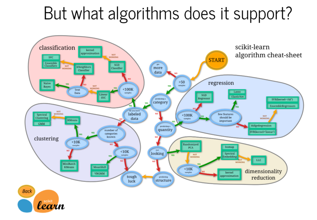
Explaining why actuaries may want to use the language python in their work, and providing a demo. Free recorded webcast, from the CAS.

Author(s): Brian Fannin, John Bogaardt

Publication Date: 6 February 2020

Publication Site: CAS Online Learning

Rebekah Jones’s Lies about Florida COVID Data Keep Piling Up

Link: https://www.nationalreview.com/2021/06/rebekah-joness-lies-about-florida-covid-data-keep-piling-up/

Excerpt:

One of the most persistent falsehoods of the COVID pandemic has been the claim that Florida has been “hiding” data. This idea has been advanced primarily by Rebekah Jones, a former Florida Department of Health employee, who, having at first expressed only some modest political disagreements with the way in which Florida responded to COVID, has over time become a fountain of misinformation.

…..

To understand what is happening here, one needs to go back to the beginning. Over the past 15 months, Florida has published a truly remarkable amount of COVID-related data. At the heart of this trove has been a well-maintained list of literally every documented case of COVID — listed by county, age, and gender, and replete with information about whether the patient had recently traveled, had visited the ER, had been hospitalized, and had had any known contact with other Floridians. To my knowledge, Florida has been the only state in the union that has published this kind of data.

…..

To this day, you can download Florida’s case-line data and see 21 cases of COVID that, despite having been identified between March 2020 and December 2020, feature a December 2019 “Event Date.” To anyone who understands data, these results are clearly the product of the system having assigned a non-null default value when no data has been entered. To the Miami Herald, however, these results hinted at scandal. Even now, when its reporters know beyond any doubt that their initial instincts were wrong, the Herald continues to tell its readers that these entries serve as “evidence of community spread potentially months earlier than previously reported.” This is not true.

Author(s): Matt Shapiro

Publication Date: 8 June 2021

Publication Site: National Review

Rebekah Jones, the COVID Whistleblower Who Wasn’t

Link: https://www.nationalreview.com/2021/05/rebekah-jones-the-covid-whistleblower-who-wasnt/

Excerpt:

There is an extremely good reason that nobody in the Florida Department of Health has sided with Jones. It’s the same reason that there has been no devastating New York Times exposé about Florida’s “real” numbers. That reason? There is simply no story here. By all accounts, Rebekah Jones is a talented developer of GIS dashboards. But that’s all she is. She’s not a data scientist. She’s not an epidemiologist. She’s not a doctor. She didn’t “build” the “data system,” as she now claims, nor is she a “data manager.” Her role at the FDOH was to serve as one of the people who export other people’s work—from sets over which she had no control—and to present it nicely on the state’s dashboard. To understand just how far removed Jones really is from the actual data, consider that even now—even as she rakes in cash from the gullible to support her own independent dashboard—she is using precisely the same FDOH data used by everyone else in the world. Yes, you read that right: Jones’s “rebel” dashboard is hooked up directly to the same FDOH that she pretends daily is engaged in a conspiracy. As Jones herself confirmed on Twitter: “I use DOH’s data. If you access the data from both sources, you’ll see that it is identical.” She just displays them differently.

Or, to put it more bluntly, she displays them badly. When you get past all of the nonsense, what Jones is ultimately saying is that the State of Florida—and, by extension, the Centers for Disease Control and Prevention—has not processed its data in the same way that she would if she were in charge. But, frankly, why would it? Again, Jones isn’t an epidemiologist, and her objections, while compelling to the sort of low-information political obsessive she is so good at attracting, betray a considerable ignorance of the material issues. In order to increase the numbers in Florida’s case count, Jones counts positive antibody tests as cases. But that’s unsound, given that (a) those positives include people who have already had COVID-19 or who have had the vaccine, and (b) Jones is unable to avoid double-counting people who have taken both an antibody test and a COVID test that came back positive, because the state correctly refuses to publish the names of the people who have taken those tests. Likewise, Jones claims that Florida is hiding deaths because it does not in­clude nonresidents in its headline numbers. But Florida does report nonresident deaths; it just reports them separately, as every state does, and as the CDC’s guidelines demand. Jones’s most recent claim is that Florida’s “excess death” number is suspicious. But that, too, has been rigorously debunked by pretty much everyone who understands what “excess deaths” means in an epidemiological context—including by the CDC; by Daniel Weinberger, an epidemiologist at the Yale School of Public Health; by Lauren Rossen, a statistician at the CDC’s National Center for Health Statistics; and, most notably, by Jason Salemi, an epidemiologist at the University of South Florida, who, having gone to the trouble of making a video explaining calmly why the talking point was false, was then bullied off Twitter by Jones and her followers.

Author(s): Charles C. W. Cooke

Publication Date: 13 May 2021

Publication Site: National Review
COMIC: How I Cope With Pandemic Numbness

Link: https://www.npr.org/sections/goatsandsoda/2021/04/25/987208356/comic-how-i-cope-with-pandemic-numbness

Graphic:

Excerpt:

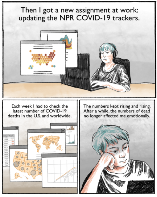
Each week I check the latest deaths from COVID-19 for NPR. After a while, I didn’t feel any sorrow at the numbers. I just felt numb. I wanted to understand why — and how to overcome that numbness.

Author(s): CONNIE HANZHANG JIN

Publication Date: 25 April 2021

Publication Site: Goats and Soda at NPR

An Alternative to the Correlation Coefficient That Works For Numeric and Categorical Variables

Link: https://rviews.rstudio.com/2021/04/15/an-alternative-to-the-correlation-coefficient-that-works-for-numeric-and-categorical-variables/

Graphic:

Excerpt:

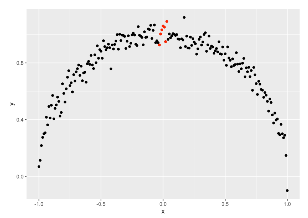
Using an insight from Information Theory, we devised a new metric – the x2y metric – that quantifies the strength of the association between pairs of variables.

The x2y metric has several advantages:

It works for all types of variable pairs (continuous-continuous, continuous-categorical, categorical-continuous and categorical-categorical)

It captures linear and non-linear relationships

Perhaps best of all, it is easy to understand and use.

I hope you give it a try in your work.

Author(s): Rama Ramakrishnan

Publication Date: 15 April 2021

Publication Site: R Views

Error-riddled data sets are warping our sense of how good AI really is

Link: https://www.technologyreview.com/2021/04/01/1021619/ai-data-errors-warp-machine-learning-progress/

Paper link: https://arxiv.org/pdf/2103.14749.pdf

Graphic:

Excerpt:

Yes, but: In recent years, studies have found that these data sets can contain serious flaws. ImageNet, for example, contains racist and sexist labels as well as photos of people’s faces obtained without consent. The latest study now looks at another problem: many of the labels are just flat-out wrong. A mushroom is labeled a spoon, a frog is labeled a cat, and a high note from Ariana Grande is labeled a whistle. The ImageNet test set has an estimated label error rate of 5.8%. Meanwhile, the test set for QuickDraw, a compilation of hand drawings, has an estimated error rate of 10.1%.

Author(s): Karen Hao

Publication Date: 1 April 2021

Publication Site: MIT Tech Review