Movember 2022: Men and Drug Overdoses (and Giving Tuesday!)

Link: https://marypatcampbell.substack.com/p/movember-2022-men-and-drug-overdoses

Graphic:

Excerpt:

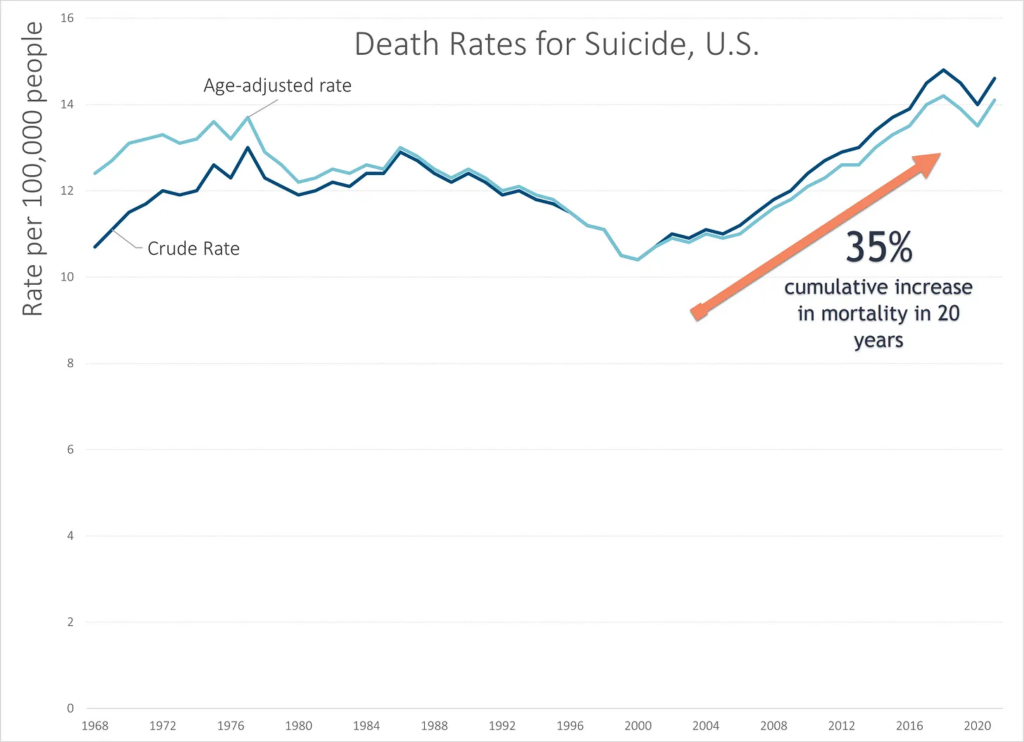
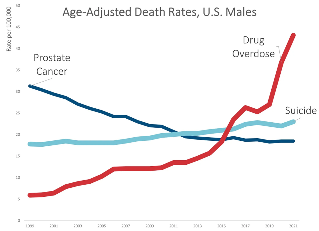
Remember the graph I made showing the suicide trend for men crossing over from prostate cancer?

Let me layer on unintentional drug overdoses:

Yeah, it’s as bad as it looks.

While death rates due to suicide increased by about 30% over the 20-year period, death rates due to unintentional drug overdoses increased by over 500%.

None of this is really a surprise. I’ve written about the drug OD problem many times before, which had a horrible trend before the pandemic and got much, much worse during the pandemic.

Much of the increase came in 2020 and 2021 — over 30% in 2020, and 17% in 2021. These are huge increases on rates that were already bad.

Author(s): Mary Pat Campbell

Publication Date: 29 Nov 2022

Publication Site: STUMP at substack

Variations On Approximation – An Exploration in Calculation

Link: https://www.soa.org/news-and-publications/newsletters/compact/2014/january/com-2014-iss50/variations-on-approximation–an-exploration-in-calculation/

Graphic:

Excerpt:

Before we get into the different approaches, why should you care about knowing multiple ways to calculate a distribution when we have a perfectly good symbolic formula that tells us the probability exactly?

As we shall soon see, having that formula gives us the illusion that we have the “exact” answer. We actually have to calculate the elements within. If you try calculating the binomial coefficients up front, you will notice they get very large, just as those powers of q get very small. In a system using floating point arithmetic, as Excel does, we may run into trouble with either underflow or overflow. Obviously, I picked a situation that would create just such troubles, by picking a somewhat large number of people and a somewhat low probability of death.

I am making no assumptions as to the specific use of the full distribution being made. It may be that one is attempting to calculate Value at Risk or Conditional Tail Expectation values. It may be that one is constructing stress scenarios. Most of the places where the following approximations fail are areas that are not necessarily of concern to actuaries, in general. In the following I will look at how each approximation behaves, and why one might choose that approach compared to others.

Author(s): Mary Pat Campbell

Publication Date: January 2014

Publication Site: CompAct, SOA

Dataviz Horror Story: How I Crashed the Top Exec’s Email

Link: https://nightingaledvs.com/dataviz-horror-story-how-i-crashed-the-top-execs-email/

Graphic:

Video:

Excerpt:

In my case, the graphs I made looked just fine—it’s just that I didn’t understand how copy/pasting graphs between Excel and Word worked (at the time). This was in the mid-2000s, when memory wasn’t quite so plentiful, so many corporate email accounts had memory quotas. If you hit that quota, you would be locked out of your email account. You had to call IT and actually talk to a person! 

I was a lowly entry-level person at a financial services company and had done some Monte Carlo modeling involving 1,000,000 scenarios. We were developing a new mutual fund project, based on changing allocations over time as people moved towards retirement, and the company wanted me to model outcomes for different allocation trajectories.  After a “full” model run of one million scenarios, I made diagnostic graphs showing the distribution of key metrics (such as the annual accumulation of the fund, how many times the fund decreased while the owner was in retirement, and whether – and when – the money in the fund ran out)  so that we could analyze different potential fund strategies. The graphs themselves were fairly simple. 

Author(s): Mary Pat Campbell

Publication Date: 31 Aug 2022

Publication Site: Nightingale

Data visualization lessons: Jitter charts, screwups, and visionaries

Link: https://marypatcampbell.substack.com/p/data-visualization-lessons-jitter

Video:

Excerpt:

Jitter charts are my new favorite tool for displaying how distributions change over time.

I used them to great effect in my recent post One Bad Year? Comparing the Long-Term Public Pension Fund Returns Against Assumptions.

I’m often looking at distributions, and wanting to communicate something about how those distributions change over time, or how distributions compare. Often, I have to simply pick out key percentiles in those distributions, or key aspects, such as mean and standard deviation.

But why not graph all the points in one’s sample directly, if one has them?

That’s where jitter charts can help.

Author(s): Mary Pat Campbell

Publication Date: 16 Sep 2022

Publication Site: STUMP at substack

World Suicide Prevention Day: U.S. Suicide Trend Update through 2021

Link: https://marypatcampbell.substack.com/p/world-suicide-prevention-day-us-suicide

Graphic:

Excerpt:

In updating the 2021 numbers, there is some bad news: while suicide rates had decreased in 2020, in 2021 they increased to continue a worrying trend:

The increase in 2021 brought the age-adjusted death rate back to a level close to the peak, which was in 2018.

As noted on the graph, the cumulative increase in the age-adjusted death rate from the minimum in 2000 to the current levels has been 35%. This is very worrying.

I could have exaggerated this trend by starting my vertical scale at 10 instead of 0, but I think it’s obvious enough the trend is bad.

I don’t need to exaggerate.

Author(s): Mary Pat Campbell

Publication Date: 10 Sep 2022

Publication Site: STUMP on substack

Pension Obligation Bonds

Link: https://marypatcampbell.substack.com/p/pension-obligation-bonds#details

Graphic:

Excerpt:

2015: Why are Pension Obligation Bonds OF THE DEVIL? A Lesson from the Dollar Auction  

http://stump.marypat.org/article/191/why-are-pension-obligation-bonds-of-the-devil-a-lesson-from-the-dollar-auction

The dollar auction is a truly evil game. I used to forbid people from playing it at Mathcamp. That’s not a joke.

I had a really ugly graph on that post, and yes, I’ve gotten better with the graphs over the years. The ugliness of that graph was a partial inspiration to seek solutions. (Other ugly graphs as well).

You can barely see it, but there was a POB between 2003 and 2005. It barely made a dent in the unfunded pension liability.

And what then? In the ten years since 2005, Illinois underfunded the TRS pension fund by at least a billion dollars a year.

With regards to contributions, there was a choice on the part of the “government”.

With regards to all the other reasons for shortfalls — investment experience, experience in salary changes and longevity — the government had less direct control. But they definitely had a choice with regards to how much of the budget to apply to the pensions.

And every damn year, the Illinois government made a conscious decision to shortchange the pension. That was not an accident.

POBs are most often used by governments that were shortchanging the pensions, or goosing the benefits in insane and seemingly sane ways, to paper over said shortchanging. This farce lasts only so long.

Author(s): Mary Pat Campbell

Publication Date: 20 Jun 2022

Publication Site: STUMP at substack

Childhood Mortality Trends, 1999-2021 (provisional), Ages 1-17

Link: https://marypatcampbell.substack.com/p/childhood-mortality-trends-1999-2021

Graphic:

Excerpt:

There was the good news from before the pandemic: the accidental death rate had come way, way down. That was mostly due to improved traffic safety. (Not reduced drug ODs, alas)

In the pandemic, both increased motor vehicle deaths and drug overdoses has pushed up the accidental death rate for teens to increase to levels seen a decade ago.

But there was a bad pre-pandemic trend: suicide rates had increased from 2007 to 2018 — increasing a total of 120% over that period. That was hideous.

It seemed to have reversed in 2019, and come down during the pandemic. The suicide trends in the pandemic really made no sense to anybody, but perhaps the increased drug ODs were actually suicides.

Homicides didn’t have a steady trend before the pandemic, but has definitely had a bad trend during the pandemic. Homicide death rates for teens increased over 50% from 2019 to 2021.

One observation: suicide and homicide death rates used to be about the same for teens in the early 2000s, and then with the bad suicide trend, suicide ranked higher. Even with the increase in homicide rates, suicide still ranks higher.

Author(s): Mary Pat Campbell

Publication Date: 15 June 2022

Publication Site: STUMP at substack

Fewer than 4000 people just approved boosting Providence Rhode Island liabilities by $515 million

Link: https://marypatcampbell.substack.com/p/fewer-than-4000-people-just-approved?s=w

Graphic:

Excerpt:

Yes, for over five years now, they’ve been contribution more than 50% of payroll to the pension plan as the full contribution to the pensions.

In the past, they mostly contributed the full requirement, though in some years they didn’t. The requirement used to be less than 50%, but when you short the fund, and when you underperform on investments (which we will see in a bit), that’s expected, right?

So let’s see how the funded ratio has been doing — for all these full payments, the funded ratio must be healthy, correct? [if you didn’t read my excerpts above]

Author(s): Mary Pat Campbell

Publication Date: 10 June 2022

Publication Site: STUMP at substack

U.S. Mortality Trends Through the Pandemic

Link: https://marypatcampbell.substack.com/p/us-mortality-trends-through-the-pandemic?s=w

Video:

Graphic:

Excerpt:

I discuss this in the portion of the talk about death rates by age group.

For 2021, the worst relative increase in mortality, compared to 2019, was for ages 30-44.

[I have called it the Millennial Massacre, but it obviously overlaps with Gen X…. and Middle Age Massacre doesn’t exactly work, either. Dang the allure of alliteration].

We will see in a moment that most of that mortality increase didn’t come from COVID.

If you look at overall mortality, obviously total mortality for this age group is much lower than for those much older.

A 5% increase in mortality for those aged 85+ will translate to a much larger number of deaths, but a 50% increase in mortality for those aged 40-44 is extremely worrisome to actuaries and insurers even if the absolute number of deaths is lower in impact. We’re setting reserves and expectations based on certain assumptions, and we’re generally not assuming fluctuations of 50% — that’s just nuts compared to our historical experience…..

…..until now.

Author(s): Mary Pat Campbell

Publication Date: 20 May 2022

Publication Site: STUMP on substack

All Men Must Die, But They Don’t Have to Die in Office

Link: https://marypatcampbell.substack.com/p/all-men-must-die-but-they-dont-have?s=w

Graphic:

Excerpt:

What’s interesting about the Senate age distribution is that though we have some difference in the lumpiness, when I look at the average age of the senators by party, they’re basically the same: 64 years old (and some change). On the younger end of the Boomers.

Author(s): Mary Pat Campbell

Publication Date: 29 April 2022

Publication Site: STUMP at substack

Preliminary results for 2021 All-Cause U.S. Mortality: 21% More Deaths than 2019, 2% More Deaths than 2020

Link: https://marypatcampbell.substack.com/p/preliminary-results-for-2021-all?s=w

Graphic:

Excerpt:

As you can see from the annotation on the graph, so far there have been 2% more deaths reported in 2021 compared to 2020. You can see that there had been a spike of deaths at the beginning of 2021, then a quiet spring/early summer. I did not extend my graph into 2022, but the heightened mortality of later/summer fall into winter has continued into winter at the beginning of 2022.

For the record, the 1% increase in deaths from 2018 to 2019 was pretty common before, driven by regular growth of the aging population of the U.S.

Author(s): Mary Pat Campbell

Publication Date: 3 April 2022

Publication Site: STUMP at substack