Link: https://nightingaledvs.com/dataviz-horror-story-how-i-crashed-the-top-execs-email/
Graphic:

Video:
Excerpt:
In my case, the graphs I made looked just fine—it’s just that I didn’t understand how copy/pasting graphs between Excel and Word worked (at the time). This was in the mid-2000s, when memory wasn’t quite so plentiful, so many corporate email accounts had memory quotas. If you hit that quota, you would be locked out of your email account. You had to call IT and actually talk to a person!
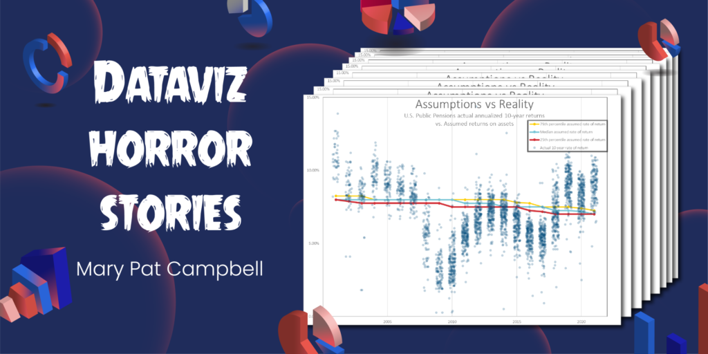
I was a lowly entry-level person at a financial services company and had done some Monte Carlo modeling involving 1,000,000 scenarios. We were developing a new mutual fund project, based on changing allocations over time as people moved towards retirement, and the company wanted me to model outcomes for different allocation trajectories. After a “full” model run of one million scenarios, I made diagnostic graphs showing the distribution of key metrics (such as the annual accumulation of the fund, how many times the fund decreased while the owner was in retirement, and whether – and when – the money in the fund ran out) so that we could analyze different potential fund strategies. The graphs themselves were fairly simple.
Author(s): Mary Pat Campbell
Publication Date: 31 Aug 2022
Publication Site: Nightingale