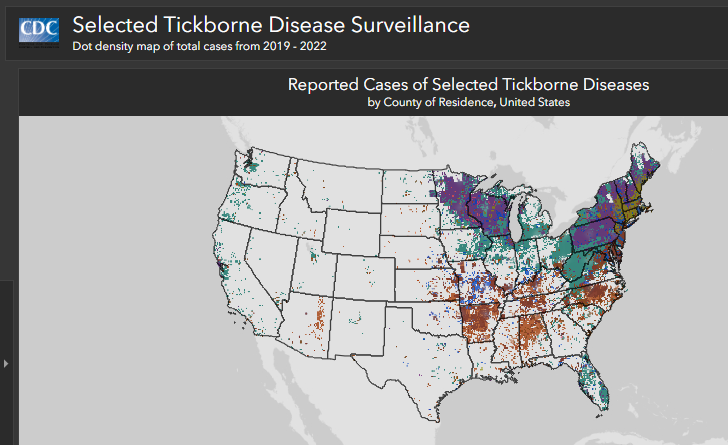
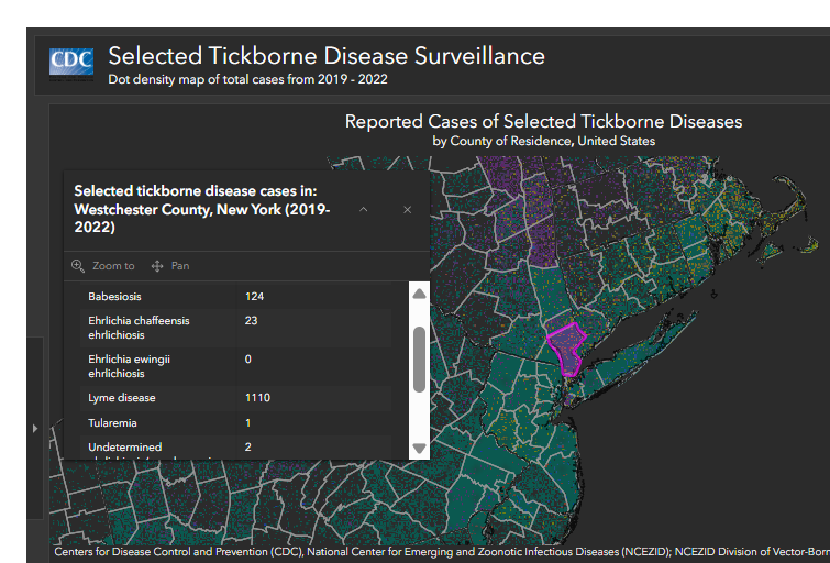
Cases are reported from the patient’s county of residence, not necessarily the place where they were infected by or exposed to ticks. Cases are not included in this list if county of residence was not reported.
Many high incidence states have modified surveillance practices that have led to notable decreases in case counts over time. Consequently, these data may not accurately represent disease trends in those areas.
Let’s look at another set of paired charts. These two graphs, one from the EC just last week and the other from Bloomberg in 2014, both use a series of tall and narrow slope charts to compare two values.
In this case, I wouldn’t argue that the EC should attribute Bloomberg’s—after all, they are just slope charts, the topics are different, and the overall design is different. As some other people pointed on out LinkedIn, a designer may begin creating with an echo of another design in their head but not be able pinpoint it (not to mention that some projects no longer live online).
The question remains: where do we draw the line between inspiration and recreation? Is 13 years long enough for a graphic to enter the “pantheon” of visualization techniques, thereby no longer requiring attribution? Or does the uniqueness of the Scarr piece mean that it should always be credited when reused or adapted?
It’s a tough question, and one without an easy answer. It’s clear from Sebastian’s response that he was inspired by Scarr’s original, so my preference would have been to include a citation or reference. But honestly, I’m not even sure where the attribution should go! Maybe under the Source line, or maybe in the Created by line that appears not in the graph but in the newsletter email itself? More questions without clear answers.
In the end, it’s about respecting the creative process. As creators, we all draw from what’s come before us—whether consciously or subconsciously. Acknowledging the work that inspires us not only gives credit where it’s due but also fosters a culture of openness and honesty. It shows respect for our peers and for the community as a whole.
I want to be very clear: this discussion in no way diminishes the fabulous work from The European Correspondent team. I have very much been enjoying their work and I love how they are taking chances with their design decisions, trying new designs and graph types, and being inspired by what people have created before! I’ve been impressed with their ability to distill complex data into short, engaging stories and the near-daily innovative and interesting graphs and charts. I find myself bookmarking two or three of their graphs each week, and adding them to my dataviz catalog. I highly recommend you subscribe to their newsletter. Even if you’re not keenly interested in European news, they are doing some great data visualization work on an almost daily basis, no small feat on its own.
Author(s): Jon Schwabish
Publication Date: 27 Aug 2024
Publication Site: PolicyViz newsletter at substack
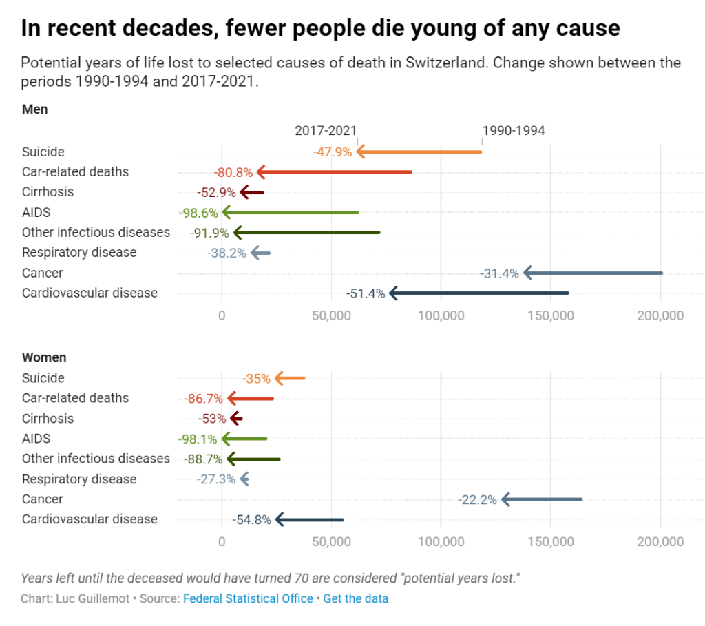
Looking at the evolution of premature deaths, we can celebrate the progress made in medical research. Years lost to infectious diseases like tuberculosis have reduced dramatically, and deaths due to AIDS in particular are nowadays close to zero, a drastic decline since the height of the pandemic in the 1990s. Cancer and cardiovascular diseases have followed a similar path, though they still cause a high number of premature deaths. We can observe that years lost to suicide before age 70 have also declined significantly. In a country where assisted suicide is legal, there is maybe something empowering in the prospect of dying healthy of old age. Years lost to alcoholism and car accidents have also declined — it may be that prevention and overall security have reduced these types of more behavioral deaths.
The authors of the 12 essays in this guide work through how to include equity at every step of the data collection and analysis process. They recommend that data practitioners consider the following:
Community engagement is necessary. Often, data practitioners take their population of interest as subjects and data points, not individuals and people. But not every person has the same history with research, nor do all people need the same protections. Data practitioners should understand who they are working with and what they need.
Who is not included in the data can be just as important as who is. Most equitable data work emphasizes understanding and caring for the people in the study. But for data narratives to truly have an equitable framing, it is just as important to question who is left out and how that exclusion may benefit some groups while disadvantaging others.
Conventional methods may not be the best methods. Just as it is important for data practitioners to understand who they are working with, it is also important for them to question how they are approaching the work. While social sciences tend to emphasize rigorous, randomized studies, these methods may not be the best methods for every situation. Working with community members can help practitioners create more equitable and effective research designs.
By taking time to deeply consider how we frame our data work—the definitions, questions, methods, icons, and word choices—we can create better results. As the field undertakes these new frontiers, data practitioners, researchers, policymakers, and advocates should keep front of mind who they include, how they work, and what they choose to show.
Author(s):
(editors) Jonathan Schwabish, Alice Feng, Wesley Jenkins
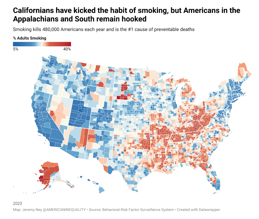
South Dakota is home to 3 of the 5 counties with the highest percent of cigarette smokers. We’ve written about one of those counties, Oglala Lakota County, severaltimes before as it has the lowest life expectancy of any county in the US (residents die at 67 on average), and median income is $30,347. Meanwhile, Utah is home to 6 of the 10 counties with the lowest percent of cigarette smokers. American Inequality has coveredseveral of these counties before. For example, Summit County has the highest life expectancy of any county in the US (residents die at 87 on average), and median income is 2.5x higher than in Oglala.
Cigarette smoking is 50% higher than in the following 12 states compared to the rest of the nation: Alabama, Arkansas, Indiana, Kentucky, Louisiana, Michigan, Mississippi, Missouri, Ohio, Oklahoma, Tennessee and West Virginia. An average smoker in these 12 states goes through about 53 packs in one year, compared with an average of 29 packs in the rest of the US. Life expectancy is 3 years lower in these states compared to the national average.
In 1998, California became the first state to implement a smoke free law prohibiting smoking in all indoor areas of bars and restaurants, as well as in most indoor workplaces. As we can see from the map above, California now has one of the lowest percent of adults smoking in the country.
The sixth edition of The Little Book of Data presents original and curated visuals, charts and graphics to offer a fresh perspective on topics shaping our world, including climate change, artificial intelligence, inflation, economics and geopolitics.
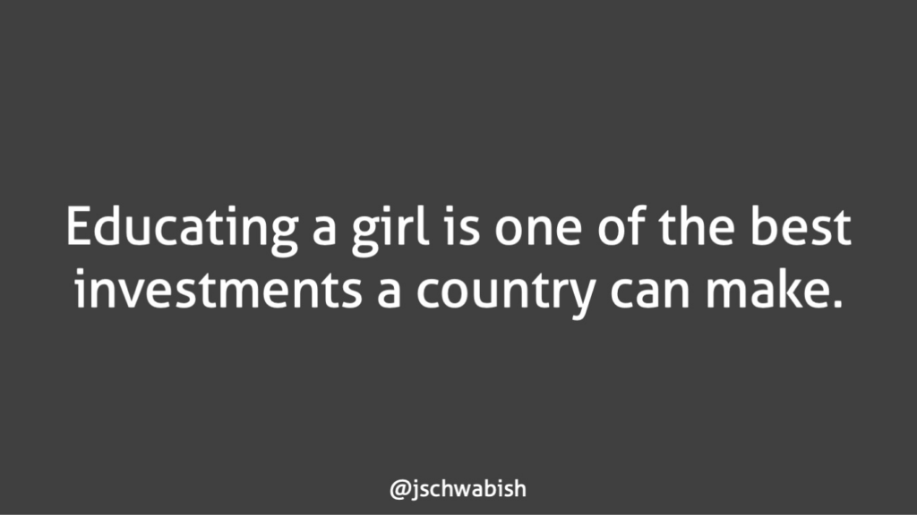
Let’s take a simple example and say you’re the author of this Brookings Institution report about how educating girls in developing countries is a great investment for families, communities, and countries. You go through your argument, presenting the data, facts, and statistics to drive home your message and call to action. You get to the end of your presentation with ample time for questions and answers when you show the slide above and say, “Thank you so much for having me. Are there any questions?”
At this point, let’s say you get some questions and there is some interesting discussion. All that time, the audience is left looking at this “Thank You. Any Questions?” slide. You’ve already said what’s on the slide—we don’t (well, shouldn’t) put everything we say on all of our slides anyways—so how does this slide help your audience? How does it reinforce your message and help them know what to do next?
Instead, what if you showed this slide and said, “Thank you so much for having me. What questions do you have?”
Author(s): Jon Schwabish
Publication Date: 1 Nov 2023
Publication Site: PolicyViz Newsletter at Substack
Information designer Evelina Judeikyte published this Map of DataViz Booksback in 2021 and updated it in December 2022. It consists of 30 books she has read across two axes: Length of read (short vs. long) and instructional vs. inspirational (arguable whether that’s continuous or not). Books Evelina read in 2022 were shown with the hatched pattern and I was pleased to see my Better Data Visualizationsbook appear on the list (in the bottom-right corner). We’ll see if she publishes a new one at the end of 2023.
I’m not sure if I saw the original image in 2021, but the 2022 version has been in the back of my head for months.
Obviously, the two dimensions are Evelina’s opinions about the books and I don’t intend to criticize or argue with her representation of the space. I do believe books can be both instructional and inspirational, but that’s not why it’s been stuck in my head.
Instead, I’ve been thinking about how I might represent the new wave of data visualization books that go beyond—or maybe in just a different direction—than the instructional/inspirational continuum.
Author(s): Jon Schwabish
Publication Date: 4 Oct 2023
Publication Site: PolicyViz Newsletter on substack
Welcome back to the 101st edition of Data Vis Dispatch! Every week, we’ll be publishing a collection of the best small and large data visualizations we find, especially from news organizations — to celebrate data journalism, data visualization, simple charts, elaborate maps, and their creators.
Recurring topics this week include pollution, transportation, and high temperatures. Plus: an opportunity to work on the Dispatch yourself as our Werkstudent*in.
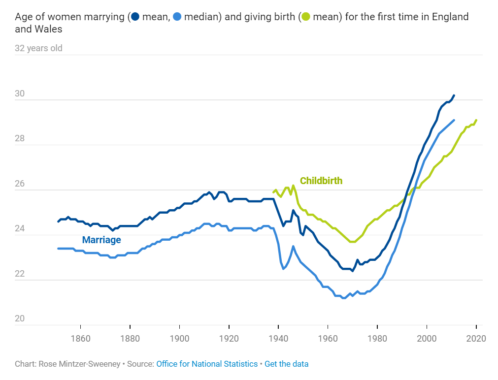
In the previous Weekly Chart, Elliot brought the data to confirm a commonsense impression: people these days are waiting later than their parents and grandparents did to get married and have children. The average age of a newlywed in the U.K. is 30.6 for women and 32.1 for men — about five years older than they would have been 1995, and nine years older than in 1964.
When we’re looking back in history, three generations is about as far as common sense can usually go. Those are the people whose lives we know firsthand. Many of us might have a general impression that women, especially, married young in the past, but we don’t actually have any 19th century friends or family to compare that impression against. Reading last week’s post, I was curious to see the older data that could fill in that gap.
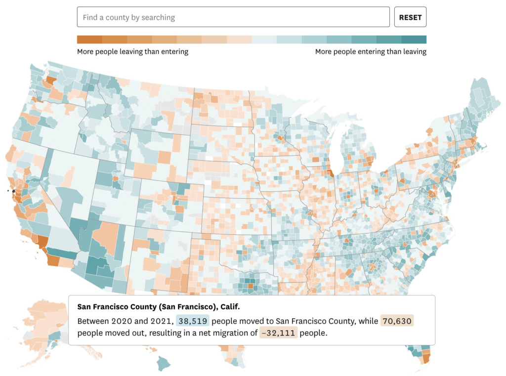
Where did people move to during the pandemic? It's a common question that's been explored using various sources, but the most accurate & detailed data recently came out from the IRS
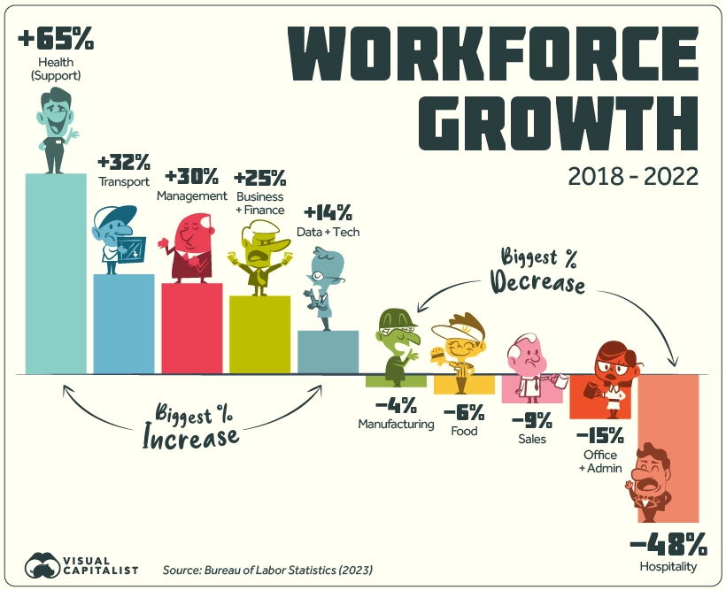
Over the last five years, the American workforce has not stayed static. Of the listed 22 groups, 13 saw growth in employment numbers, nine saw a decrease, and one stayed flat since 2018.
The top gainer by far is Health Support (medical assistants, care aides, orderlies, etc.) which grew by 65%. Looking at the timeline of growth does not paint a steady picture: employment jumped between 2018 and 2019, briefly fell in 2020, and has since risen again in 2021-2022.
Another top gainer is Transport, rising from the 4th to 3rd biggest employer, beating out Sales in 2022. Business & Finance and Management have also seen steady increases since 2018.
On the other hand Hospitality saw a staggering 48% drop in numbers, not all together surprising given the impact of the COVID-19 pandemic as well as the rise of tech companies like Airbnb.
Meanwhile, Office & Admin work saw a 15% loss in employees, even though this category is still the biggest employer in the country by a significant margin. Although jobs in this group saw steady declines from 2018-2021, it registered a slight uptick in workers between 2021 and 2022.
