Link: https://www.gunviolencearchive.org/
Graphic:
Excerpt:
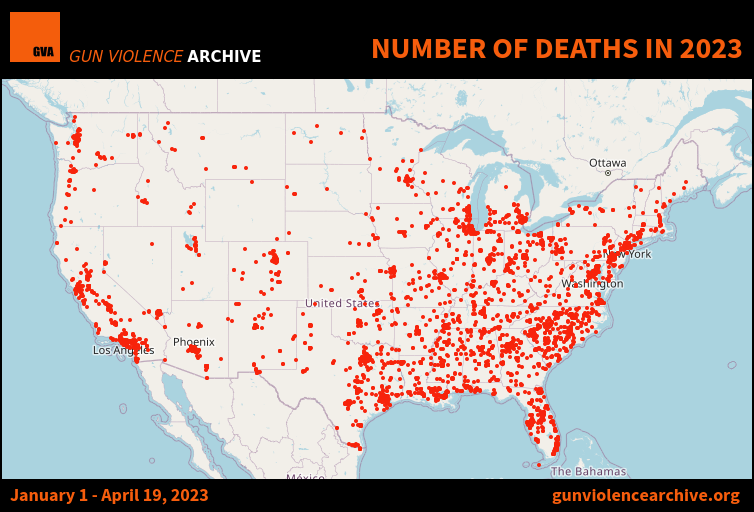
PUBLISHED DATE: April 20, 2023
- Total Number of GV Deaths – ALL Causes4 12,712
- Homicide/Murder/Unintentional/DGU1 5,452
- Suicide3 7,260
- Total Number of Injuries1 9,927
- Mass Shootings2 165
- Mass Murders2 16
- Number of Children (age 0-11)1 Killed 77
- Injured 182
- Number of Teens (age 12-17)1 Killed 452
- Injured 1,096
- Officer Involved Incident1 Killed 18
- Officer Killed or Injured Injured 117
- Officer Involved Incident1 Killed 421
- Subject-Suspect Killed or Injured Injured 247
- Defensive Use2 322
- Unintentional Shooting2 453
- Murder/Suicides Incidents2 214
Gun violence and crime incidents are collected/validated from 7,500 sources daily – Incident Reports and their source data are found at the gunviolencearchive.org website.
Footnotes
- Number of source verified deaths and injuries
- Number of INCIDENTS reported and verified
- Calculation based on CDC Suicide Data
- Actual total of all non-suicide deaths plus daily calculated suicide deaths
All numbers are subject to change or incidents recategorized as new evidence is established and verified.
METHODOLOGY & DEFINITIONS AVAILABLE AT:
https://www.gunviolencearchive.org/methodology
www.gunviolencearchive.org
www.facebook.com/gunviolencearchive
On Twitter @gundeaths
Publication Date: accessed 20 April 2023
Publication Site: Gun Violence Archive