Link:https://results4america.org/tools/arp-dashboard/
Graphic:
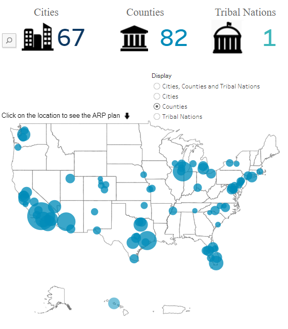
Excerpt:
Accessed: 6 December 2021
Publication Site: Results for America
All about risk
Link:https://results4america.org/tools/arp-dashboard/
Graphic:
Excerpt:
Accessed: 6 December 2021
Publication Site: Results for America
Link:https://nightingaledvs.com/ive-stopped-using-box-plots-should-you/
Graphic:
Excerpt:
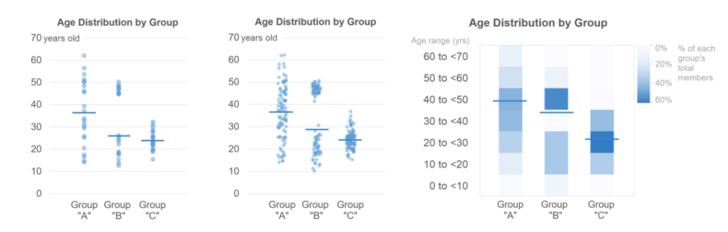
Well, as far as I can tell, the only advantage of box plots is that they show quartile ranges. The obvious next question, of course, is how often it’s necessary to show quartile ranges in order to say what you need to say about the data. In my experience, it’s not nearly as often as a lot of chart creators seem to think. Most of the time, you’re pointing out that distributions are higher or lower than one another, more concentrated or more dispersed than one another, have outliers, etc. None of these types of insights require showing quartile ranges and all can be communicated using simpler chart types. Some types of insights might require showing medians, but those can be easily added to simpler chart types:
Author(s): Nick Desbarats
Publication Date: 4 Nov 2021
Publication Site: Nightingale
Graphic:
Publication Date: 18 Oct 2021
Publication Site: The Economist
Link:https://www.bloomberg.com/graphics/2021-uk-gender-pay-gap/
Graphic:
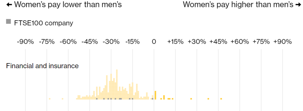
Excerpt:
Women in finance in the U.K. still make significantly less than men. While the gender pay gap at financial firms in the country narrowed slightly last year, overall the industry continues to have the biggest disparity.
Men working in finance and insurance made 25% more than women last year, down from 28% in 2019, a Bloomberg News analysis of government data shows. The pay gap is especially wide in investment banking, where some of the highest-paid employees work.
It is the fourth straight year that finance has led the industry rankings, showing that executives are finding it difficult to shrink the gap. Mining and quarrying had the second-biggest pay gap at 23% as the commodity boom boosted the income of workers, who are largely male.
Author(s): Neil Callahan
Publication Date: 6 Oct 2021
Publication Site: Bloomberg
Link:https://www.themarshallproject.org/2021/08/30/the-black-mortality-gap-and-a-century-old-document
Graphic:
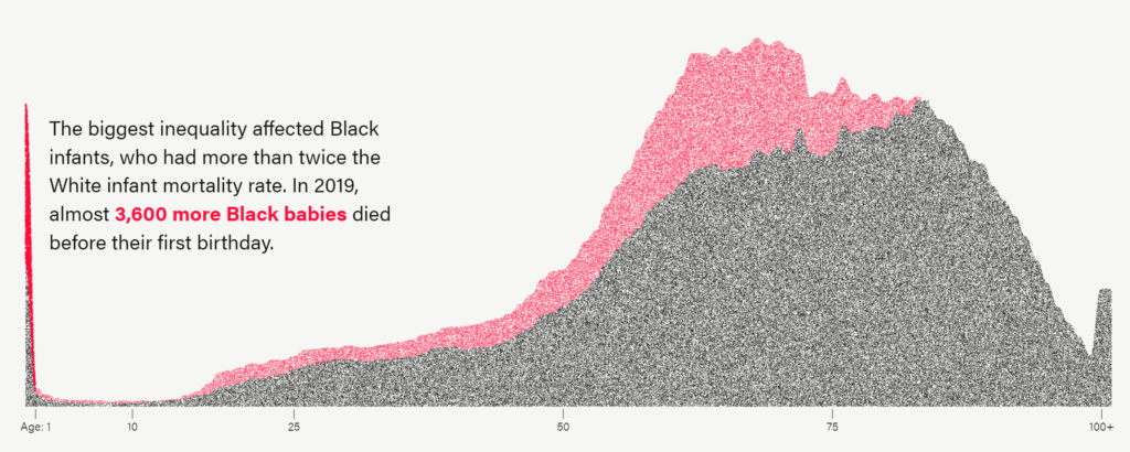
Excerpt:
Black Americans die at higher rates than White Americans at nearly every age.
In 2019, the most recent year with available mortality data, there were over 62,000 such earlier deaths — or one out of every five African American deaths.
The age group most affected by the inequality was infants. Black babies were more than twice as likely as White babies to die before their first birthday.
The overall mortality disparity has existed for centuries. Racism drives some of the key social determinants of health, like lower levels of income and generational wealth; less access to healthy food, water and public spaces; environmental damage; overpolicing and disproportionate incarceration; and the stresses of prolonged discrimination.
But the health care system also plays a part in this disparity.
Author(s): Anna Flagg
Publication Date: 30 Aug 2021
Publication Site: The Marshall Project
Link: https://booth.lse.ac.uk/map/12/-0.0421/51.5132/100/0
Graphic:
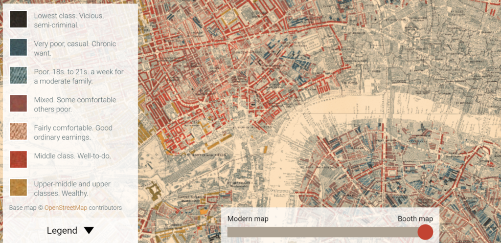
Additional: https://booth.lse.ac.uk/learn-more/what-were-the-poverty-maps
Excerpt:
The Maps Descriptive of London Poverty are perhaps the most distinctive product of Charles Booth’s Inquiry into Life and Labour in London (1886-1903). An early example of social cartography, each street is coloured to indicate the income and social class of its inhabitants.
….
The first edition of the poverty maps was based on information gathered from School Board visitors. A first sheet covering the East End was published in the first volume of Labour and Life of the People, Volume 1: East London (London: Macmillan, 1889) as the Descriptive Map of East End Poverty. The map was expanded in 1891 to four sheets – covering an area from Kensington in the west to Poplar in the east, and from Kentish Town in the north to Stockwell in the south – and published in subsequent volumes of the survey. These maps are collectively known as the Descriptive Map of London Poverty 1889. They use Stanford’s Library Map of London and Suburbs at a scale of 6 inches to 1 mile (1:10560) as their base. A digital image of the 1889 map has been made by the University of Michigan.
The original working maps from this first edition of the poverty maps are held at the Museum of London. These are hand-coloured and use the 1869 Ordnance Survey 1:2500 maps as their base.
Download the maps: https://booth.lse.ac.uk/learn-more/download-maps
Link:https://marypatcampbell.substack.com/p/revisualizing-the-financial-state
Graphic:

Excerpt:
One large benefit of a tile grid map is you can see the geographically small states, which are often more obscured when you a geographically accurate map.
When viewed in this way, with the states colored by their grades, you can see that there’s a Northeastern Rogue’s Gallery, in addition to the expected stinkers of Illinois, Kentucky, and California (also, Hawaii, but many people don’t expect that one.)
But I want to point out that a lot of “red” states, in the political sense, also have crappy finances.
Texas is a particularly bad offender here, with a taxpayer deficit of -$13,100 per taxpayer. It’s not just the “expected” states where pensions are grossly underfunded — mind you, pretty much every single taxpayer sinkhole here has grossly underfunded state-level pensions — but it is a widespread problem.
Author(s): Mary Pat Campbell
Publication Date: 29 Sept 2021
Publication Site: STUMP at substack
Graphic:
Author(s): Polimath
Publication Date: 23 Sept 2021
Publication Site: Polimath
Link: https://github.com/Financial-Times/chart-doctor/blob/main/visual-vocabulary/poster.png
Graphic:
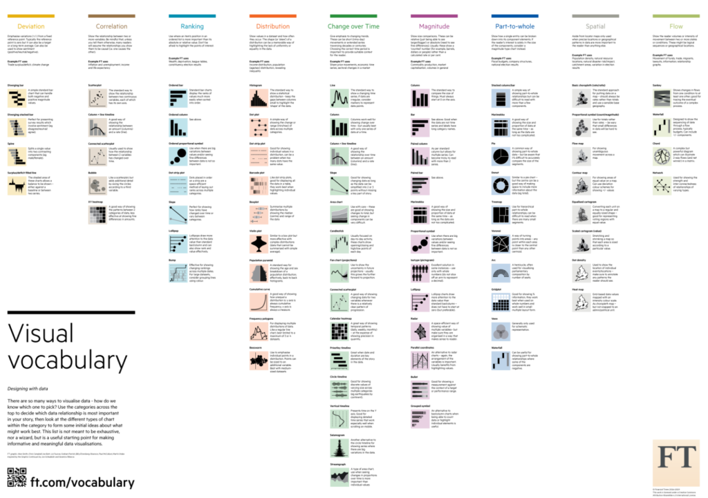
Author(s): Alan Smith, Financial Times
Publication Date: 24 September 2019, accessed 25 August 2021
Publication Site: github
Graphic:
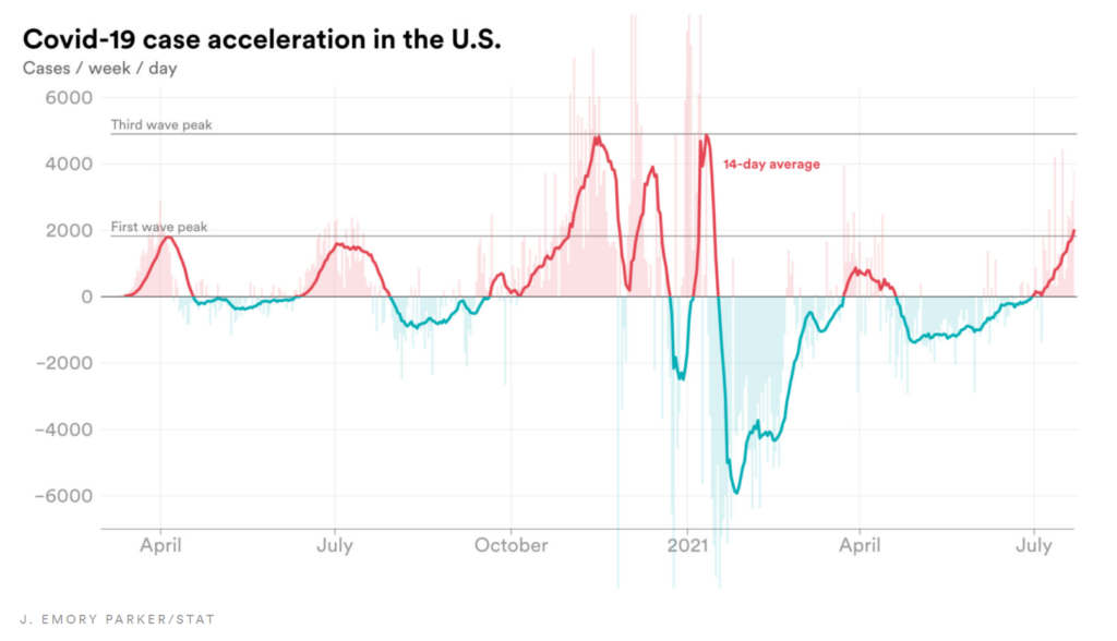
Excerpt:
The number represented by the line could be thought of as the velocity of cases in the U.S. It tells us how fast case counts are increasing or decreasing and does a good job of showing us the magnitude of each wave of cases.
The chart, however, fails to show the rate of acceleration of cases. This is the rate at which the number of new cases is speeding up or slowing down.
As an analogy, a car’s velocity tells you how fast the car is going. Its acceleration tells you how quickly that car is speeding up.
Using Covid-19 case data compiled by the Center for Systems Science and Engineering at Johns Hopkins University and Our World in Data, combined with data from the Centers for Disease Control and Prevention, STAT was able to calculate the rate of weekly case acceleration, pictured below.
Author(s): Emory Parker
Publication Date: 26 July 2021
Publication Site: STAT News
Graphic:
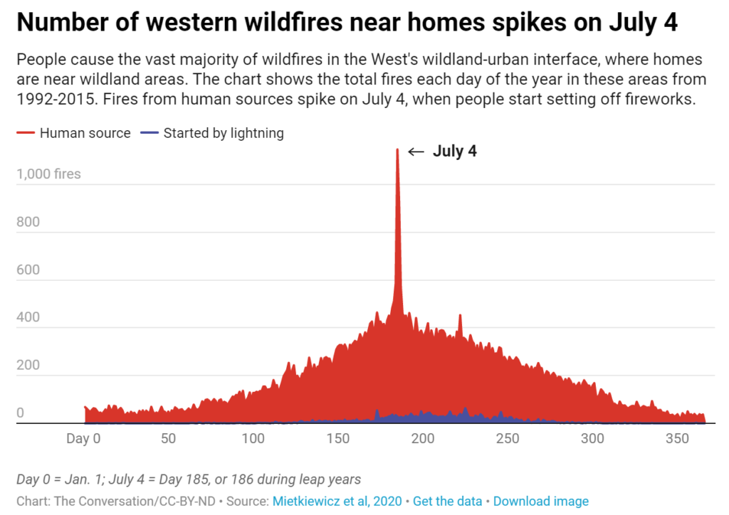
Excerpt:
For decades, one of the most striking and predictable patterns of human behavior in the western U.S. has been people accidentally starting fires on the Fourth of July. From 1992 to 2015, more than 7,000 wildfires started in the U.S. on July 4 – the most wildfires ignited on any day during the year. And most of these are near homes.
Author(s): Philip Higuera, Alexander L. Metcalf, Dave McWethy, Jennifer Balch
Publication Date: 1 July 2021
Publication Site: The Conversation
Graphic:
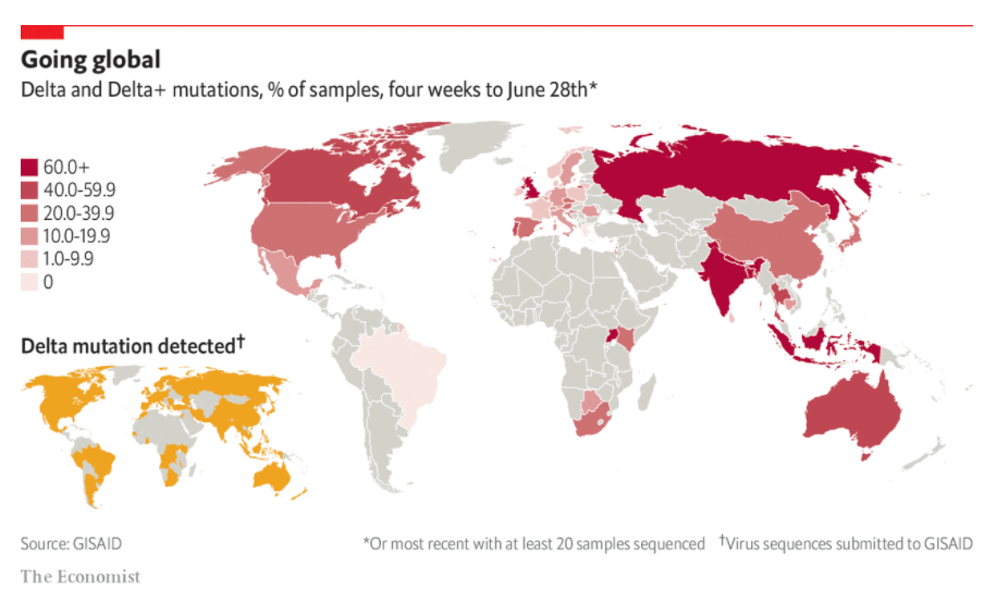
Excerpt:
AT A PRESS conference at the White House on June 22nd Anthony Fauci, the director of America’s National Institute of Allergy and Infectious Diseases, issued a warning. The delta variant of the SARS-CoV-2 virus, first identified in India in February, was spreading in America—and quickly. “The delta variant is currently the greatest threat in the US to our attempt to eliminate covid-19,” declared Dr Fauci. Boris Johnson, Britain’s prime minister, issued a similar warning a week earlier. To contain the rapid spread of the variant, European countries and Hong Kong have tightened controls on travellers from Britain.
According to GISAID, a data-sharing initiative for corona- and influenza-virus sequences, the delta variant has been identified in 78 countries (see chart). The mutation is thought to be perhaps two or three times more transmissible than the original virus first spotted in Wuhan in China in 2019. It is rapidly gaining dominance over others. According to GISAID’s latest four-week average, it represents more than 85% of sequenced viruses in Bangladesh, Britain, India, Indonesia and Russia. It may soon be the most prevalent strain in America, France, Germany, Italy, Mexico, South Africa, Spain and Sweden. (GISAID does not, in its summary data, distinguish between delta, B.1.617.2, and the “delta plus” mutation, AY.1, AY.2.)
Publication Date: 29 June 2021
Publication Site: The Economist