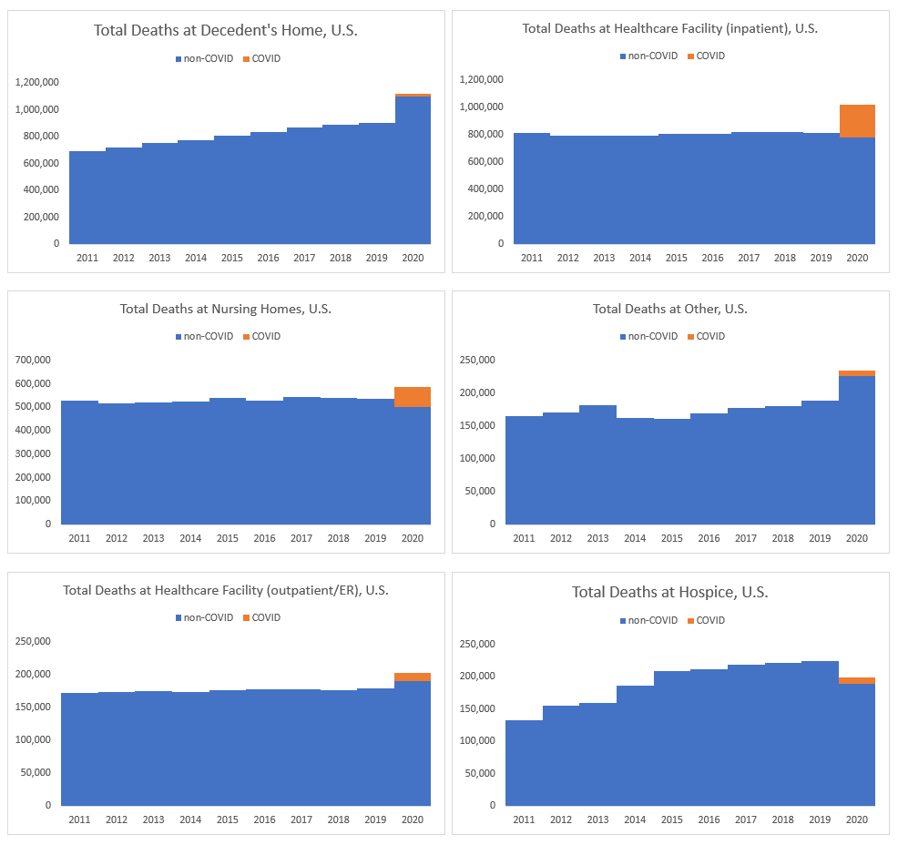
For a few locations, it’s pretty clear that COVID explains almost all their excess deaths: inpatient healthcare facilities and nursing homes. Indeed, it looks like over 100% of the nursing home excess mortality came from COVID, which accords with what I see with excess mortality for older people.
However, there is a lot of excess mortality for people who died at home, and most of that is currently unexplained by COVID.
I don’t think it will be — I think we will find those excess diabetes, heart attack, and ‘unintentional injury’ deaths will have been at home, and because of lockdowns there weren’t other people around to get these people to treatment before they died. This accords with what Emma Woodhouse saw for Illinois – that pattern holds for the entire U.S., it seems.
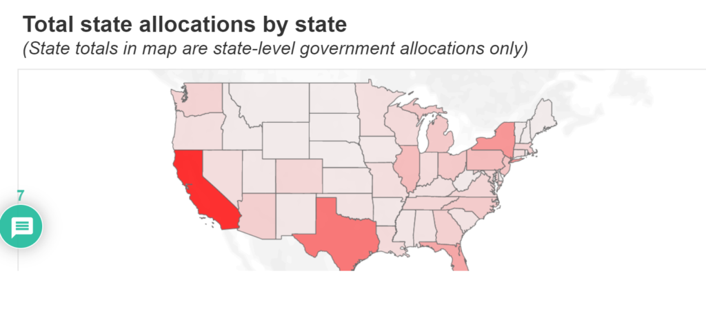
Embedded below are a set of searchable databases that provide the estimated allocation of the $360 billion in direct government aid to states, counties and cities under the $1.9 trillion American Rescue Plan. The remaining stimulus includes funding for schools and other programs, for which detailed data is not yet available.
The $360 billion is split as follows: State governments are set to receive $230 billion in direct and capital project grants, county governments will receive $65 billion, and municipal governments will receive the other $65 billion.
Author(s): Ted Dabrowski, Mark Glennon, John Klingner
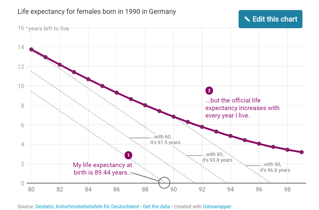
But here’s what I only started to understand last week (and I was kind of mind-blown by that, so I’m thrilled to share it with you): Our life expectancy increases with every minute we live. When I turned 30, my life expectancy got up to 90.37 years. Once I turn 80, it’ll be 93.76 years.
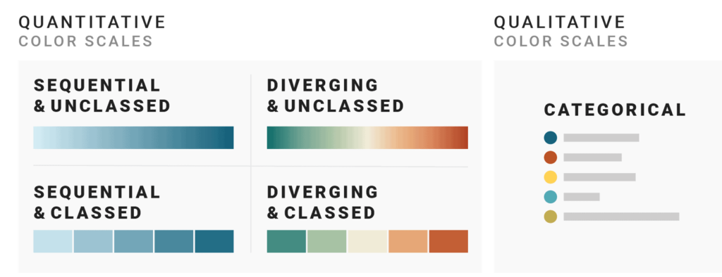
But when looking at data visualizations, I noticed that the decision of which color scale to use is often not as obvious as many of these data vis books make us believe. Some data visualizations are using sequential color palettes, although they’re visualizing categories. Or the same data is visualized with a diverging color scale in one publication and with a sequential one in the next. And sometimes with classed and other times with unclassed gradients.
What are the rules, the challenges, and the trade-offs?
Let’s find out.
The next three parts of this series provide you with a “decision tree” – a Choose Your Own Adventure of data vis – by asking three questions:
Part 2: When should you use a qualitative and when a quantitative color scale?
Part 3: If you decided to use a quantitative color scale – when should you use a sequential and when a diverging one?
Part 4: If you decided to use a quantitative color scale – when should you use a classed and when an unclassed one?
There was a recent email thread in the IsoStat listserv about a cool visualization that recently came out in the New York Times showing COVID-19 cases over time. This sparked a discussion about whether this was possible to recreate in R with ggplot, so of course I gave it a try!
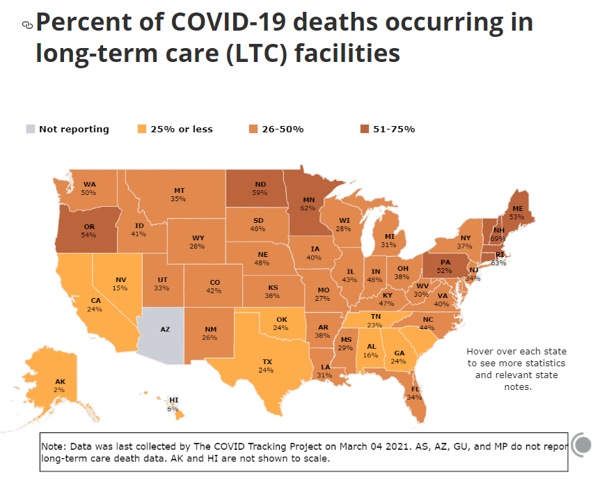
Less than 1% of America’s population lives in long-term-care facilities, but as of March 4, 2021, this tiny fraction of the country accounts for 34% of US COVID-19 deaths.
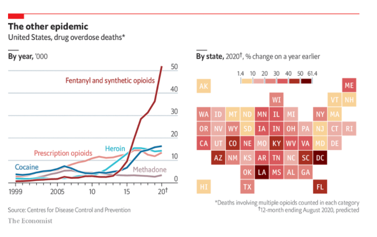
LAST YEAR was a woeful time for people suffering from a drug addiction. Government shutdowns brought job losses and social isolation—conditions that make a transportive high all the more enticing. Those who had previously used drugs with others did so alone; if they overdosed, no one was around to call for help or administer naloxone, a medication that reverses opioid overdoses.
Fatal overdoses were marching upwards before the pandemic. But they leapt in the first part of last year as states locked down, according to provisional data from the Centres for Disease Control and Prevention. Deaths from synthetic opioids—the biggest killer—were up by 52% year-on-year in the 12 months to August, the last month for which data are available. Those drugs killed nearly 52,000 Americans during the period; cocaine and heroin killed about 16,000 and 14,000, respectively (see chart). Once fatalities are fully tallied for 2020, in a few months’ time, it is likely to be the deadliest year yet in America’s opioid epidemic.
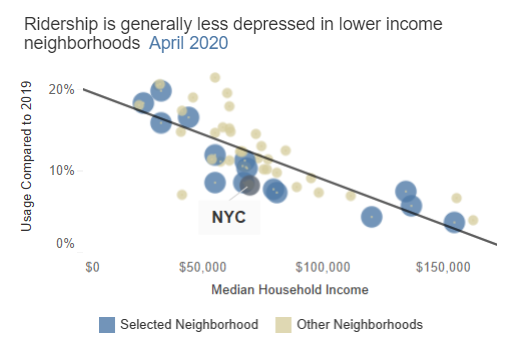
Subway turnstile data published by the Metropolitan Transportation Authority (MTA) shows a correlation between median household income and subway ridership. Neighborhoods with lower median household incomes tended to have significantly higher ridership as a share of 2019 levels compared to wealthier neighborhoods. This trend was clear not only in April, when COVID-19 had its most dramatic impact on ridership, but has continued through the recovery to date.
In high-income neighborhoods, residents are more likely to be employed in sectors that have easily adapted to remote-work models, such as financial activities and business services. In neighborhoods where residents are more likely to continue using the subway during the pandemic, common areas of employment are the health care and social assistance sector and the leisure and hospitality sector.
Author(s): Thomas DiNapoli
Date Accessed: 28 March 2021
Publication Site: Office of New York State Comptroller
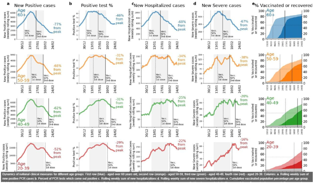
Studies on the real-life impact of the BNT162b2 vaccine, recently authorized for the prevention of coronavirus disease 2019 (COVID-19), are urgently needed. Here, we analysed the temporal dynamics of the number of new COVID-19 cases and hospitalization in Israel following a rapid vaccination campaign initiated on December 20th, 2020. We conducted a retrospective descriptive analysis of data originating from the Israeli Ministry of Health (MOH) from March 2020 to February 2021. In order to distill the possible effect of the vaccinations from other factors, including a third lockdown imposed in Israel on January 2021, we compared the time-dependent changes in number of COVID-19 cases and hospitalizations between (1) individuals aged 60 years and older, eligible to receive the vaccine earlier, and younger age groups; (2) the latest lockdown (which was imposed in parallel to the vaccine rollout) versus the previous lockdown, imposed on September 2020; (3) early-vaccinated cities compared to late-vaccinated cities; and (4) early-vaccinated geographical statistical areas (GSAs) compared to late-vaccinated GSAs. In mid-January, the number of COVID-19 cases and hospitalization started to decline, with a larger and earlier decrease among older individuals, followed by younger age groups, by the order in which they were prioritized for vaccination. This fast and early decline in older individuals was more evident in early-vaccinated compared to late-vaccinated cities. Such a pattern was not observed in the previous lockdown. Our analysis demonstrates evidence for the real-life impact of a national vaccination campaign in Israel on the pandemic dynamics. We believe that our findings have major public health implications in the struggle against the COVID-19 pandemic, including the public ’s perception of the need for and benefit of nationwide vaccination campaigns. More studies aimed at assessing the effectiveness and impact of vaccination both on the individual and on the population level, with longer followup, are needed.
Author(s): Hagai Rossman, Smadar Shilo, Tomer Meir, Malka Gorfine, Uri Shalit, Eran Segal
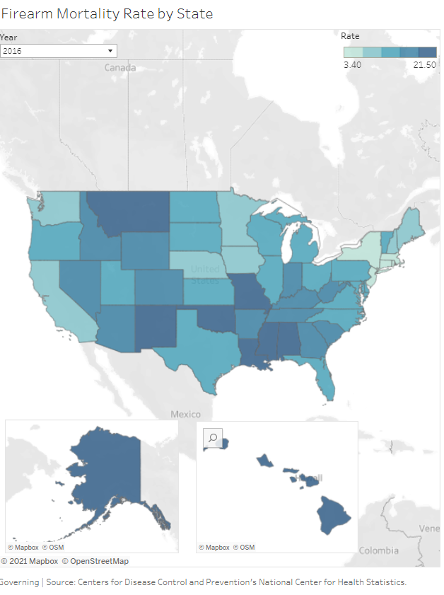
But when firearm mortality is viewed state by state, a strong variation emerges. Using data from the Centers for Disease Control and Prevention, Massachusetts had the lowest death rate of just 3.4 per 100,000 in 2019, the latest year data is available. Alaska and Mississippi are tied for the highest: 24 deaths per 100,000. The following map and table provide specific numbers for each state.
We live in a world where data visualisations are done through intricate code and graphic design. From Tableau to Datawrapper and Python and R, numerous possibilities exist for visualising compelling stories. But in the beginning, all data visualisation was done by hand. Visualisation pioneers like W. E. B. Du Bois and Florence Nightingale hand-drew their visualisations because there was simply no other way to make them.
For Du Bois it was his team of black sociologists who explained institutionalised racism to the world using data visualisations, while for Nightingale it was her diagram showing the causes of mortality.
And, even as computers developed, it was often easier to visualise using analogue means. This article will explore the history of hand-drawn visualisations and the case for presenting them in this style. It will also show examples from experts who have opted for the pencil over the screen. You’ll also learn some top tips to help get you started.
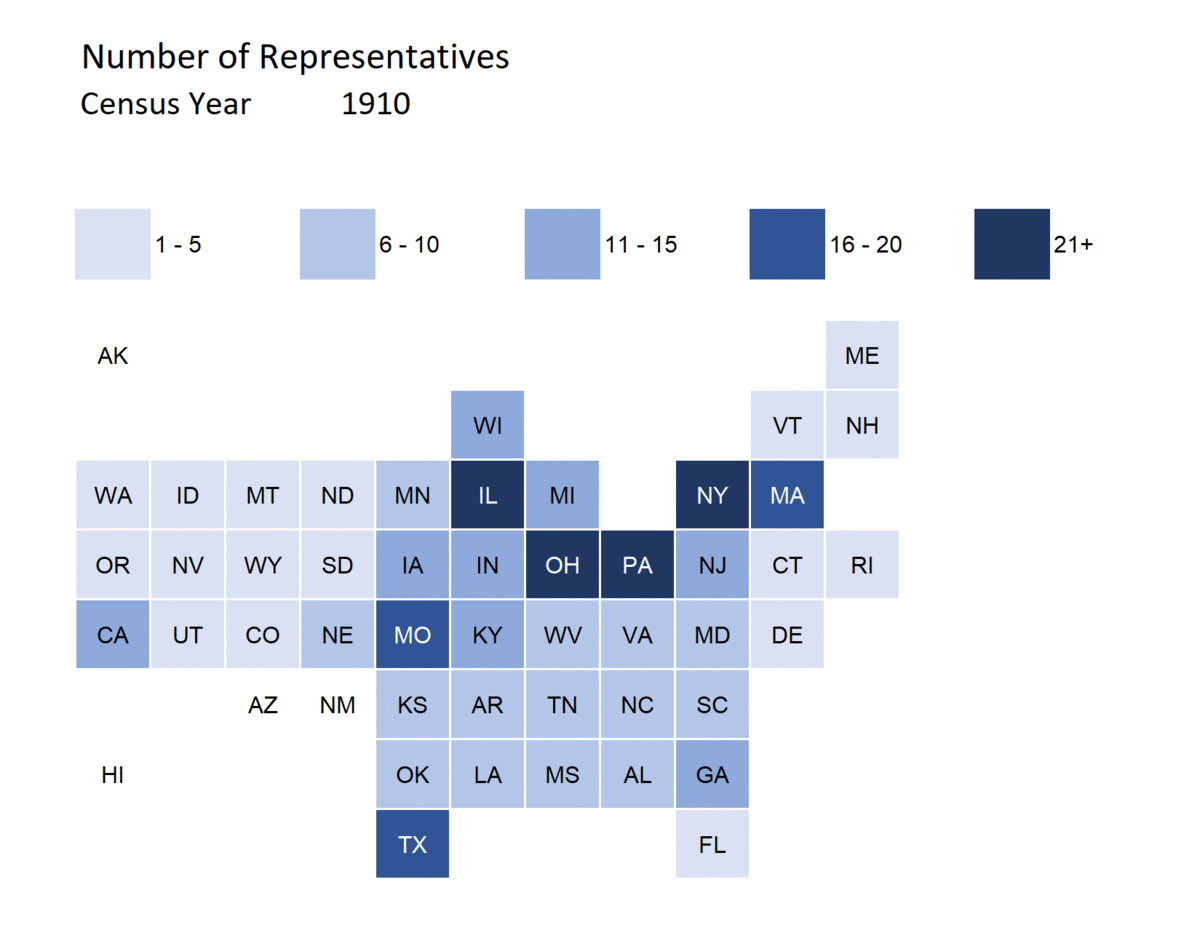
So you can see how the dominating states change in the House of Representatives:
in 1910, it was Illinois, Ohio, Pennsylvania, and New York
in 2010, it was New York, California, Texas, and Florida
While New York was a large state throughout this visualization, Ohio, Pennsylvania, and Illinois dropped out and California, Texas, and Florida rose up.