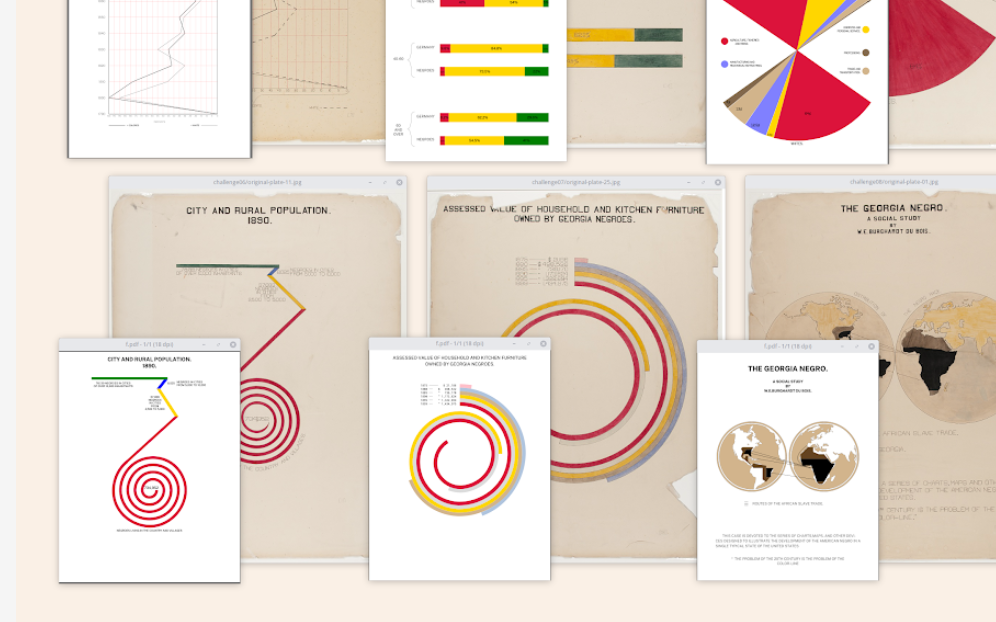
Anthony Starks on Recreating Du Bois’s Iconic Style

Graphic:

Excerpt:

When Sekou and I met with Anthony to discuss his Du Bois recreations, he explained that he was “immediately struck” by Howard Wainer’s presentation on “Historical Development of W.E.B. Du Bois Graphical Narrative.” This was back in May 2017 at a Data Visualization New York meetup hosted by data viz pioneer Naomi Robbins. He was in awe of the existence and artistry of Du Bois’s work. The thought that immediately came to his mind was, “How can I reproduce this?”

Author(s): Allen Hillery

Publication Date: 25 February 2021

Publication Site: Data Literacy

Behind the maps

Link: https://koenvandeneeckhout.medium.com/behind-the-maps-66d6377b8644

Graphic:

Excerpt:

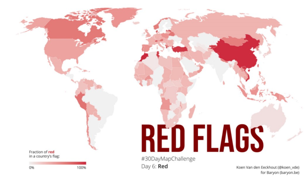
Data: I don’t know how the idea popped into my head, but I always wanted to do something with 🚩 country flags, and the color schemes they use. I had found a suitable set of all the countries’ flags in .svg format, but was struggling to extract specific colors from them. Googling around I stumbled upon the Image Color Summarizer, which partly did what I was looking for, but not entirely. I was saved when I found out that Martin Krzywinski, creator of the tool, had many other tools and examples on his mindblowing website — including an overview of all the colors in all of the different flags! 🤯 The most difficult part left to do was defining when a color was ‘red’ — #FF0000 is obviously red, but what about #D62612 (in the Bulgarian flag)? Or #FBDE4A (in the flag of Congo-Brazzaville)? This was done more or less manually by going through the entire list and quickly verifying any colours for which I had doubts.

Author(s): Koen Van den Eeckhout

Publication Date: 6 January 2021

Publication Site: Koen Van den Eeckhout

The Importance of How we See the Numbers During the Pandemic

Link: https://idsc.miami.edu/the-importance-of-how-we-see-the-numbers-during-the-pandemic/

Excerpt:

Speaking to Al Jazeera English for a piece entitled: “The Power and Politics of Data Visualisation” three contributors looked at how data is often presented as objective truth, but the way it is presented, interpreted, and contextualized can distort its original purpose. Turning data into graphics people can understand is increasingly important, but viewers also should also be better informed and more careful in recognizing the nature of uncertainty in these visualizations.

The piece looks at how important it is to be able to trust the data, yet it’s equally important that viewers understand that the visualization of the data can be influenced by human decisions on the collection, interpretation, and depiction of the data.  Dr. Cairo says “Data visualizations are some of the best tools that we have to understand the world if we use them well and we interpret them well, but that doesn’t mean that those numbers are the whole story. We also need to use logic and scientific reasoning.”

Publication Date: 26 February 2021

Publication Site: Institute for Data Science & Computing at University of Miami

Reflecting on a decade of data science and the future of visualization tools

Link: https://www.tableau.com/about/blog/2021/2/data-science-and-future-visualization-tools-reflection

Graphic:

Excerpt:

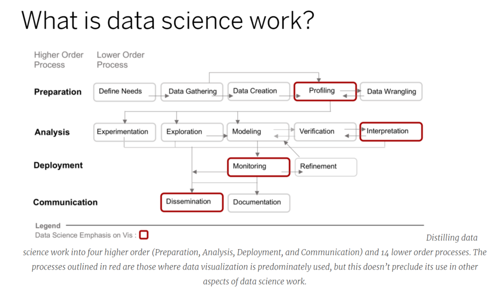
Importantly, a working definition of data science narrows the scope of research. Instead of considering all possible types of data analysis that one may wish to conduct, we look closely at the types of analyses data scientists carry out. This distinction is important as the specific steps that, say, an experimental physicist takes to analyze data are different, even though they share commonalities, than the analytic steps a data scientist may take. Which leads to an important follow on: what exactly is data science work?

There have been several industry standards for breaking down data science work. The first was the KDD (or Knowledge in Data Discovery) method, that over time was modified and expanded upon by others. From these derivations, as well as studies that interview data scientists, we created a framework that has four higher order processes (preparation, analysis, deployment, and communication) and 14 lower order processes. Using the red stroke outline we also highlighted the specific areas where data visualization already plays a prominent role in data science work. In our research article we provide detailed definitions and examples of these processes.

Author(s): ANA CRISAN

Publication Date: 24 February 2021

Publication Site: Tableau

Three ways to make your charts more accessible

Link: https://flourish.studio/2021/03/01/accessible-chart-design/

Graphic:

Excerpt:

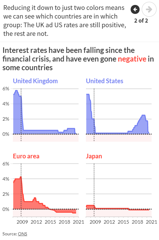
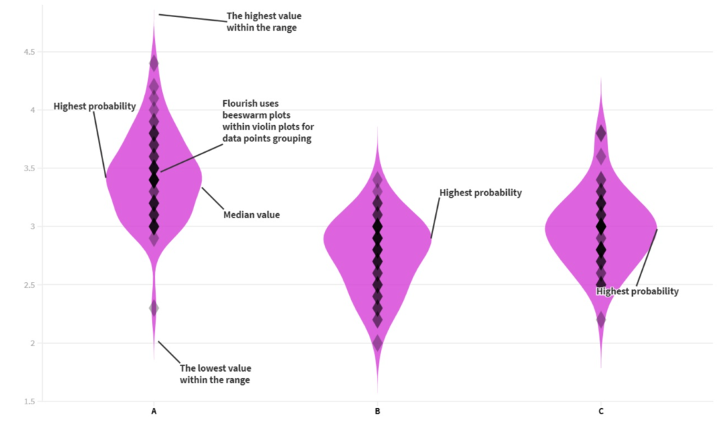
Where possible, use colors that are bold and clear enough for people to see both text and graphical elements, like lines and points. The Web Content Accessibility Guidelines (WCAG) suggest meeting the WCAG AA requirements – something that is required by law for public bodies in several countries.

To check if your color (and font size) choices are AA accessible you can use a contrast checker website. Here you can check if there is enough contrast between the foreground and background colour for someone with a certain level of impaired vision to be able to see your data or text.

Author(s): Lyndsey Pereira-Brereton, Luisa Bider

Publication Date: 1 March 2021

Publication Site: Flourish

Data visualization guidelines and a case study

Link: http://lenkiefer.com/2021/02/26/data-visualization-guidelines-and-a-case-study/

Graphic:

Excerpt:

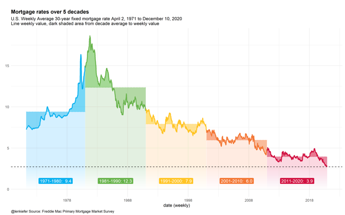
Yesterday I gave a virtual lecture on data visualization at GMU. Here I’m posting the slides I used for that talk and including my discussion notes for the portion of the talk where I discussed guidelines for data visualization.

At the beginning of the talk I spoke a bit about data visualization guidelines. I framed this part of my talk around Jon Schwabish’s five guidelines from his new book Better Data Visualizations see (on Amazon) and here for a blog summary.

I then went over some charts I’ve used recently in talks I’ve given and discussed how I used (or didn’t use) the guidelines in that chart.

Author(s): Len Kiefer

Publication Date: 26 February 2021

Publication Site: LenKiefer.com

It’s Time: The COVID Tracking Project Will Soon Come to an End

Link: https://covidtracking.com/analysis-updates/covid-tracking-project-end-march-7

Excerpt:

Every day for almost a year, hundreds of COVID Tracking Project contributors from all walks of life have compiled, published, and interpreted vitally important COVID-19 data as a service to their fellow Americans. On March 7, the one-year anniversary of our founding, we will release our final daily update and our data compilation will stop. Documentation, analysis, and archival work will continue for another two months, and we will bring the project to a close in May.

….

That we were able to carry the data through a full year is a testament to the generosity of the foundations and firms that gave us the resources we needed, to the counsel of our advisory board, to The Atlantic’s support for our highly unusual organization, and above all to the devotion of our contributors. But the work itself—compiling, cleaning, standardizing, and making sense of COVID-19 data from 56 individual states and territories—is properly the work of federal public health agencies. Not only because these efforts are a governmental responsibility—which they are—but because federal teams have access to far more comprehensive data than we do, and can mandate compliance with at least some standards and requirements. We were able to build good working relationships with public health departments in states governed by both Republicans and Democrats, and these relationships helped bring much more data to into public view. But ultimately, the best we could hope to do with unstandardized state data was to build a bridge over the data gaps—and the good news is that we believe we can now see the other side.

Author(s): Erin Kissane & Alexis Madrigal

Publication Date: 1 February 2021

Publication Site: Covid Tracking Project
The Ten Most Misleading Charts During Donald Trump’s Presidency

Link: https://policyviz.com/2021/02/15/the-ten-most-misleading-charts-during-donald-trumps-presidency/

Graphic:

Excerpt:

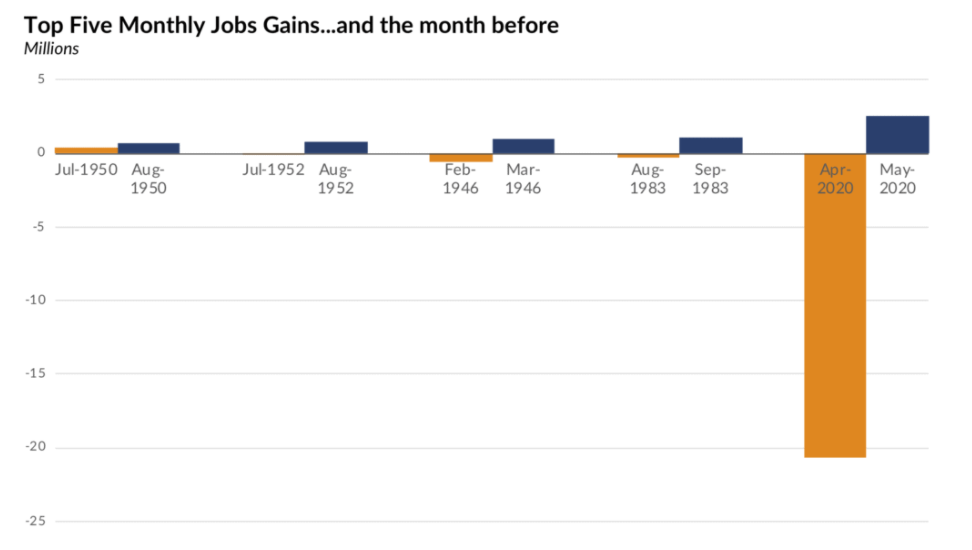
Over the course of four years as President, Donald Trump made more than 30,000 false or misleading claims, according to the Washington Post Fact Checker. It should be no surprise, then, that some of these took the form of data visualizations. Here are the top ten most misleading charts, graphs, maps, and tables from the Trump Administration over the past four years.

Author(s): Jonathan Schwabish

Publication Date: 15 February 2021

Publication Site: PolicyViz

Analyzing Census Data in Excel

Link: https://www.census.gov/data/academy/courses/excel.html

Description

Excel is a very popular tool among all data users. It can be leveraged to unlock the value of open data of all kinds, and it is particularly well-suited to transforming, analyzing, and visualizing Census data. This course will show how to use Excel to access, manipulate, and visualize Census data.  It will also tools for doing advanced statistical analysis.

After completing this course, you will be able to:
    ✓    Access data from the Census Bureau using the American FactFinder
    ✓    Format tables for data analysis
    ✓    Perform basic and advanced analysis of Census data using Excel
    ✓    Create data visualizations such as sparklines, hierarchical charts, and histograms

Author(s): Andy Hecktman, Alexandra Barker

Date Accessed: 27 February 2021

Publication Site: U.S. Census Bureau

How Drawing Makes Us Better at Data Visualization

Graphic:

Excerpt:

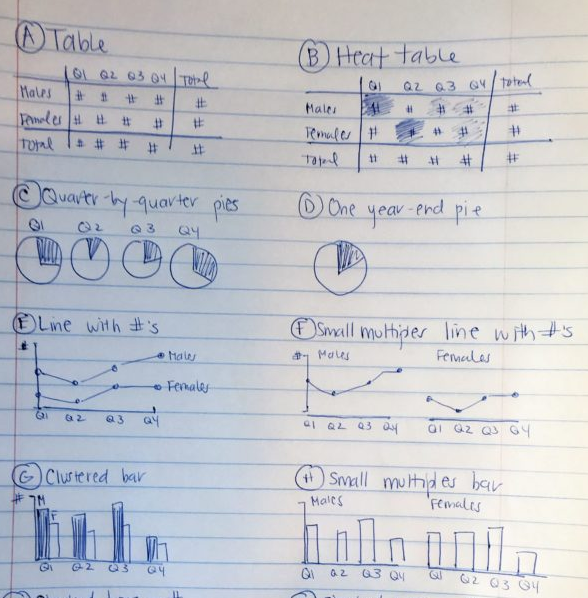
Once I’ve selected lots of individual graphs to use, I often need to arrange them together on a page or screen.

For example, if I’m designing an infographic, the one-page summary might involve three, four, or five individual graphs.

Or, if I’m designing a dashboard, the screen might involve three, four, or five individual graphs.

I need to decide which graph should be displayed first, second, or third. Is there a natural sequence?

I also need to decide which graphs “go together.” Is there a natural grouping? A categorization? Similar graphs should be next to each other on the infographic or dashboard.

I use a pen and paper to sketch what that page could look like.

Author(s): Ann K. Emery

Publication Date: 23 February 2021

Publication Site: Depict Data Studio

How Spending Changed for Different Income Groups

Link: https://flowingdata.com/2021/02/24/how-spending-changed-for-different-income-groups/

Graphic:

Excerpt:

The categories are roughly ordered from increased spending to decreased spending. So you see by how much the cost of housing and healthcare has gone up over a couple of decades, especially for the lower income groups.

For the lowest income quintile, housing and healthcare make up more than half of spending on average.

In contrast, the higher income groups are spending more in retirement savings, education, and entertainment, and their cost of housing changed little.

Author(s): Nathan Yau

Publication Date: 24 February 2021

Publication Site: Flowing Data