Visualizing the 700-Year Fall of Interest Rates

Link:https://www.visualcapitalist.com/700-year-decline-of-interest-rates/

Graphic:

Excerpt:

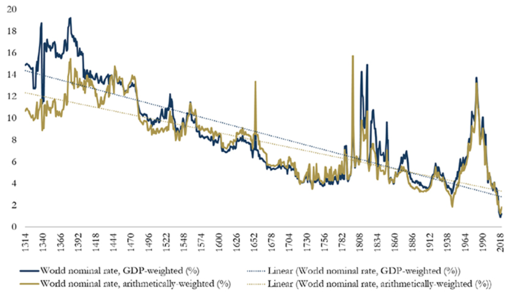
Today’s graphic from Paul Schmelzing, visiting scholar at the Bank of England (BOE), shows how global real interest rates have experienced an average annual decline of -0.0196% (-1.96 basis points) throughout the past eight centuries.

….

Starting in 1311, data from the report shows how average real rates moved from 5.1% in the 1300s down to an average of 2% in the 1900s.

The average real rate between 2000-2018 stands at 1.3%.

….

Demographics impact interest rates on a number of levels. The aging population—paired with declining fertility levels—result in higher savings rates, longer life expectancies, and lower labor force participation rates.

In the U.S., baby boomers are retiring at a pace of 10,000 people per day, and other advanced economies are also seeing comparable growth in retirees. Theory suggests that this creates downward pressure on real interest rates, as the number of people in the workforce declines.

Author(s): Dorothy Neufeld

Publication Date: 4 Feb 2020

Publication Site: Visual Capitalist

Who’s Quitting Their Jobs? New Data Show Some Workers Are More Likely Than Others

Link:https://www.wsj.com/articles/as-american-workers-leave-jobs-in-record-numbers-a-closer-look-at-who-is-quitting-11636894801

Excerpt:

Workers resigned from a record 4.4 million jobs in September, according to Labor Department data, and new surveys show that low-wage workers, employees of color and women outside the management ranks are those most likely to change roles. The findings signal that turnover isn’t evenly spread across the U.S. workforce even as employers across industries struggle to fill a variety of roles.

The overall percentage of people considering leaving their jobs — about three in 10, according to research by consulting firm Mercer LLC — is fairly consistent with historical trends. But sentiment varies across demographics and occupations. While front-line and low-wage positions typically see high rates of turnover, for example, employees in those roles are especially likely to leave now, Mercer found in a survey of 2,000 U.S. workers conducted in August.

….

Nearly half of low-wage and front-line workers surveyed said their pay and benefits were insufficient while 41% said they felt burned out from demanding workloads. Some 35% of Black employees and 40% of Asian employees said they were considering leaving, compared with 26% of white employees.

Author(s): Kathryn Dill

Publication Date: 14 Nov 2021

Publication Site: WSJ

On Covid, Excess Mortality by Race/Ethnicity, and Geographic Patterns

Link:https://marypatcampbell.substack.com/p/on-covid-excess-mortality-by-raceethnicity

Graphic:

Video:

Excerpt:

And now you can see it — the blue curve for Hispanics has a summer 2020 peak much higher than that for whites, Blacks, and Asians.

I want to note the high peak for Asian deaths in winter 2020-2021.

See that there is a high spike for Asian, Hispanic, and Black in that first NYC-centered wave that we’ve known so well… but a little blip for White. And I want you to think about that a little. Because that really explains a lot of the disproportionate effects on minorities in the U.S. and it goes back to Charles Blow’s question at the top of this post.

The answer to all of this being geographic distribution.

Author(s): Mary Pat Campbell

Publication Date: 6 Nov 2021

Publication Site: STUMP at substack

Revisiting the Beveridge Curve: Why Has It Shifted so Dramatically?

Link:https://www.richmondfed.org/publications/research/economic_brief/2021/eb_21-36

Graphic:

Excerpt:

The Beveridge curve is one of the most robust regularities in economics, as it holds in different time periods, across countries2 and at the aggregate and disaggregated (or sectoral) level. When shown in a graph, it plots the job-vacancy rate (on the x-axis) against the unemployment rate (on the y-axis). The curve generally slopes downward, indicating that vacancies tend to be higher when the unemployment rate is lower, and vice versa.

Figure 1 shows the Beveridge curve for the monthly data collected in the Bureau of Labor Statistics’ Job Openings and Labor Turnover Survey (JOLTS) from December 2000 until August 2021 (the most recent data point). Each dot represents a combination of the unemployment rate and the job opening rate.3 The sample is divided into four distinct periods, which correspond to the period up to the financial crisis, the ensuing recession and recovery up until 2017, and the period between January 2018 and March 2020, during which the unemployment rate was persistently below 4.5 percent. The fourth period — April 2020 through August 2021 — captures the COVID-19 months.

Author(s): Thomas A. Lubik

Publication Date: October 2021

Publication Site: Federal Reserve Bank of Richmond

Details in BLS report suggest that the ‘gender earnings gap’ can be explained by age, marital status, children, hours worked, etc.

Link: https://www.aei.org/carpe-diem/details-in-bls-report-suggest-that-the-gender-earnings-gap-can-be-explained-by-age-marital-status-children-hours-worked-etc/

Graphic:

Excerpt:

Let’s investigate the claim that the gender pay gap is a result of discrimination by looking at some of the data on wages and hours worked by gender and by marital status and age in the BLS report for 2020:

….

Comment: Because men work more hours on average than women, some of the raw earnings gap naturally disappears just by simply controlling for the number of hours worked per week, an important factor not even mentioned by groups like the National Committee on Pay Equity. For example, women earned 82.3% of median male earnings for all workers working 35 hours per week or more in 2020, for a raw, unadjusted pay gap of 17.7% for all full-time workers. But for those workers with a 40-hour workweek (more than three-quarters of all full-time female workers), women earned 87.4% of median male earnings, for a smaller pay gap of only 12.6% (see chart and Table 1). Therefore, once we control only for one variable – hours worked – and compare men and women both working 40-hours per week in 2020, almost one-third (5.1 percentage points) of the raw 17.7% pay gap reported by the BLS for full-time workers disappears.

….

Bottom Line: When the BLS reports that women working full-time in 2020 earned 82.3% of what men earned working full-time, that is very much different from saying that women earned 82.3% of what men earned for doing exactly the same work while working the exact same number of hours in the same occupation, with exactly the same educational background and exactly the same years of continuous, uninterrupted work experience, and with exactly the same marital and family (e.g., number of children) status. As shown above, once we start controlling individually for the many relevant factors that affect earnings, e.g., hours worked, age, marital status, and having children, most of the raw earnings differential disappears. In a more comprehensive study that controlled for all of the relevant variables simultaneously, we would likely find that those variables would account for nearly 100% of the unadjusted, raw earnings differential of 17.7% for women’s earnings compared to men as reported by the BLS. Discrimination, to the extent that it does exist, would likely account for a very small portion of the raw 17.7% gender earnings gap.

Author(s): Mark J. Perry

Publication Date: 22 Oct 2021

Publication Site: AEI

Here’s the Gender Pay Gap at 10,000 U.K. Employers

Link:https://www.bloomberg.com/graphics/2021-uk-gender-pay-gap/

Graphic:

Excerpt:

Women in finance in the U.K. still make significantly less than men. While the gender pay gap at financial firms in the country narrowed slightly last year, overall the industry continues to have the biggest disparity.

Men working in finance and insurance made 25% more than women last year, down from 28% in 2019, a Bloomberg News analysis of government data shows. The pay gap is especially wide in investment banking, where some of the highest-paid employees work.

It is the fourth straight year that finance has led the industry rankings, showing that executives are finding it difficult to shrink the gap. Mining and quarrying had the second-biggest pay gap at 23% as the commodity boom boosted the income of workers, who are largely male.

Author(s): Neil Callahan

Publication Date: 6 Oct 2021

Publication Site: Bloomberg

The Black Mortality Gap, and a Century-Old Document

Link:https://www.themarshallproject.org/2021/08/30/the-black-mortality-gap-and-a-century-old-document

Graphic:

Excerpt:

Black Americans die at higher rates than White Americans at nearly every age.

In 2019, the most recent year with available mortality data, there were over 62,000 such earlier deaths — or one out of every five African American deaths.

The age group most affected by the inequality was infants. Black babies were more than twice as likely as White babies to die before their first birthday.

The overall mortality disparity has existed for centuriesRacism drives some of the key social determinants of health, like lower levels of income and generational wealth; less access to healthy foodwater and public spaces; environmental damageoverpolicing and disproportionate incarceration; and the stresses of prolonged discrimination.

But the health care system also plays a part in this disparity.

Author(s): Anna Flagg

Publication Date: 30 Aug 2021

Publication Site: The Marshall Project

COVID-19-Associated Orphanhood and Caregiver Death in the United States

Link:https://pediatrics.aappublications.org/content/pediatrics/early/2021/10/06/peds.2021-053760.full.pdf

Graphic:

Excerpt:

Methods: We quantified COVID-19-associated caregiver loss and orphanhood in the US and for
each state using fertility and excess and COVID-19 mortality data. We assessed burden and rates
of COVID-19-associated orphanhood and deaths of custodial and co-residing grandparents,
overall and by race/ethnicity. We further examined variations in COVID-19-associated
orphanhood by race/ethnicity for each state.


Results: We found that from April 1, 2020 through June 30, 2021, over 140,000 children in the
US experienced the death of a parent or grandparent caregiver. The risk of such loss was 1.1 to
4.5 times higher among children of racial and ethnic minorities, compared to Non-Hispanic
White children. The highest burden of COVID-19-associated death of parents and caregivers
occurred in Southern border states for Hispanic children, Southeastern states for Black children,
and in states with tribal areas for American Indian/Alaska Native populations.

Author(s): Hillis SD, Blenkinsop A, Villaveces A, et al.

Publication Date: 2021, accessed 12 Oct 2021

DOI: 10.1542/peds.2021-053760

Citation: Hillis SD, Blenkinsop A, Villaveces A, et al. COVID-19-associated orphanhood and
caregiver death in the United States. Pediatrics. 2021; doi: 10.1542/peds.2021-053760

Publication Site: Pediatrics

Charles Booth’s London Poverty Maps

Link: https://booth.lse.ac.uk/map/12/-0.0421/51.5132/100/0

Graphic:

Additional: https://booth.lse.ac.uk/learn-more/what-were-the-poverty-maps

Excerpt:

The Maps Descriptive of London Poverty are perhaps the most distinctive product of Charles Booth’s Inquiry into Life and Labour in London (1886-1903). An early example of social cartography, each street is coloured to indicate the income and social class of its inhabitants.

….

Descriptive Map of London Poverty 1889

The first edition of the poverty maps was based on information gathered from School Board visitors. A first sheet covering the East End was published in the first volume of Labour and Life of the People, Volume 1: East London (London: Macmillan, 1889) as the Descriptive Map of East End Poverty. The map was expanded in 1891 to four sheets – covering an area from Kensington in the west to Poplar in the east, and from Kentish Town in the north to Stockwell in the south – and published in subsequent volumes of the survey. These maps are collectively known as the Descriptive Map of London Poverty 1889. They use Stanford’s Library Map of London and Suburbs at a scale of 6 inches to 1 mile (1:10560) as their base. A digital image of the 1889 map has been made by the University of Michigan.

The original working maps from this first edition of the poverty maps are held at the Museum of London. These are hand-coloured and use the 1869 Ordnance Survey 1:2500 maps as their base.

Download the maps: https://booth.lse.ac.uk/learn-more/download-maps

QUARTERLY REPORT ON HOUSEHOLD DEBT AND CREDIT: 2021Q2

Link: https://www.newyorkfed.org/medialibrary/interactives/householdcredit/data/pdf/HHDC_2021Q2.pdf

Graphic:

Excerpt:

Aggregate household debt balances increased by $313 billion in the second quarter of 2021, a 2.1% rise from 2021Q1, and
now stand at $14.96 trillion. Balances are $812 billion higher than at the end of 2019 and $691 billion higher than 2020Q2. The 2.1%
increase in aggregate balances was the largest seen since 2013Q4 and marked the largest nominal increase in debt balances since
2007Q2.

Publication Date: August 2021

Publication Site: NY Fed

Japan’s older population hits record high

Link: https://www.japantimes.co.jp/news/2021/09/20/national/japans-older-population-hits-record-high/

Excerpt:

The estimated number of people aged 65 or older in Japan stood at a record high of 36.4 million as of Wednesday, an increase of 220,000 from a year before, the internal affairs ministry said Sunday.

The share of those aged adults in the nation’s total population rose to a record 29.1%, the highest among 201 countries and regions across the world.

Older men totaled 15.83 million, or 26% of the total male population. There were 20.57 million elderly women, or 32% of the female population.

The ministry released the data ahead of Respect for the Aged Day on Monday, a national holiday.

In Japan, the share of aged people has been rising since 1950. The figure is expected to rise to as high as 35.3% in 2040 when the so-called second baby-boomer generation, or people born in the early 1970s, reaches the age of 65 or older, according to the National Institute of Population and Social Security Research.

Publication Date: 20 Sept 2021

Publication Site: The Japan Times

More than Half of U.S. Counties Were Smaller in 2020 Than in 2010

Link: https://www.census.gov/library/stories/2021/08/more-than-half-of-united-states-counties-were-smaller-in-2020-than-in-2010.html

Graphic:

Excerpt:

Almost half (47%) of U.S. counties or equivalents gained population between 2010 and 2020 (Figure 1).

Five counties (metro areas in parentheses) gained at least 300,000 people during that period: Harris County, Texas (Houston-The Woodlands-Sugar Land); Maricopa County, Arizona (Phoenix-Mesa-Chandler); King County, Washington (Seattle-Tacoma-Bellevue); Clark County, Nevada (Las Vegas-Henderson-Paradise); and Tarrant County, Texas (Dallas-Fort Worth-Arlington).

California’s Los Angeles County remained the largest county in 2020, crossing the 10.0 million-person mark between 2010 and 2020.

Author(s): PAUL MACKUN, JOSHUA COMENETZ, AND LINDSAY SPELL

Publication Date: 12 August 2021

Publication Site: U.S. Census Bureau