Link: https://medium.com/nightingale/demystifying-vaccination-metrics-cd0a29251dd2
Graphic:
Excerpt:
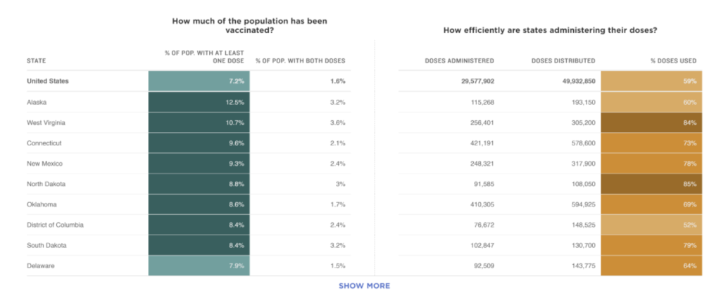
3. Display distribution (supply) and administration (demand) data together for a more complete picture of the vaccine rollout.
To make sense of what was happening with COVID cases, charts from groups like the COVID-19 Tracking Project clustered trends on testing, cases, hospitalizations, and deaths for a more complete picture. Similarly, we can’t look at data on doses administered in isolation to understand how a country or state is performing on vaccine rollout.
The New York Times displays a combination of the percent of people given at least one shot or two shots and information about the doses distributed and the share of doses used. Together, these metrics give a high level snapshot of information about supply distributed and administered. Note that understanding demand requires knowing more than how many people received shots though, which is likely influenced by supply.
Author(s): Amanda Makulec
Publication Date: 1 February 2021
Publication Site: Nightingale at Medium