Last year, Christos Makridis and I used homicide data from the Centers for Disease Control to break down the 2020 homicide spike by geography and demographics. With another year’s worth of numbers now finalized—plus “provisional” numbers stretching into 2022—it’s time for a brief update. The CDC’s data, compiled from death certificates, are especially crucial in a year when the FBI completely failed to collect murder data from many of the nation’s police departments.
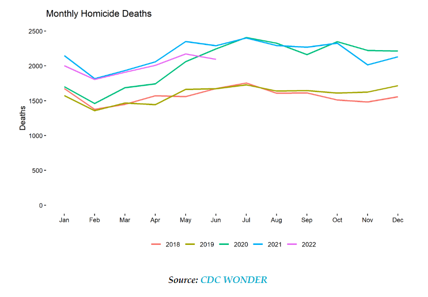
The good news is that, after spiking in 2020 and rising a little further in 2021, homicides seem to be falling again. The bad news is that this has been an extremely slow process, with recent numbers still well above pre-2020 levels, even if violence remains far from the sky-high levels of the early 1990s.
The CDC puts the national homicide rate at 7.8 per 100,000 for 2021, versus 7.5 for 2020 and 5.8 for 2019. Here are the month-by-month totals since 2018, including provisional data for the first half of 2022:
Early government mortality numbers show that the number of U.S. deaths has stayed very high this summer, both for members of the general population and for working-age people.
For all U.S. residents, for the period from July 3 through Aug. 27, the number of deaths recorded in the U.S. Centers for Disease Control and Prevention’s FluView reports was 426,881, according to the report released Friday, which included data sent to the CDC by Sept. 3.
The “all cause” total for the general population was down just 0.8% from the total for the comparable period in 2021, and it was 22% higher than the total for the comparable period in 2019, before the COVID-19 pandemic began.
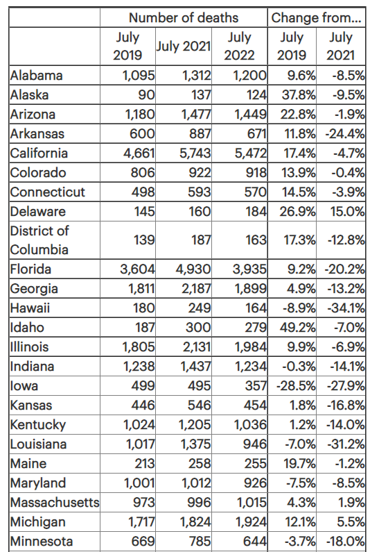
For U.S. residents ages 25 through 64, the all-cause death total during that same period was 113,665, according to early, weighted data in the CDC’s Weekly Counts of Deaths by Jurisdiction and Age reports, as of Sept. 8.
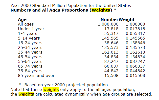
Age-adjusted death rates are weighted averages of the age-specific death rates, where the weights represent a fixed population by age. They are used to compare relative mortality risk among groups and over time. An age-adjusted rate represents the rate that would have existed had the age-specific rates of the particular year prevailed in a population whose age distribution was the same as that of the fixed population. Age-adjusted rates should be viewed as relative indexes rather than as direct or actual measures of mortality risk.
The year “2000 U.S. standard” is the default population selection for the calculation of age-adjusted rates. However, you can select other standard populations, or select specific population criteria to determine the age distribution ratios. See Frequently Asked Questions about Death Rates for more information.
The rates of almost all causes of death vary by age. Age adjustment is a technique for “removing” the effects of age from crude rates, so as to allow meaningful comparisons across populations with different underlying age structures. For example, comparing the crude rate of heart disease in Florida to that of California is misleading, because the relatively older population in Florida will lead to a higher crude death rate, even if the age-specific rates of heart disease in Florida and California are the same. For such a comparison, age-adjusted rates are preferable. Age-adjusted rates should be viewed as relative indexes rather than as direct or actual measures of mortality risk.
The National Center for Health Statistics (NCHS) age-adjusts death rates using the direct method. That is, by applying age-specific death rates (Ri) to the U.S. standard population age distribution.
R’ = S i ( Psi / Ps ) R i
where Psi is the standard population for age group i and Ps is the total U.S. standard population (all ages combined).
In the direct method, a standard age distribution is chosen and the age-specific death rates are weighted according to the standard. A reasonable choice for the standard is the U.S. total population (all races, both genders) for the year under study. To permit comparison of death rates from year to year, a standard population is used. Beginning with the 1999 data year, NCHS adopted the year 2000 projected population of the United States as the standard population. This new standard replaces the 1940 standard population that was used by NCHS for over 50 years. The new population standard affects the level of mortality and to some extent trends and group comparisons. Of particular note are the effects on race comparison of mortality. For detailed discussion, see:Anderson RN, Rosenberg HM. Age standardization of death rates: Implementation of the year 2000 standard. National Vital Statistics Reports; vol 47 no 3. Hyattsville, Maryland. National Center for Health Statistics. 1998.Beginning with publications of the year 2003 data, the traditional standard million population along with corresponding standard weights to six decimal places were replaced by the projected year 2000 population age distribution (see 2000 Standard Population below). The effect of the change is negligible and does not significantly affect comparability with age-adjusted rates calculated using the previous method.
Publication Date: Accessed 21 May 2022, last reviewed 2 March 2022
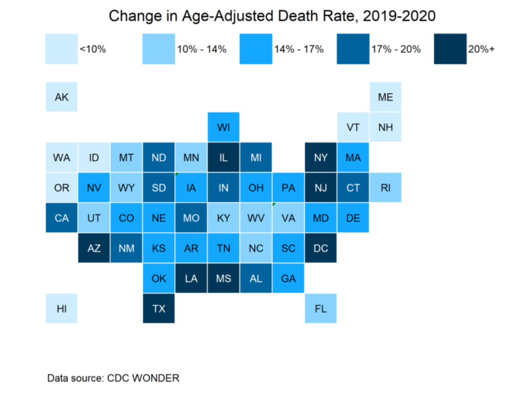
The ranking tables do reflect where COVID hit hard in 2020 — the spring 2020 wave in the northeast, and the summer 2020 wave along the south and southwest (Texas, in particular). No, Florida didn’t show its big COVID impact until January 2021, so it’s pretty far down on this ranking table.
This way, we can see if there are any geographic patterns. We did know the hot spots of NY, NJ, IL (mainly around Chicago), DC, TX, Louisiana (around New Orleans), Arizona. I had not been aware of Mississippi being so bad, but maybe that was spillover from New Orleans.