How to pick the least wrong colors

Link: https://matthewstrom.com/writing/how-to-pick-the-least-wrong-colors/

Graphic:

Excerpt:

Stripe’s dashboards use graphs to visualize data. While the color palettes we use are certainly passable, the team is always trying to improve them. A colleague was working on creating updated color palettes, and we discussed the challenges he was working through. The problem boiled down to this: how do I pick nice-looking colors that cover a broad set of use cases for categorical data while meeting accessibility goals?

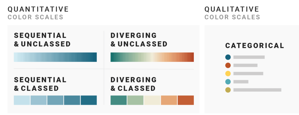
The domain of this problem is categorical data — data that can be compared by grouping it into two or more sets. In Stripe’s case, we’re often comparing payments from different sources, comparing the volume of payments between multiple time periods, or breaking down revenue by product.

The criteria for success are threefold:

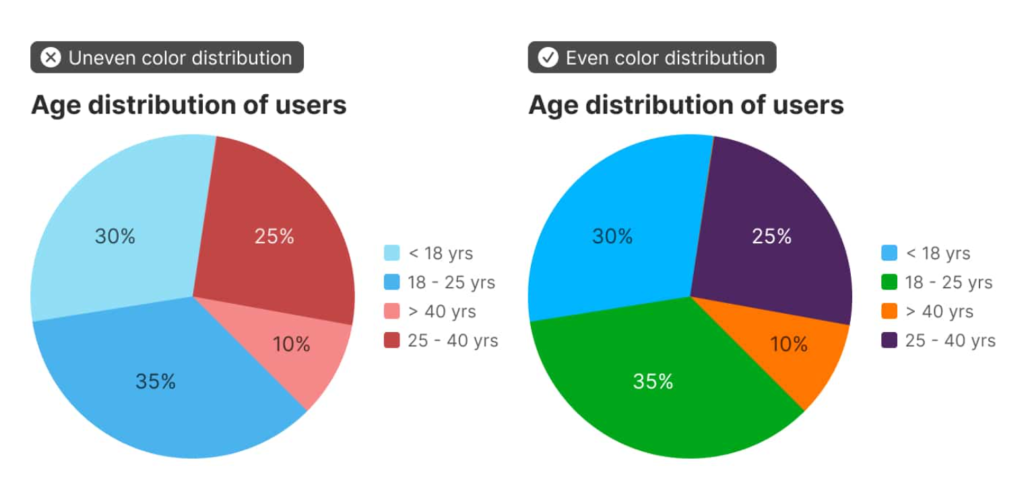
  1. The colors should look nice. In my case, they need to be similar to Stripe’s brand colors.
  2. The colors should cover a broad set of use cases. In short, I need lots of colors in case I have lots of categories.
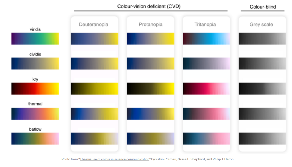
  3. The colors should meet accessibility goals. WCAG 2.2 dictates that non-text elements like chart bars or lines should have a color contrast ratio of at least 3:1 with adjacent colors.

Author(s): Matthew Ström

Publication Date: 31 May 2022

Publication Site: Matthew Ström

Data visualizations: Choosing colors with purpose

Link: https://uxdesign.cc/data-visualizations-choosing-colors-with-purpose-4a672ac0215a

Graphic:

Excerpt:

The incorporation of intuitive color maps in data visualizations is an extremely useful tool, but has one major drawback: the information conveyed by the colors is lost to those who cannot distinguish between them. According to the Colour Blind Awareness Organisation (UK-based), approximately 8% of men and 0.5% of women worldwide have some form of color vision deficiency (CVD). Fortunately, certain scientifically derived color maps have been created which are able to maintain distinguishability across various different types of color blindness. Several such color maps are shown below with their corresponding CVD-adjusted perceptions.

Author(s): T. J. Kyner

Publication Date: 30 April 2021

Publication Site: UX Collective

Which color scale to use when visualizing data

Link: https://blog.datawrapper.de/which-color-scale-to-use-in-data-vis/

Graphic:

Excerpt:

But when looking at data visualizations, I noticed that the decision of which color scale to use is often not as obvious as many of these data vis books make us believe. Some data visualizations are using sequential color palettes, although they’re visualizing categories. Or the same data is visualized with a diverging color scale in one publication and with a sequential one in the next. And sometimes with classed and other times with unclassed gradients.

What are the rules, the challenges, and the trade-offs?

Let’s find out.

The next three parts of this series provide you with a “decision tree” – a Choose Your Own Adventure of data vis – by asking three questions:

Part 2: When should you use a qualitative and when a quantitative color scale?

Part 3: If you decided to use a quantitative color scale – when should you use a sequential and when a diverging one?

Part 4: If you decided to use a quantitative color scale – when should you use a classed and when an unclassed one?


Author(s): Lisa Charlotte Rost

Publication Date: 16 March 2021

Publication Site: Datawrapper