Using First Name Information to Improve Race and Ethnicity Classification

Link: https://papers.ssrn.com/sol3/papers.cfm?abstract_id=2763826

Graphic:

Abstract:

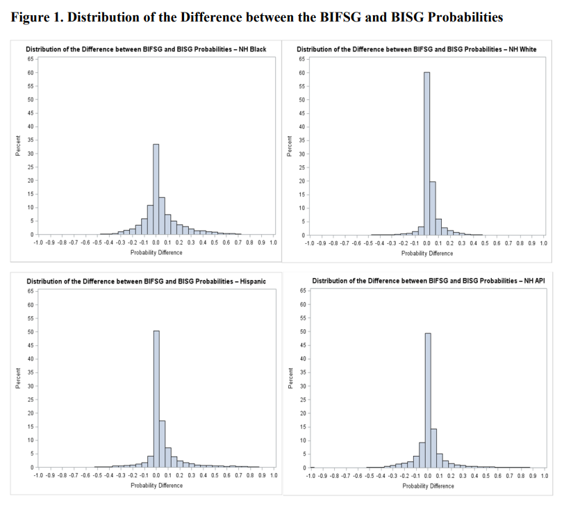
This paper uses a recent first name list to improve on a previous Bayesian classifier, the Bayesian Improved Surname Geocoding (BISG) method, which combines surname and geography information to impute missing race and ethnicity. The proposed approach is validated using a large mortgage lending dataset for whom race and ethnicity are reported. The new approach results in improvements in accuracy and in coverage over BISG for all major ethno-racial categories. The largest improvements occur for non-Hispanic Blacks, a group for which the BISG performance is weakest. Additionally, when estimating disparities in mortgage pricing and underwriting among ethno-racial groups with regression models, the disparity estimates based on either BIFSG or BISG proxies are remarkably close to those based on actual race and ethnicity. Following evaluation, I demonstrate the application of BIFSG to the imputation of missing race and ethnicity in the Home Mortgage Disclosure Act (HMDA) data, and in the process, offer novel evidence that race and ethnicity are somewhat correlated with the incidence of missing race/ethnicity information.

Author(s):

Ioan Voicu
Office of the Comptroller of the Currency (OCC)

Publication Date: February 22, 2016

Publication Site: SSRN

Suggested Citation:

Voicu, Ioan, Using First Name Information to Improve Race and Ethnicity Classification (February 22, 2016). Available at SSRN: https://ssrn.com/abstract=2763826 or http://dx.doi.org/10.2139/ssrn.2763826

An Actuarial View of Correlation and Causation—From Interpretation to Practice to Implications

Link: https://www.actuary.org/sites/default/files/2022-07/Correlation.IB_.6.22_final.pdf

Graphic:

Excerpt:

Examine the quality of the theory behind the correlated variables. Is there good
reason to believe, as validated by research, the variables would occur together? If such
validation does not exist, then the relationship may be spurious. For example, is there
any validation to the relationship between the number of driver deaths in railway
collisions by year (the horizontal axis), and the annual imports of Norwegian crude
oil by the U.S., as depicted below?36 This is an example of a spurious correlation. It is
not clear what a rational explanation would be for this relationship.

Author(s): Data Science and Analytics Committee

Publication Date: July 2022

Publication Site: American Academy of Actuaries

Non-Linear Correlation Matrix — the much needed technique which nobody talks about

Link: https://towardsdatascience.com/non-linear-correlation-matrix-the-much-needed-technique-which-nobody-talks-about-132bc02ce632

Graphic:

Excerpt:

Just looking at these dots, we see that for engine size between 60 and 200, there is a linear increase in the weight. However, after an engine size of 200, the weight does not increase linearly but is leveling. So, this means that the relation between engine size and weight is not strictly linear.

We can also confirm the non-linear nature by performing a linear curve fit as shown below with a blue line. You will observe that the points marked in the red circle are completely off the straight line indicating that a linear line does not correctly capture the pattern.

We started by looking at the color of the cell which indicated a strong correlation. However, we concluded that it is not true when we looked at the scatter plot. So where is the catch?

The problem is in the name of the technique. As it is titled a correlation matrix, we tend to use it to interpret all types of correlation. The technique is based on Pearson correlation, which is strictly measuring only linear correlation. So the more appropriate name of the technique should be linear correlation matrix.

Author(s): Pranay Dave

Publication Date: 4 Jan 2022

Publication Site: Towards Data Science

Ivermectin: Much More Than You Wanted To Know

Link:https://astralcodexten.substack.com/p/ivermectin-much-more-than-you-wanted

Graphic:

Excerpt:


About ten years ago, when the replication crisis started, we learned a certain set of tools for examining studies.

Check for selection bias. Distrust “adjusting for confounders”. Check for p-hacking and forking paths. Make teams preregister their analyses. Do forest plots to find publication bias. Stop accepting p-values of 0.049. Wait for replications. Trust reviews and meta-analyses, instead of individual small studies.

These were good tools. Having them was infinitely better than not having them. But even in 2014, I was writing about how many bad studies seemed to slip through the cracks even when we pushed this toolbox to its limits. We needed new tools.

I think the methods that Meyerowitz-Katz, Sheldrake, Heathers, Brown, Lawrence and others brought to the limelight this year are some of the new tools we were waiting for.

Part of this new toolset is to check for fraud. About 10 – 15% of the seemingly-good studies on ivermectin ended up extremely suspicious for fraud. Elgazzar, Carvallo, Niaee, Cadegiani, Samaha. There are ways to check for this even when you don’t have the raw data. Like:

The Carlisle-Stouffer-Fisher method: Check some large group of comparisons, usually the Table 1 of an RCT where they compare the demographic characteristics of the control and experimental groups, for reasonable p-values. Real data will have p-values all over the map; one in every ten comparisons will have a p-value of 0.1 or less. Fakers seem bad at this and usually give everything a nice safe p-value like 0.8 or 0.9.

GRIM – make sure means are possible given the number of numbers involved. For example, if a paper reports analyzing 10 patients and finding that 27% of them recovered, something has gone wrong. One possible thing that could have gone wrong is that the data are made up. Another possible thing is that they’re not giving the full story about how many patients dropped out when. But something is wrong.

But having the raw data is much better, and lets you notice if, for example, there are just ten patients who have been copy-pasted over and over again to make a hundred patients. Or if the distribution of values in a certain variable is unrealistic, like the Ariely study where cars drove a number of miles that was perfectly evenly distributed from 0 to 50,000 and then never above 50,000.

Author(s): Scott Alexander

Publication Date: 17 Nov 2021

Publication Site: Astral Codex Ten at substack

Leaders: Stop Confusing Correlation with Causation

Link:https://hbr.org/2021/11/leaders-stop-confusing-correlation-with-causation

Excerpt:

A 2020 Washington Post article examined the correlation between police spending and crime. It concluded that, “A review of spending on state and local police over the past 60 years…shows no correlation nationally between spending and crime rates.” This correlation is misleading. An important driver of police spending is the current level of crime, which creates a chicken and egg scenario. Causal research has, in fact, shown that more police lead to a reduction in crime.

….

Yelp overcame a similar challenge in 2015. A consulting report found that companies that advertised on the platform ended up earning more business through Yelp than those that didn’t advertise on the platform. But here’s the problem: Companies that get more business through Yelp may be more likely to advertise. The former COO and I discussed this challenge and we decided to run a large-scale experiment that gave packages of advertisements to thousands of randomly selected businesses. The key to successfully executing this experiment was determining which factors were driving the correlation. We found that Yelp ads did have a positive effect on sales, and it provided Yelp with new insight into the effect of ads.

Author(s): Michael Luca

Publication Date: 5 Nov 2021

Publication Site: Harvard Business Review