Why do Swiss people die?

Link: https://blog.datawrapper.de/why-do-swiss-people-die/

Graphic:

Excerpt:

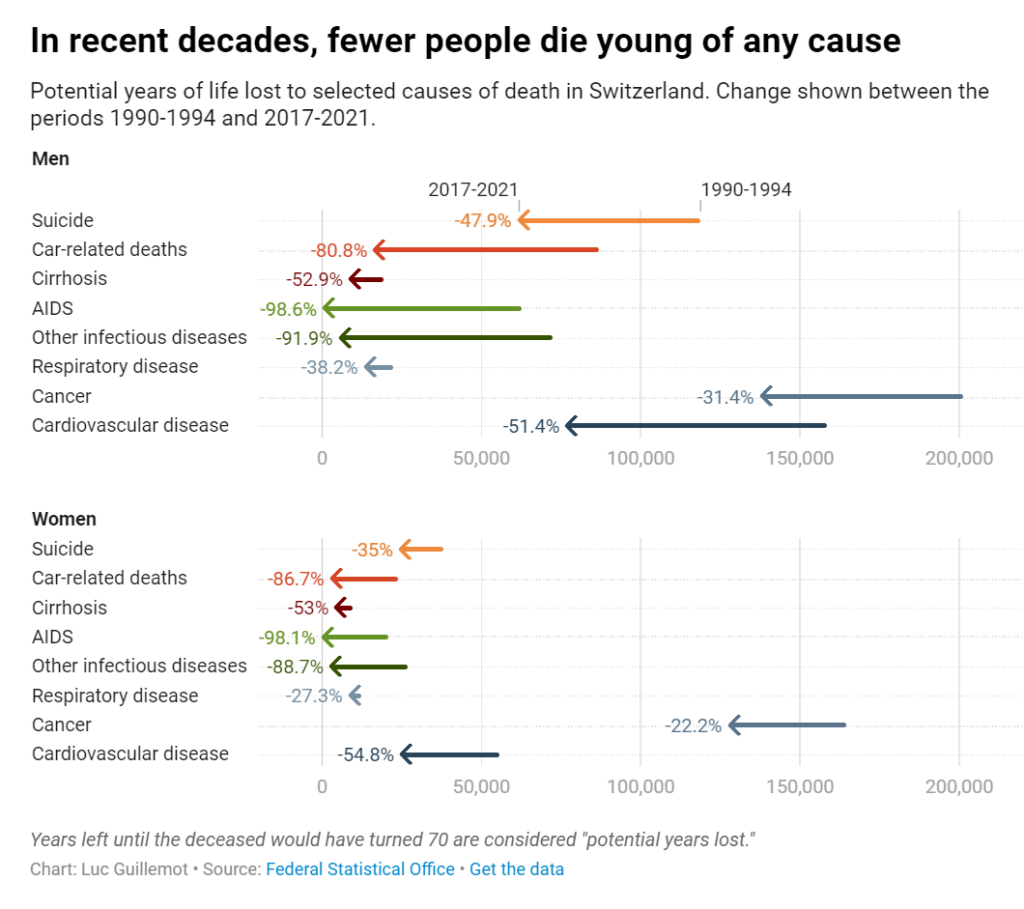
Looking at the evolution of premature deaths, we can celebrate the progress made in medical research. Years lost to infectious diseases like tuberculosis have reduced dramatically, and deaths due to AIDS in particular are nowadays close to zero, a drastic decline since the height of the pandemic in the 1990s. Cancer and cardiovascular diseases have followed a similar path, though they still cause a high number of premature deaths. We can observe that years lost to suicide before age 70 have also declined significantly. In a country where assisted suicide is legal, there is maybe something empowering in the prospect of dying healthy of old age. Years lost to alcoholism and car accidents have also declined — it may be that prevention and overall security have reduced these types of more behavioral deaths.

Author(s): Luc Guillemot

Publication Date: 26 Oct 2023

Publication Site: datawrapper

Data Vis Dispatch, July 11

Link: https://blog.datawrapper.de/data-vis-dispatch-july-11-2023/

Graphic:

Excerpt:

Welcome back to the 101st edition of Data Vis Dispatch! Every week, we’ll be publishing a collection of the best small and large data visualizations we find, especially from news organizations — to celebrate data journalism, data visualization, simple charts, elaborate maps, and their creators.

Recurring topics this week include pollution, transportation, and high temperatures. Plus: an opportunity to work on the Dispatch yourself as our Werkstudent*in.

Author(s): Rose Mintzer-Sweeney

Publication Date: 11 July 2023

Publication Site: Datawrapper

British marriage, zoomed out

Link: https://blog.datawrapper.de/historical-marriage-age-britain/

Graphic:

Excerpt:

In the previous Weekly Chart, Elliot brought the data to confirm a commonsense impression: people these days are waiting later than their parents and grandparents did to get married and have children. The average age of a newlywed in the U.K. is 30.6 for women and 32.1 for men — about five years older than they would have been 1995, and nine years older than in 1964.

When we’re looking back in history, three generations is about as far as common sense can usually go. Those are the people whose lives we know firsthand. Many of us might have a general impression that women, especially, married young in the past, but we don’t actually have any 19th century friends or family to compare that impression against. Reading last week’s post, I was curious to see the older data that could fill in that gap.

Author(s): Rose Mintzer-Sweeney

Publication Date: 15 Jun 2023

Publication Site: Datawrapper

Data Vis Dispatch, January 31

Link:https://blog.datawrapper.de/data-vis-dispatch-january-31-2023/

Graphic:

Excerpt:

Welcome back to the 79th edition of Data Vis Dispatch! Every week, we’ll be publishing a collection of the best small and large data visualizations we find, especially from news organizations — to celebrate data journalism, data visualization, simple charts, elaborate maps, and their creators.

Recurring topics this week include wintery weather, social inequality, and inflation.

Author(s):Veronika Halamková

Publication Date: 31 JAN 2023

Publication Site: Datawrapper

What to consider when using text in data visualizations

Link: https://blog.datawrapper.de/text-in-data-visualizations/

Graphic:

Excerpt:

Text is maybe the most underrated element in any data visualization. There’s a lot of text in any chart or map — titles, descriptions, notes, sources, bylines, logos, annotations, labels, color keys, tooltips, axis labels — but often, it’s an afterthought in the design process. This article explains how to use text to make your visualizations easier to read and nicer to look at.

Show information where readers need it
01 Label directly
02 Repeat the units your data is measured in
03 Remind people what they’re looking at in tooltips
04 Move the axis ticks where they’re needed
05 Emphasize and explain with annotations

Design for readability
06 Use a font that’s easy to read
07 Lead the eye with font sizes, styles, and colors
08 Limit the number of font sizes in your visualization
09 Don’t center-align your text
10 Don’t make your readers turn their heads
11 Use a text outline

Phrase for readability
12 Use straightforward phrasings
13 Be conversational first and precise later
14 Choose a suitable number format

Author(s): Lisa Charlotte Muth

Publication Date: 28 Sept 2022

Publication Site: Datawrapper

Lego builds itself (back) up

Link:https://blog.datawrapper.de/lego-sets-colors-history/

Graphic:

Excerpt:

Some of Lego’s basic colors, like black and white, seem to maintain their representation across the years. However, other classics like red, blue, and yellow decreased in the mid-2000s, opening up space for a wider variety of colors and shades. The last few decades came with an explosion of the number of colors, and also the creative possibilities.

Author(s): Edurne Morillo

Publication Date: 27 Jan 2022

Publication Site: Datawrapper

Who would want to leave New York?

Link: https://blog.datawrapper.de/new-york-city-immigration/

Graphic:

Excerpt:

In fact, just having been born here makes me an atypical New Yorker. Of the approximately 8.3 million people who live in the city today, just under half were born in New York State. Eleven percent come from other US states and 40% from the rest of the world. So we’re not wrong to associate New York with immigration—the average New Yorker comes from somewhere else.

I got these numbers from the US Census Bureau, who do their best to estimate not just how many people live in each county, but how they got there: by birth, by migrating from another country, or by migrating from elsewhere in the US. When you take away the people who died, moved abroad, or moved domestically, you’re left with each of these three streams’ net effect on the population that year.[1] Those are the numbers that will show us whether it’s unusual to move away:

Author(s): Rose Mintzer-Sweeney

Publication Date: 3 June 2021

Publication Site: Datawrapper

Datawrapper Dataviz Book Club

Link: https://notes.datawrapper.de/p/bookclub-tufte

Excerpt:

1. What was the most surprising thing you’ve learned? Choose a text passage, and explain how it challenged something you assumed. (Type up the text passage / phrase, and tell us on which page we can find it!) 

2. Select one of your favorite data visualizations. Is it working well becauseof a principle that Tufte explained? Or do you appreciate something about it although it goes against Tufte’s principles? – give us a link to the data vis! If you need to upload something, but it on https://imgur.com/ or Twitter. 

3. Having read the book, what will you do differently the next time you design a chart?

Date Published: August 2018

Date Accessed: 21 April 2021

Publication Site:

The older you get, the higher your life expectancy

Link: https://blog.datawrapper.de/the-older-you-get-the-higher-your-life-expectancy/

Graphic:

Excerpt:

But here’s what I only started to understand last week (and I was kind of mind-blown by that, so I’m thrilled to share it with you): Our life expectancy increases with every minute we live. When I turned 30, my life expectancy got up to 90.37 years. Once I turn 80, it’ll be 93.76 years.

Author(s): Lisa Charlotte Rost

Publication Date: 25 March 2021

Publication Site: Datawrapper

Which color scale to use when visualizing data

Link: https://blog.datawrapper.de/which-color-scale-to-use-in-data-vis/

Graphic:

Excerpt:

But when looking at data visualizations, I noticed that the decision of which color scale to use is often not as obvious as many of these data vis books make us believe. Some data visualizations are using sequential color palettes, although they’re visualizing categories. Or the same data is visualized with a diverging color scale in one publication and with a sequential one in the next. And sometimes with classed and other times with unclassed gradients.

What are the rules, the challenges, and the trade-offs?

Let’s find out.

The next three parts of this series provide you with a “decision tree” – a Choose Your Own Adventure of data vis – by asking three questions:

Part 2: When should you use a qualitative and when a quantitative color scale?

Part 3: If you decided to use a quantitative color scale – when should you use a sequential and when a diverging one?

Part 4: If you decided to use a quantitative color scale – when should you use a classed and when an unclassed one?


Author(s): Lisa Charlotte Rost

Publication Date: 16 March 2021

Publication Site: Datawrapper