Link: https://flourish.studio/2021/03/01/accessible-chart-design/
Graphic:

Excerpt:
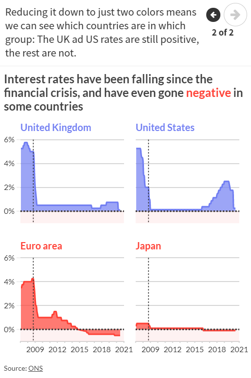
Where possible, use colors that are bold and clear enough for people to see both text and graphical elements, like lines and points. The Web Content Accessibility Guidelines (WCAG) suggest meeting the WCAG AA requirements – something that is required by law for public bodies in several countries.
To check if your color (and font size) choices are AA accessible you can use a contrast checker website. Here you can check if there is enough contrast between the foreground and background colour for someone with a certain level of impaired vision to be able to see your data or text.
Author(s): Lyndsey Pereira-Brereton, Luisa Bider
Publication Date: 1 March 2021
Publication Site: Flourish