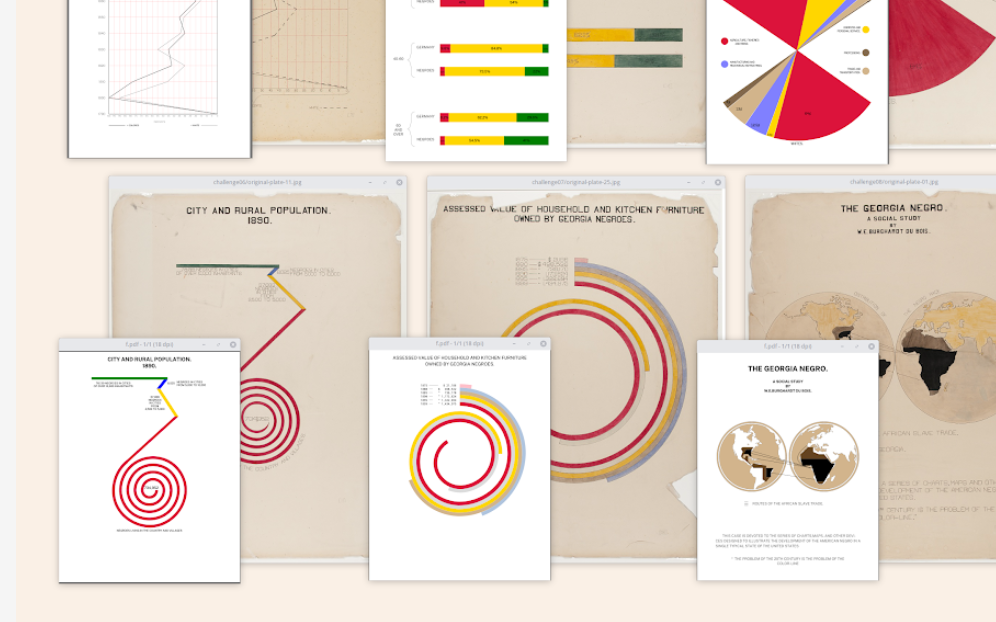
When Sekou and I met with Anthony to discuss his Du Bois recreations, he explained that he was “immediately struck” by Howard Wainer’s presentation on “Historical Development of W.E.B. Du Bois Graphical Narrative.” This was back in May 2017 at a Data Visualization New York meetup hosted by data viz pioneer Naomi Robbins. He was in awe of the existence and artistry of Du Bois’s work. The thought that immediately came to his mind was, “How can I reproduce this?”
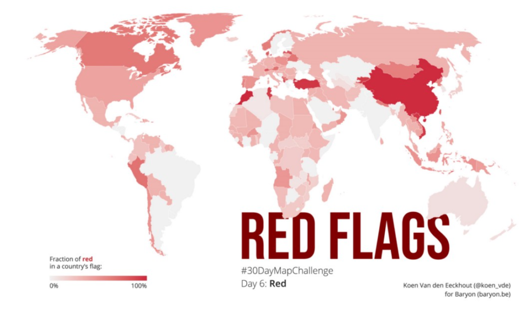
Data: I don’t know how the idea popped into my head, but I always wanted to do something with 🚩 country flags, and the color schemes they use. I had found a suitable set of all the countries’ flags in .svg format, but was struggling to extract specific colors from them. Googling around I stumbled upon the Image Color Summarizer, which partly did what I was looking for, but not entirely. I was saved when I found out that Martin Krzywinski, creator of the tool, had many other tools and examples on his mindblowing website — including an overview of all the colors in all of the different flags! 🤯 The most difficult part left to do was defining when a color was ‘red’ — #FF0000 is obviously red, but what about #D62612 (in the Bulgarian flag)? Or #FBDE4A (in the flag of Congo-Brazzaville)? This was done more or less manually by going through the entire list and quickly verifying any colours for which I had doubts.
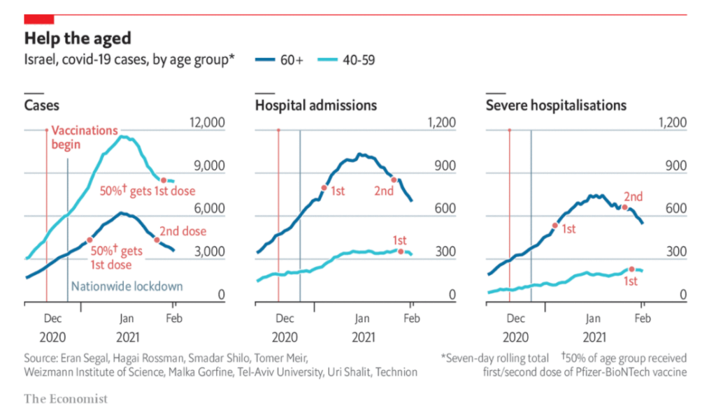
OVER ONE-THIRD of Israel’s population has received a vaccination against covid-19 since December 19th. Binyamin Netanyahu, the prime minister, has campaigned heavily for vaccinations, personally lobbying the boss of Pfizer, an American drugmaker, to secure early shipments of its vaccine. He was the first Israeli to be jabbed, live on television. He promised that “Israel will be the first country in the world” to emerge from the pandemic—by the end of March. (Conveniently, this is when Israel will be holding a parliamentary election and Mr Netanyahu believes success will boost his Likud party.) This was a bold claim considering nobody was sure that vaccines would successfully lower infection rates by enough to lift lockdown restrictions.
There is now evidence that the vaccination programme is having an impact. Analysis from Eran Segal, a computational biologist at the Weizmann Institute of Science in Rehovot, and his colleagues, has found that covid-19 cases are falling appreciably among old people in Israel. The effect is especially pronounced in hospital admissions: among people aged over 60 severe hospital cases have fallen by 26% since their peak on January 19th (see chart). In contrast, among those between 40 and 59—a group further back in the queue to be vaccinated—such severe cases have increased by 13%.
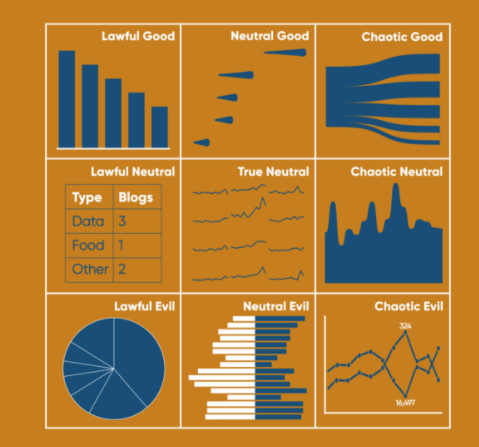
For this specific application, when I think of lawfulness, I am going to mainly assess the likelihood to be misused. And for good versus evil, I’ll be looking at how well they can typically help the user understand the data.
Lawful Good: Bar Chart
This is the best alignment you can be. In traditional use, lawful good applies to people that both follow the rules and help others. Here I’m applying it to a chart that I think is often used well and is easy to read. Name a better liked and more used chart than the bar chart – you can’t. 10/10 analysts would recommend.