doi: https://doi.org/10.1177/15291006211051956
Graphic:
Excerpt:
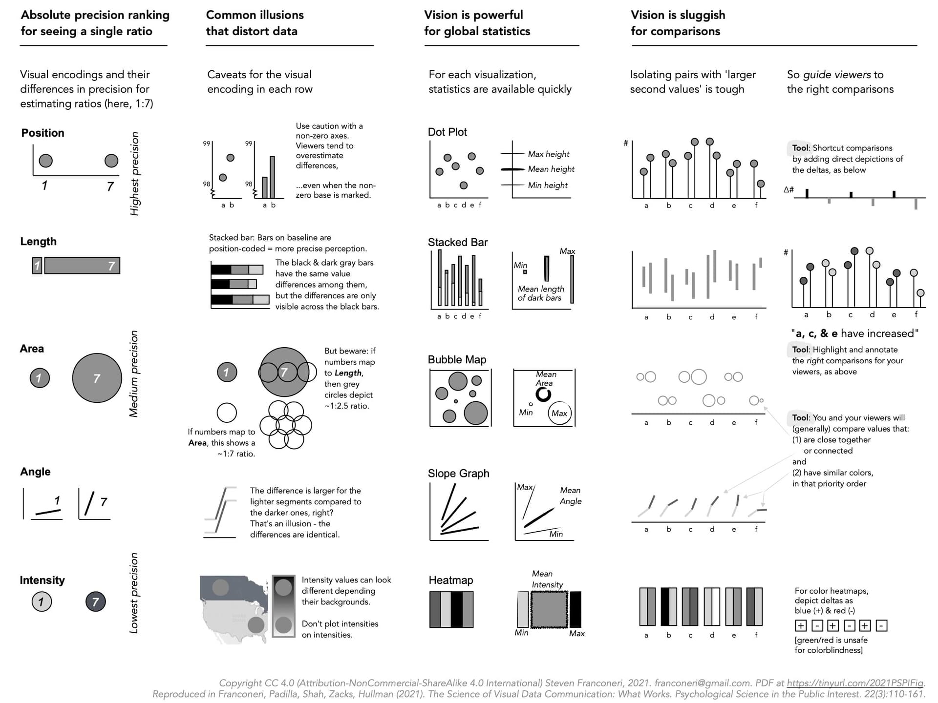
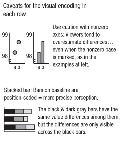
Effectively designed data visualizations allow viewers to use their powerful visual systems to understand patterns in data across science, education, health, and public policy. But ineffectively designed visualizations can cause confusion, misunderstanding, or even distrust—especially among viewers with low graphical literacy. We review research-backed guidelines for creating effective and intuitive visualizations oriented toward communicating data to students, coworkers, and the general public. We describe how the visual system can quickly extract broad statistics from a display, whereas poorly designed displays can lead to misperceptions and illusions. Extracting global statistics is fast, but comparing between subsets of values is slow. Effective graphics avoid taxing working memory, guide attention, and respect familiar conventions. Data visualizations can play a critical role in teaching and communication, provided that designers tailor those visualizations to their audience.
Author(s):
Steven L. Franconeri, Lace M. Padilla, Priti Shah, Jeffrey M. Zacks, Jessica Hullman
Publication Date: 15 Dec 2021
Publication Site: SAGE Journals