Link: https://www.urban.org/research/publication/do-no-harm-guide-crafting-equitable-data-narratives
Graphic:
Excerpt:
KEY FINDINGS
The authors of the 12 essays in this guide work through how to include equity at every step of the data collection and analysis process. They recommend that data practitioners consider the following:
- Community engagement is necessary. Often, data practitioners take their population of interest as subjects and data points, not individuals and people. But not every person has the same history with research, nor do all people need the same protections. Data practitioners should understand who they are working with and what they need.
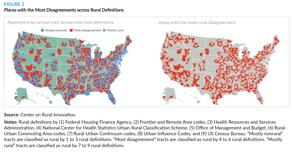
- Who is not included in the data can be just as important as who is. Most equitable data work emphasizes understanding and caring for the people in the study. But for data narratives to truly have an equitable framing, it is just as important to question who is left out and how that exclusion may benefit some groups while disadvantaging others.
- Conventional methods may not be the best methods. Just as it is important for data practitioners to understand who they are working with, it is also important for them to question how they are approaching the work. While social sciences tend to emphasize rigorous, randomized studies, these methods may not be the best methods for every situation. Working with community members can help practitioners create more equitable and effective research designs.
By taking time to deeply consider how we frame our data work—the definitions, questions, methods, icons, and word choices—we can create better results. As the field undertakes these new frontiers, data practitioners, researchers, policymakers, and advocates should keep front of mind who they include, how they work, and what they choose to show.
Author(s):
(editors) Jonathan Schwabish,
Alice Feng,
Wesley Jenkins
Publication Date: 16 Feb 2024
Publication Site: Urban Institute