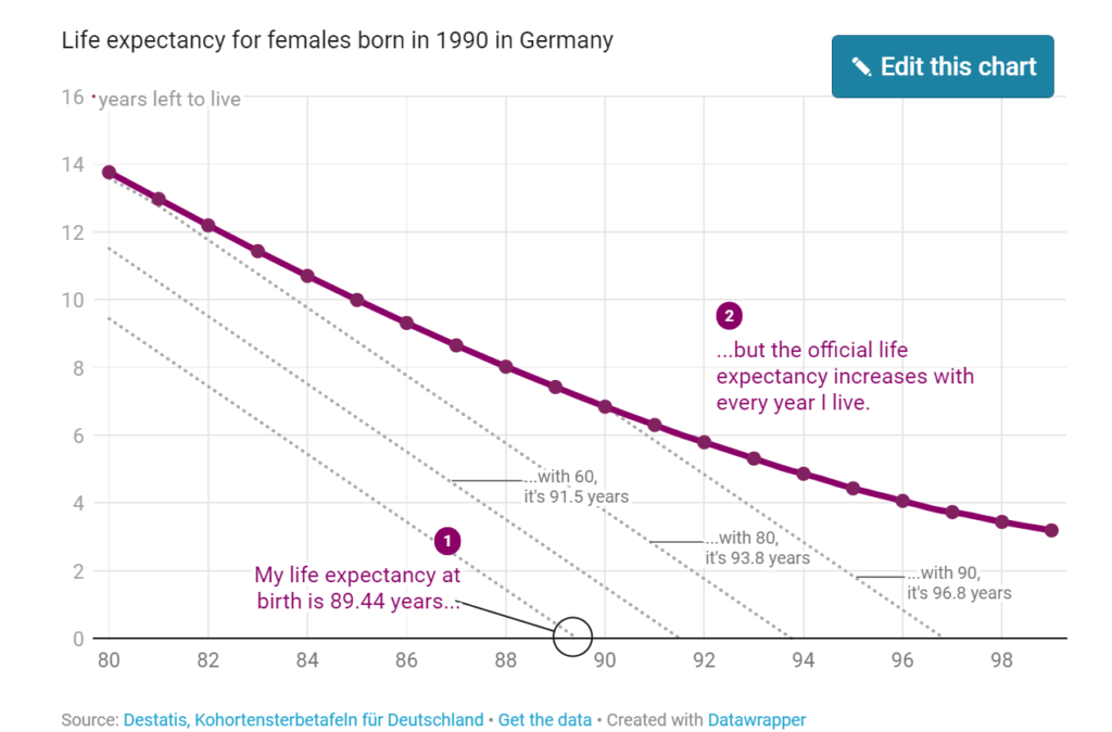
But here’s what I only started to understand last week (and I was kind of mind-blown by that, so I’m thrilled to share it with you): Our life expectancy increases with every minute we live. When I turned 30, my life expectancy got up to 90.37 years. Once I turn 80, it’ll be 93.76 years.
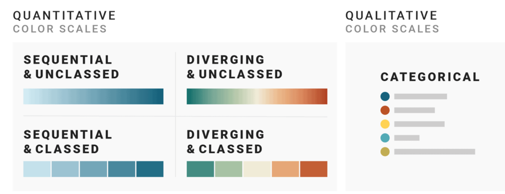
But when looking at data visualizations, I noticed that the decision of which color scale to use is often not as obvious as many of these data vis books make us believe. Some data visualizations are using sequential color palettes, although they’re visualizing categories. Or the same data is visualized with a diverging color scale in one publication and with a sequential one in the next. And sometimes with classed and other times with unclassed gradients.
What are the rules, the challenges, and the trade-offs?
Let’s find out.
The next three parts of this series provide you with a “decision tree” – a Choose Your Own Adventure of data vis – by asking three questions:
Part 2: When should you use a qualitative and when a quantitative color scale?
Part 3: If you decided to use a quantitative color scale – when should you use a sequential and when a diverging one?
Part 4: If you decided to use a quantitative color scale – when should you use a classed and when an unclassed one?