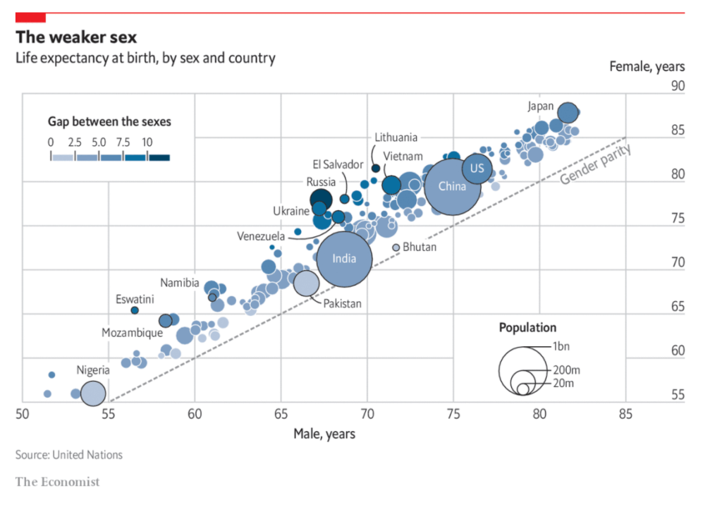
MEN ARE around 1.7 times more likely than women to die from covid-19, according to a recent paper by researchers at Yale University, published in Science. Men older than 30 have a significantly greater mortality risk. That is striking, but perhaps should not come as a surprise. Human lifespans have climbed steadily in recent decades, but wide disparities remain between women and men (see chart). Globally women live nearly five years longer than men, up from three years in 1950. The reasons for that gap are both biological and environmental, and help to explain why more men are dying from covid-19.
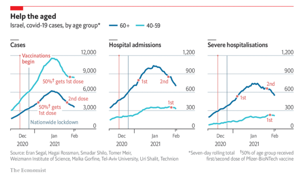
OVER ONE-THIRD of Israel’s population has received a vaccination against covid-19 since December 19th. Binyamin Netanyahu, the prime minister, has campaigned heavily for vaccinations, personally lobbying the boss of Pfizer, an American drugmaker, to secure early shipments of its vaccine. He was the first Israeli to be jabbed, live on television. He promised that “Israel will be the first country in the world” to emerge from the pandemic—by the end of March. (Conveniently, this is when Israel will be holding a parliamentary election and Mr Netanyahu believes success will boost his Likud party.) This was a bold claim considering nobody was sure that vaccines would successfully lower infection rates by enough to lift lockdown restrictions.
There is now evidence that the vaccination programme is having an impact. Analysis from Eran Segal, a computational biologist at the Weizmann Institute of Science in Rehovot, and his colleagues, has found that covid-19 cases are falling appreciably among old people in Israel. The effect is especially pronounced in hospital admissions: among people aged over 60 severe hospital cases have fallen by 26% since their peak on January 19th (see chart). In contrast, among those between 40 and 59—a group further back in the queue to be vaccinated—such severe cases have increased by 13%.
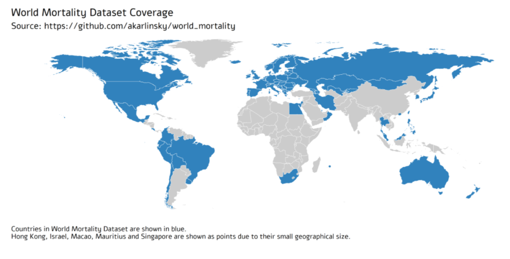
Comparing the impact of the COVID-19 pandemic between countries or across time is difficult because the reported numbers of cases and deaths can be strongly affected by testing capacity and reporting policy. Excess mortality, defined as the increase in all-cause mortality relative to the recent average, is widely considered as a more objective indicator of the COVID-19 death toll. However, there has been no central, frequently-updated repository of the all-cause mortality data across countries. To fill this gap, we have collected weekly, monthly, or quarterly all-cause mortality data from 77 countries, openly available as the regularly-updated World Mortality Dataset. We used this dataset to compute the excess mortality in each country during the COVID-19 pandemic. We found that in the worst-affected countries the annual mortality increased by over 50%, while in several other countries it decreased by over 5%, presumably due to lockdown measures decreasing the non-COVID mortality. Moreover, we found that while some countries have been reporting the COVID-19 deaths very accurately, many countries have been underreporting their COVID-19 deaths by an order of magnitude or more. Averaging across the entire dataset suggests that the world’s COVID-19 death toll may be at least 1.6 times higher than the reported number of confirmed deaths.
Democrats who control the state Senate blocked a motion Monday to subpoena records of the Cuomo administration seeking a fuller accounting of nursing home residents who died from the coronavirus.
The motion was made by Sen. Thomas O’Mara, the ranking Republican on the Investigations Committee panel during a virtual meeting
The GOP motion to compel the state Health Department to release records came just days after Attorney General Letitia James issued a blistering report that found Gov. Andrew Cuomo and his health agency withheld an accurate count of the number of nursing home residents who died from COVID-19 by some 50 percent by excluding residents who died after being take to hospitals.
The impact on the nursing home industry has been catastrophic!
With occupancy rates plummeting, this industry is in deep financial trouble.
The American Health Care Association and the National Center for Assisted Living (AHCA/NCAL) conducted a survey of 953 nursing home providers across the U.S. on their financial and staffing challenges.
Two-thirds of nursing homes operators say they won’t make it another year given current operating pace due to increased COVID-19 costs.
90% of nursing homes are currently operating at a loss or less than 3% profit margin.
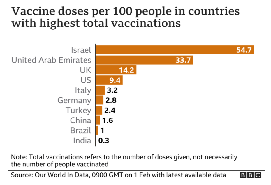
Almost 9.3 million people in the UK have now received the first dose of a Covid-19 vaccine. The country’s plan to vaccinate the most vulnerable is, remarkably, on track to meet its spring deadline. With a limited supply, the government has had to make tough decisions about who should be first in line to receive the jab. As the first phase of the vaccination programme continues at pace, one question keeps cropping up: who’s next on the list?
The UK’s current vaccination priority list was drawn up with a single goal in mind: preventing as many deaths as possible. That meant vaccinating those carrying the highest risk of mortality from Covid-19, as well as protecting the health and social care staff and systems. The government is aiming to offer a first dose to everybody in the top four priority groups by the middle of February. The rest of the list goes down incrementally in age to those aged 50 and over, and younger people with underlying conditions. All together, these groups are estimated to make up 99 per cent of preventable deaths from Covid-19.
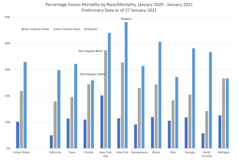
Overall, excess mortality (in a relative sense) for Hispanics is about three times than that seen by non-Hispanic Whites, and non-Hispanic Blacks have excess mortality about twice that of non-Hispanic Whites.
Note that New York City by itself has a very large amount of excess mortality. You can see why New York, as an area, reacted very drastically last year. When I saw the mortality spike coming from the city last year, I was just fine staying at home… because I could. The trade-offs have been relatively easy for me to see.
Increase the public pensions funding target to 100% from 90% in accordance with actuarial best practices. The goal year for 100% funding would remain 2045.
Gradually increase retirement ages for current workers under age 45 by a maximum of five years.
Apply a pensionable salary cap of $100,000 that grows with inflation. Government workers could still earn more than $100,000, but their pensions could not be based on more than the cap. The cap would only apply to employees not currently receiving a retirement check.
Replace Tier 1 retirees’ 3% compounding benefit increase with true cost-of-living adjustments tied to inflation. Annual increases would be simple, not compounding, and rise with the consumer price index for urban consumers, as reported by the U.S. Bureau of Labor Statistics.
Increase Tier 2 COLAs from half of inflation to full inflation. This would end the unfair subsidization of older workers by younger workers and could prevent a potential lawsuit.
Implement COLA holidays to allow inflation to catch up to past benefit increases. If a worker has been retired for eight years or more, they would skip every other year for 16 years for a total of eight adjustment periods at 0%. If a retiree has been receiving benefits for seven years, they would skip one payment every other year for 14 years, and so on.
Enroll all newly hired employees in a defined contribution personal retirement account with a 4% guaranteed employer match. This would ensure the state never gets into pension trouble again. This would also provide state workers with a portable retirement benefit they could take with them from employer to employer, rather than being forced to stay with the state in order to maximize retirement benefits.
Data is inherently noisy, trend lines are a way to filter out noise and focus on the main movements of a time series. “Are we trending up or down?” is a simple yet important question, but it can be hard to answer by just looking at the raw data. In that sense a trend line is simply a way to de-noise the data.
But how do we distinguish noise from the “real” signal in the data? First we need to understand the “data generating process”. In case of COVID-19 timelines that’s viral growth, so we expect the main signal of our time series to be exponential growth with periods of constant growth rates, with noise added on top of that. (This can also be tested directly by running tests on the COVID-19 cases time series.)
The NFL was slowly discovering something far deeper: a core tenet of Covid-19 transmission wisdom—how to define when individuals are in “close contact”—was just wrong.
The safety of interactions during this global pandemic had been for months measured by a stopwatch and a tape measure. The guidance was that someone had been exposed to the virus if they had been within six feet of an infected person for more than 15 minutes. It was drilled into everyone for so long it became coronavirus gospel.
But that wasn’t proving true during the NFL’s outbreaks. People were testing positive for the virus even though they had spent far less than 15 minutes or weren’t within six feet of an infectious person—and the league had the contact-tracing technology to prove it.