Link: https://blog.d4bl.org/racial-disparities-in-covid19-vaccination-data/
Graphic:
Excerpt:
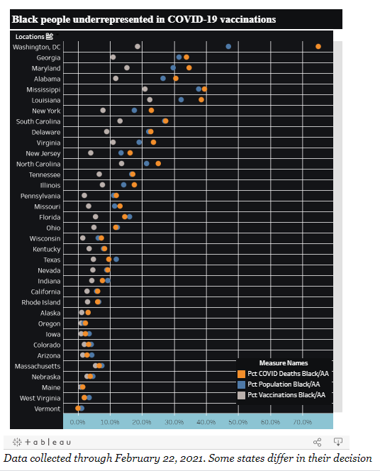
Below is a chart containing data from a number of states and Washington, D.C. to help visualize the gap between how many Black people are dying from COVID-19 and how many are receiving the vaccine. U.S. states and the percentages of Black people are respectively on the y- and x-axes. For each location, there are 3 data points:
Percent of State’s Black Population (Pct Population Black/AA): How many residents of the state identify as Black/African-American. Displayed as the blue dot.
Percent of State’s Vaccinated Population that are Black (Pct Vaccinations Black/AA): How many residents of the state have received at least one vaccine dose and identify as Black/African-American. Displayed as the gray dot.
Percent of State’s COVID-19 Deaths that are Black (Pct COVID Deaths Black/AA): How many residents of the state who died from COVID-19 identified as Black/African-American. Displayed as the orange dot.
Author(s): Paul Watkins
Publication Date: 25 February 2021
Publication Site: Data for Black Lives Blog