Link: https://blog.usejournal.com/why-humans-love-pie-charts-9cd346000bdc
Graphic:
Excerpt:
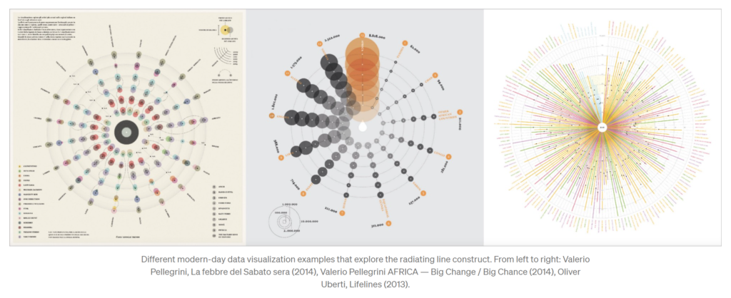
We might think of the pie chart as a fairly recent invention, with arguably more flaws than benefits, in regards to the statistical portrayal of data. However, if we look deep into history we realize this popular chart is only a recent manifestation of an ancient visual motif that carried meaning to numerous civilizations over space and time. A graphical construct of radiating lines enclosed by a circle, this motif is also a powerful perceptual recipe. If we look deep into ourselves we uncover a strong proclivity for such a visual pattern, despite the final message it might carry. As one of the oldest archetypes of the circular diagram, the sectioned circle will certainly outlast all of us, and indifferent to criticism, I suspect, so will the pie chart.
Author(s): Manuel Lima
Publication Date: 23 July 2018
Publication Site: Noteworthy – the Journal blog