Mortgage Mayhem

Link: https://www.netinterest.co/p/mortgage-mayhem

Excerpt:

Studying successful entrepreneurs is great; I am looking forward to reading Brad Stone’s new book, Amazon Unbound: Jeff Bezos and the Invention of a Global Empire. But studying unsuccessful ones can be more enlightening. As Charlie Munger says, “All I want to know is where I’m going to die so I’ll never go there.” The trouble is that there are few books written about unsuccessful entrepreneurs. The next best thing is a parliamentary hearing. This week, Lex Greensill, founder of Greensill Capital, appeared in front of the UK House of Commons Treasury Committee to help lawmakers understand what went wrong.

The Chair of the Committee cited the piece Steve Clapham and I wrote back in July last year warning of problems at Greensill. Lex Greensill didn’t confirm if he’d read it but replied that he didn’t become concerned about the position of his business until December. His view is that the failure of his firm rests with the insurance company that denied him cover. He even used the opportunity to give the Committee a recommendation: “…one of the real lessons from the failure of my firm… is that a heavy reliance on trade credit insurance is dangerous. I urge you and the Committee to consider the manner in which that is regulated, because it is fundamentally counter cyclical in its behaviour.”  

No surprise that he would deflect. The firm failed because it was riddled with conflicts of interest, carried heavy customer concentrations and grew too fast. The problem with unsuccessful entrepreneurs is that they may be less than honest.

Author(s): Marc Rubinstein

Publication Date: 14 May 2021

Publication Site: Net Interest at substack

Never Trust a Clean Partisan Story

Link: https://polimath.substack.com/p/never-trust-a-clean-partisan-story

Graphic:

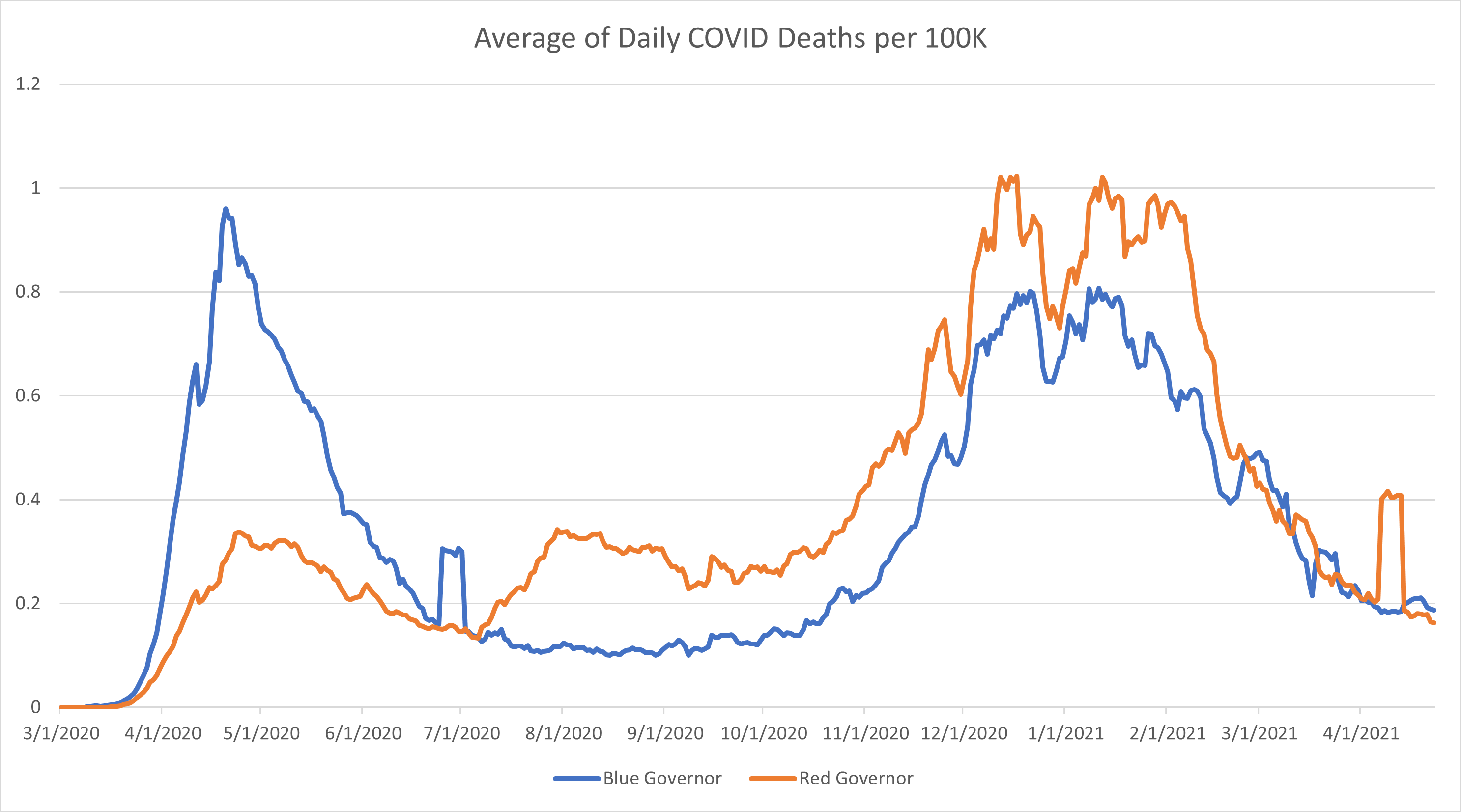
Before [wrong]:

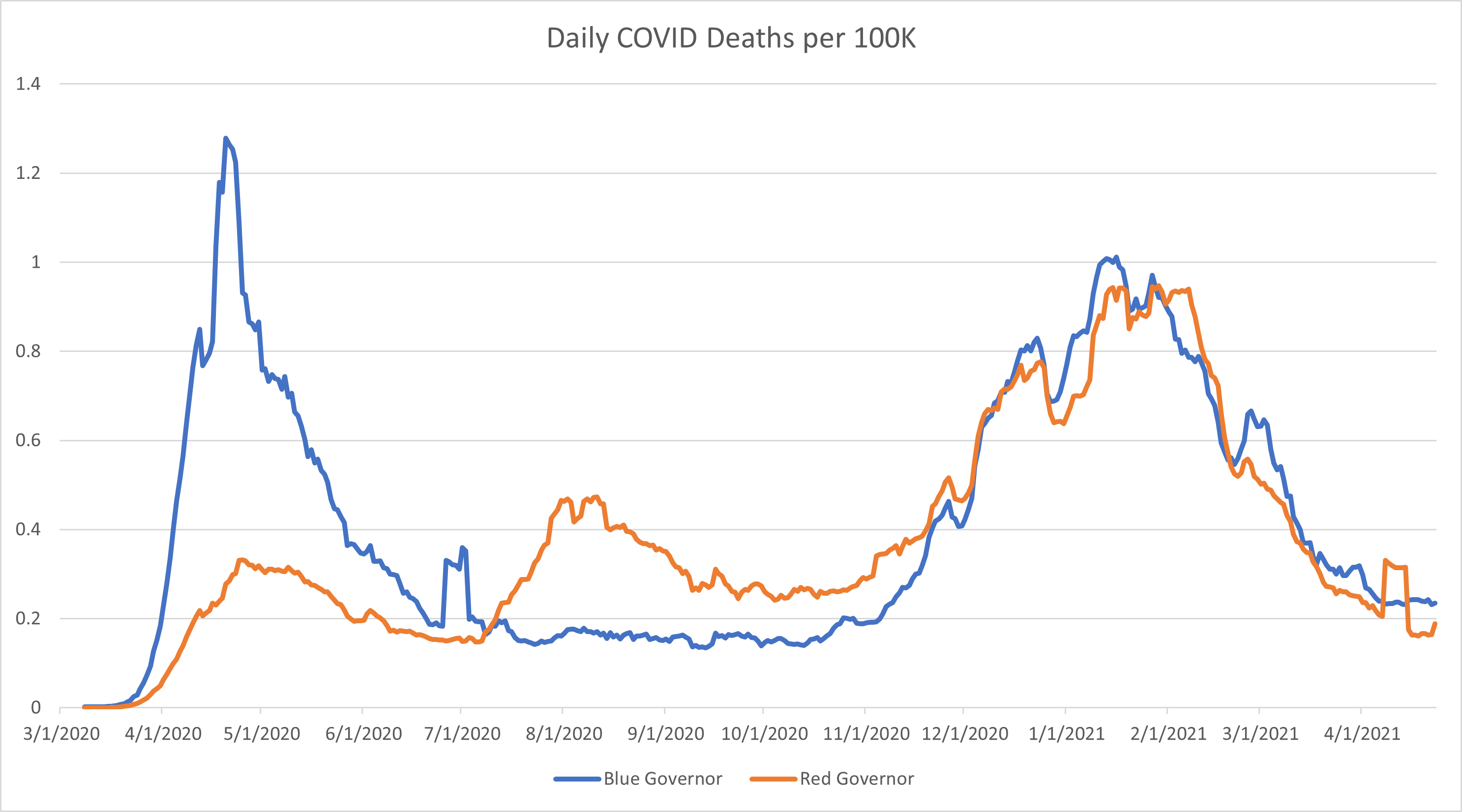
After [correct]:

Excerpt:

The biggest problem with this study is the fact that they made what is an elementary statistics error and it went all the way to publication and no one caught it.

The authors took the per capita COVID case and death numbers among the “red states” and “blue states” and ran an analysis on them. In doing this, they gave North Dakota the same weight as Texas and Hawaii the same weight as New York despite the obvious population differences. Their chart is tiny and unreadable, so I’ve roughly duplicated their work here.

At first glance, this looks like the authors at least have their data correct. It looks like, after the initial wave, states with red governors had consistently higher patterns of cases and deaths from the summer all the way through the winter surge.

However, what we’re seeing here is due to the fact that the authors weighted the death rates for small and rural states with the same weight that they applied to high population states. This is a statistics error that is so common it has its own name: Simpson’s Paradox. It is when you take the average of the averages instead of calculating the overall average based on the properly weighted data.

Author(s): PoliMath

Publication Date: 13 May 2021

Publication Site: Marginally Compelling at substack

Which Public Pension Funds Have the Highest Holdings of Alternative Assets? 2021 Edition

Link: https://marypatcampbell.substack.com/p/which-public-pension-funds-have-the

Graphic:

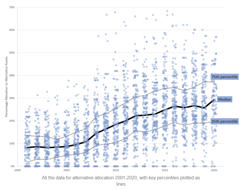
All the data for alternative allocation 2001-2020, with key percentiles plotted as lines

Excerpt:

What you see in that graph is a data point for each of the plans I know their asset allocation for, with the median, 25th percentile, and 75th percentiles marked out so you can see the allocations increasing.

That pattern does not make me feel good.

Allocating more to alternatives doesn’t seem to get asset managers higher returns. But the group is generally sliding upwards in their allocations, and I’m very unhappy about this.

Author(s): Mary Pat Campbell

Publication Date: 11 May 2021

Publication Site: STUMP at substack

The Few Sentences That Explain Much of What Went Wrong With Our Pandemic Response

Link: https://www.theinsight.org/p/the-few-sentences-that-explain-much

Excerpt:

Why did it take so long to accept that SARS-CoV-2 was being transmitted through aerosols, respiratory particles that are small enough to remain suspended in the air, rather than through short-range respiratory droplets that could not travel more than a few feet because of their (bigger) size?

The reasons for this delay go back more than a century, to the fight against (incorrect but prevalent) theories that blame miasma—noxious odors, especially from rotting organic material—for diseases. While trying to counter erroneous but millenia-long folk-beliefs, some of the founders of public health and the field of infectious control of diseases around the world made key errors and conflations around the turn of the 20th century. These errors essentially froze into tradition and dogma that went unchanged and uncorrected for more than a century, until a pandemic forced our hand.

Author(s): Zeynep Tufekci

Publication Date: 7 May 2021

Publication Site: Insight at substack

The Heroic Congressional Fight to Save the Rich

Link: https://taibbi.substack.com/p/the-heroic-congressional-fight-to

Graphic:

Excerpt:

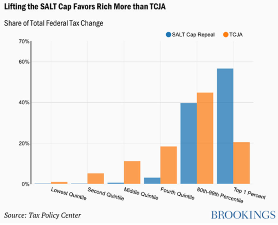
However, the SALT cap didn’t so much go after “Democrats” as “affluent Democrats.” It only applied to people who itemize their taxes, which meant the 90% of Americans who take the standard deduction were unaffected. The deduction raised over $70 billion in just the first year, and roughly 56% of that money came just from the top 1% of taxpayers, living in a few states in particular.

The tax nastygram seemed directed at Trump’s hometown delegation. Congresswoman Carolyn Maloney in April of 2017 complained about the cost of protecting “Trump and his family here in NYC”; the SALT cap affected 19% of Maloney’s constituents in Brooklyn and on the Upper East Side, and taxpayers in that 19% each lost an average of $100,405 in breaks. Chuck Schumer, one of Trump’s fiercest critics, personally took over $58,000 in SALT deductions just in 2016.

Overall, 39 of the 40 districts most affected by the SALT cap were represented by Democrats. Of those, 28 came from New York, New Jersey, and Connecticut. Also affected: Nancy Pelosi’s San Francisco district, where residents lost an average of $53,471 of write-offs. Trump’s campaign promises to take on “elites” proved phony, except when he was able to effect this targeted partisan strike at the people he knew and hated the most: rich, socially liberal Democrats, especially ones from the tri-state area.

Author(s): Matt Taibbi

Publication Date: 23 April 2021

Publication Site: TK News at substack

Public Finance: Full Accrual Accounting and Governmental Accounting Standards Board Testimony

Link: https://marypatcampbell.substack.com/p/public-finance-full-accrual-accounting

Video:

Excerpt:

I will give a very simple example: suppose Netflix makes a deal where instead of you paying for a year’s subscription at a time, you can get a big discount if you pay for 2 years’ subscription.

Subscribers love the deal and pay for it….

….and then Netflix says their sales doubled in their financial reports. That’s IF they followed cash-based accounting, which records cash flows.

But they don’t, because accounting standards boards (outside the government sphere) know that this is just a trick to boost how financials look under cash accounting. And there are loads of these tricks. I just gave one simple example. The trick of getting people to pre-pay for sales to boost the numbers is a well-known ploy on the revenue side. A well-known ploy on the expenses side is to put off paying bills.

This is obviously distorting recognizing the true economic arrangement underlying these transactions, and some of the tricks make for a more fragile economic position for specific businesses. It was always the marginal businesses, which were barely hanging on, where cash-basis accounting tempts into trickery, which usually ends in financial failure. So accounting standards have developed to prevent this stuff.

Author(s): Mary Pat Campbell

Publication Date: 22 April 2021

Publication Site: STUMP at Substack

Mortality with Meep: Location of Death Data for 1999-2020, Entire United States

Link: https://marypatcampbell.substack.com/p/mortality-with-meep-looking-at-location

Graphic:

Excerpt:

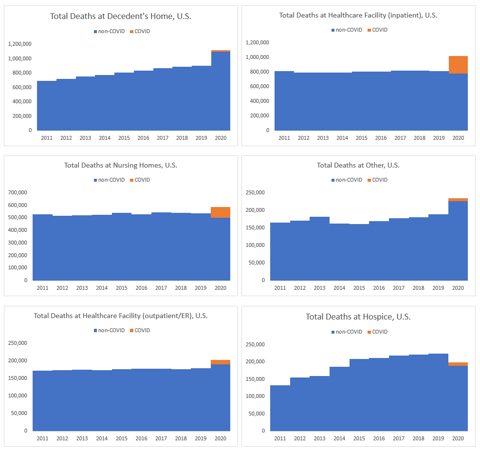
For a few locations, it’s pretty clear that COVID explains almost all their excess deaths: inpatient healthcare facilities and nursing homes. Indeed, it looks like over 100% of the nursing home excess mortality came from COVID, which accords with what I see with excess mortality for older people.

However, there is a lot of excess mortality for people who died at home, and most of that is currently unexplained by COVID.

I don’t think it will be — I think we will find those excess diabetes, heart attack, and ‘unintentional injury’ deaths will have been at home, and because of lockdowns there weren’t other people around to get these people to treatment before they died. This accords with what Emma Woodhouse saw for Illinois – that pattern holds for the entire U.S., it seems.

Author(s): Mary Pat Campbell

Publication Date: 20 April 2021

Publication Site: STUMP at substack

Vaccine Efficacy and the Immunity Time Spans

Link: https://polimath.substack.com/p/vaccine-efficacy-and-the-immunity

Graphic:

Excerpt:

Let’s refer back to the Pfizer study submitted to the FDA. In that study, 18,555 people were vaccinated and 18,533 people received the placebo injection. In these groups, 7 days after the second dose was administered, we saw that the vaccinated group got infected at only 5% the rate that the placebo group was infected.

Furthermore, this is the number of cases we see over the course of a two month study. So those 9 people out of 18,555 were not symptomatic and infectious that whole time, but only for a few weeks.

So, to take CNN’s example and re-imagine it for the reality we have with this data.

Let’s say 1 million people are travelling. If everyone is unvaccinated (and the window of infection is roughly one week), there will be about 1,100 infected travelers.

If, however, everyone is vaccinated, there will be about 60 infected travelers and their chance of infecting you (my dear vaccinated friend) is reduced substantially.

Author(s): PoliMath

Publication Date: 13 April 2021

Publication Site: Marginally Compelling on substack

SALT Cap Tussle: NY Democrats Have an Ultimatum

Link: https://marypatcampbell.substack.com/p/salt-cap-tussle-ny-democrats-have

Graphic:

Excerpt:

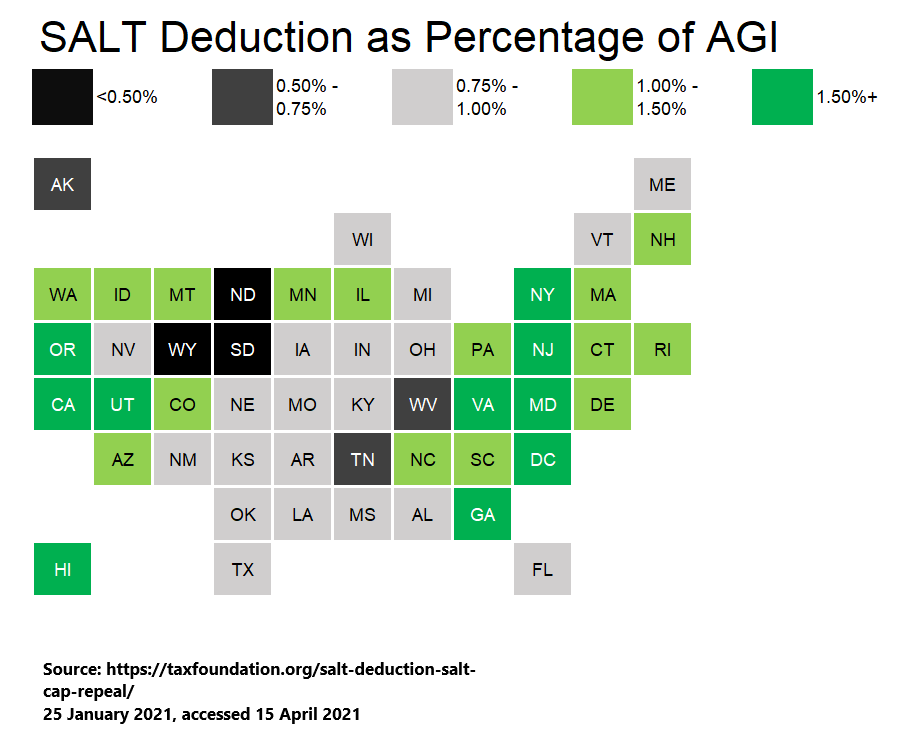
It’s not just a matter of the state/local tax levels for each state, but also what income levels are like for the state.

In any case, the pattern of which states’ taxpayers get the biggest boost from SALT deductibility might surprise you a little, such as with Utah and Georgia. But many aren’t surprising at all, such as New York and New Jersey.

But even without considering the geographical footprint, obviously high-income folks get the biggest boost from removing the SALT cap. This has been known since the TCJA back in 2017 when they imposed the cap to begin with. It’s partly why it was done.

Author(s): Mary Pat Campbell

Publication Date: 15 April 2021

Publication Site: STUMP at substack

Mortality with Meep: Top Causes of Death in the United States in 2020

Link: https://marypatcampbell.substack.com/p/mortality-with-meep-top-causes-of

Graphic:

Excerpt:

You’ll see that among adults, the age range with the most suicides are people age 50-55. That’s due to two things: the number of people in that age range (early Gen X, so tailing off from Boomers) and the rate. For each age group far more males die by suicide than do females.

You can see that deaths by suicide in number drop off in old age…. but that’s because the population is dropping off in size (as mortality rates accelerate at high ages).

Author(s): Mary Pat Campbell

Publication Date: 12 April 2021

Publication Site: STUMP at substack

What We Hope Is The Final COVID Surge

Link: https://polimath.substack.com/p/what-we-hope-is-the-final-covid-surge

Graphic:

Excerpt:

My current plan is to stop following COVID numbers after this coming May. But a lot of that plan rested on this assumption that, as we get really high up there with vaccine numbers, the COVID data would become less and less interesting as it just kind of fizzles out.

Michigan is currently putting that assumption to the test.

*takes deep breath*

The numbers out of Michigan have all the markings of a classic COVID surge. I could maybe make the case that it’s not as steep as we would have expected and maybe it will plateau in the next week or two, but I’ve been expecting that the rate of vaccinations would temper this kind of a surge.

Author(s): PoliMath

Publication Date: 6 April 2021

Publication Site: Marginally Compelling at Substack

Mortality with Meep: Ranking the States (and NYC and DC) by Excess Mortality

Link: https://marypatcampbell.substack.com/p/mortality-with-meep-ranking-the-states

Graphic:

Excerpt:

The three worst areas just pop out: Arizona, New Jersey, and New York City.

(Also popping out: the hole where North Carolina should be. I’m going to guess it has landed in the midrange of states, like its neighbors South Carolina and Tennessee.)

New York state excluding NYC (which is what the NY square represents) is middle-of-the-pack for excess mortality, which is hardly surprising – as most of New Jersey is crowded near NYC, New York state is geographically huge and has significant populations on the Great Lakes, far away from NYC.

The lowest excess mortality also really pops out: some states bordering on the edges of Canada, plus Hawaii. It is a little surprising that Washington State, in particular, has not been hit hard by COVID mortality.

Author(s): Mary Pat Campbell

Publication Date: 1 April 2021

Publication Site: STUMP at substack