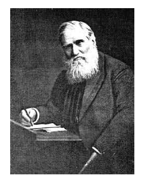
Thomas Bond Sprague (1830-1920)

Link:https://mathshistory.st-andrews.ac.uk/Biographies/Sprague/

Graphic:
Excerpt:

Dr Sprague was the main person behind a mortality study covering the experience of twenty U. K. life offices. This study resulted in the Institute of Actuaries Life Tables (the so-called Twenty Offices Table) which was published in 1869 [2]. From this study, he produced, in 1879, the first Select Tables of Mortality [3] which were the first two-dimensional mortality tables ever published (the two dimensions being ‘insured duration’ i.e. the ‘select period’ and ‘age attained’). The ‘select period’ was five years.

Dr Sprague pioneered the important 1870 Life Insurance Companies Act [4] which was introduced following the notorious insolvencies of both the Albert and the European life assurance companies. The 1870 Act required:-

… an investigation into the financial condition of a life insurance company to be made regularly by an actuary,

required a separate “long-term fund” and required the:-

… preparation of a revenue account and balance sheet every year in prescribed form to be filed with the Board of Trade,

the latter being a public document. Dr Sprague was one of the foremost advocates of the principle of ‘Freedom with Publicity’ (i.e. documents available to the public) and was opposed to there being any Government regulation prescribing the manner of valuation of policy liabilities. He wrote the major 19th century work on the preparation of life office accounts in conformity with the 1870 Act [5].

Author(s): David O Forfar

Publication Date: accessed 9 Feb 2022

Publication Site: MacTutor History of Math Archives
Battle lines drawn over the future of UK’s biggest pension fund

Link:https://www.theguardian.com/business/2022/feb/05/battle-lines-drawn-over-the-future-of-uks-biggest-pension-fund

Graphic:

Excerpt:

The UK’s biggest private pension scheme, the Universities Superannuation Scheme (USS), was no different: the custodian of the retirement savings of 470,000 university and college workers lost billions of pounds.

At its latest valuation, actuaries came up with an alarming conclusion: the assets of USS were only worth £67bn, leaving a huge deficit of £18bn compared to the liabilities it has promised to pay out in the future.

Yet the recovery was almost as extraordinary as the decline. Central banks pumped money into the economy, and tech companies in the US recorded astonishing gains. That helped USS assets back to more than £90bn at the end of January.

That recovery – and the controversial question of how the fund accounts for it – has put USS at the centre of a row that could result in university staff occupying picket lines across the country. The scheme will also be at the centre of a legal battle this month, with academics asking a court for permission to sue directors for not performing their duties.

….

 In a paper published in September, David Miles, professor of economics at Imperial College London and a former Bank of England monetary policymaker, and James Sefton, also an Imperial economics professor, argued that the risk of USS having insufficient funds to pay promised pensions was between 20% and 40%.

Simon Pilcher, chief executive of USS Investment Management, is in charge of choosing the actual investments. “Sadly, one can’t project the past into the future,” he said.

“Today, we think it is reasonable to expect lower returns going forward than we’ve experienced in the past, because it’s those higher returns that have driven us to these high prices.”

Author(s): Jasper Jolly

Publication Date: 5 Feb 2022

Publication Site: The Guardian

We’re pricing the poor out of food in the UK – that’s why I’m launching my own price index

Link:https://www.theguardian.com/society/2022/jan/22/were-pricing-the-poor-out-of-food-in-the-uk-thats-why-im-launching-my-own-price-index

Excerpt:

A collection of 700 pre-specified goods that includes a leg of lamb, bedroom furniture, a television and champagne seems a blunt and darkly comical tool for recording the impact of inflated grocery prices in a country where two and a half million citizens were forced by an array of desperate circumstances to use food banks in the last year.

The Smart Price, Basics and Value range products offered as lower-cost alternatives are stealthily being extinguished from the shelves, leaving shoppers with no choice but to “level up” to the supermarkets’ own branded goods – usually in smaller quantities at larger prices.

I have been monitoring this for the last decade, through writing recipes on my online blog and documenting the prices of ingredients in forensic detail. In 2012, 10 stock cubes from Sainsbury’s Basics range were 10p. In 2022, those same stock cubes are 39p, but only available in chicken or beef. The cheapest vegetable stock cubes are, inexplicably, £1 for 10. Last year the Smart Price pasta in my local Asda was 29p for 500g. Today, it is unavailable, so the cheapest bag is 70p; a 141% price rise for the same product in more colourful packaging. A few years ago, there were more than 400 products in the Smart Price range; today there are 87, and counting down.

….

I have been writing about these things for 10 years now. I have given evidence to multiple parliamentary inquiries, led numerous petitions, been consulted on the School Food Plan and the National Food Strategy, spoken twice at the Conservative party conference, and still the realities of the worst of our collective experiences are dismissed by haughty money men as not matching their theoretical lamb-and-champagne metrics.

So, along with a team of economists, charitable partners, retail price analysts, people working to combat poverty in the UK, ex-staff from the Office for National Statistics and others who have volunteered their time and expertise, I am compiling a new price index – one that will document the disappearance of the budget lines and the insidiously creeping prices of the most basic versions of essential items at the supermarket.

Author(s): Jack Monroe

Publication Date: 22 Jan 2022

Publication Site: The Guardian

The catastrophe of the Covid models

Link:https://www.spiked-online.com/2022/01/21/the-catastrophe-of-the-covid-models/

Graphic:

Excerpt:

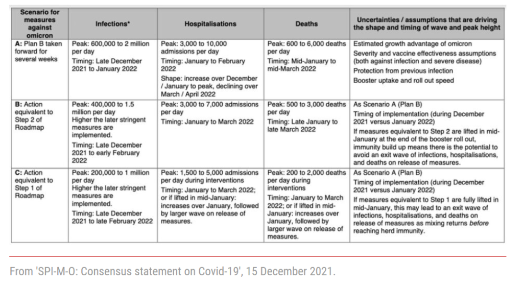
Having taken all the modelling into account, SAGE produced a table that showed in stark terms what the future held if the government stuck to ‘Plan B’. With the usual risible caveat that ‘these are not forecasts or predictions’, they showed a peak in hospitalisations of between 3,000 and 10,000 per day and a peak in deaths of between 600 and 6,000 a day. In previous waves, without any vaccines, deaths had never exceeded 1,250 a day.

The government was effectively given an ultimatum. SAGE offered Johnson a choice between the disaster that would surely unfold and a ‘Step 1’ or ‘Step 2’ lockdown, both of which had been helpfully modelled to give him a steer. ‘Step 1’ was a full lockdown as implemented last January. ‘Step 2’ allowed limited contact with other households but only outdoors.

In the event, as we all know, Boris Johnson ignored the warnings and declined to implement any new restrictions on liberty. A few days later, Robert West, a nicotine-addiction specialist who is on SAGE for some reason, tweeted: ‘It is now a near certainty that the UK will be seeing a hospitalisation rate that massively exceeds the capacity of the NHS. Many thousands of people have been condemned to death by the Conservative government.’

It did not quite turn out that way. Covid-related hospitalisations in England peaked at 2,370 on 29 December and it looks like the number of deaths will peak well below 300. This is not just less than was projected under ‘Plan B’, it is less than was projected under a ‘Step 2’ lockdown. The modelling for ‘Step 2’ showed a peak of at least 3,000 hospitalisations and 500 deaths a day. SAGE had given itself an enormous margin of error. There is an order of magnitude between 600 deaths a day and 6,000 deaths a day and yet it still managed to miss the mark.

Author(s): Christopher Snowdon

Publication Date: 22 Jan 2022

Publication Site: Spiked Online

Life expectancy across the UK

Link:https://www.clubvita.co.uk/news-and-insights/life-expectancy-across-the-uk

Graphic:

Excerpt:

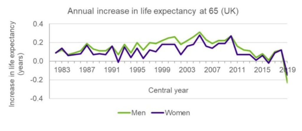
The ONS (‘Office of National Statistics) produces annual updates on period life expectancy in the UK – the so-called National Life Tables. The latest tables are based on the 2018 to 2020 period, and therefore are the first to pick up the impact of the COVID-19 pandemic. Given the significantly increased death rates seen in 2020, this fall in life expectancy is not unexpected. However, it is important to note that the headline figures hide a wide variety of underlying impacts at a more granular level.

Author(s): Conor O’Reilly

Publication Date: 27 Sept 2021

Publication Site: Club Vita

Introducing the UK Covid-19 Crowd Forecasting Challenge

Link: https://www.crowdforecastr.org/2021/05/11/uk-challenge/

Twitter thread of results: https://twitter.com/nikosbosse/status/1449043922794188807

Graphic:

Image

Excerpt:

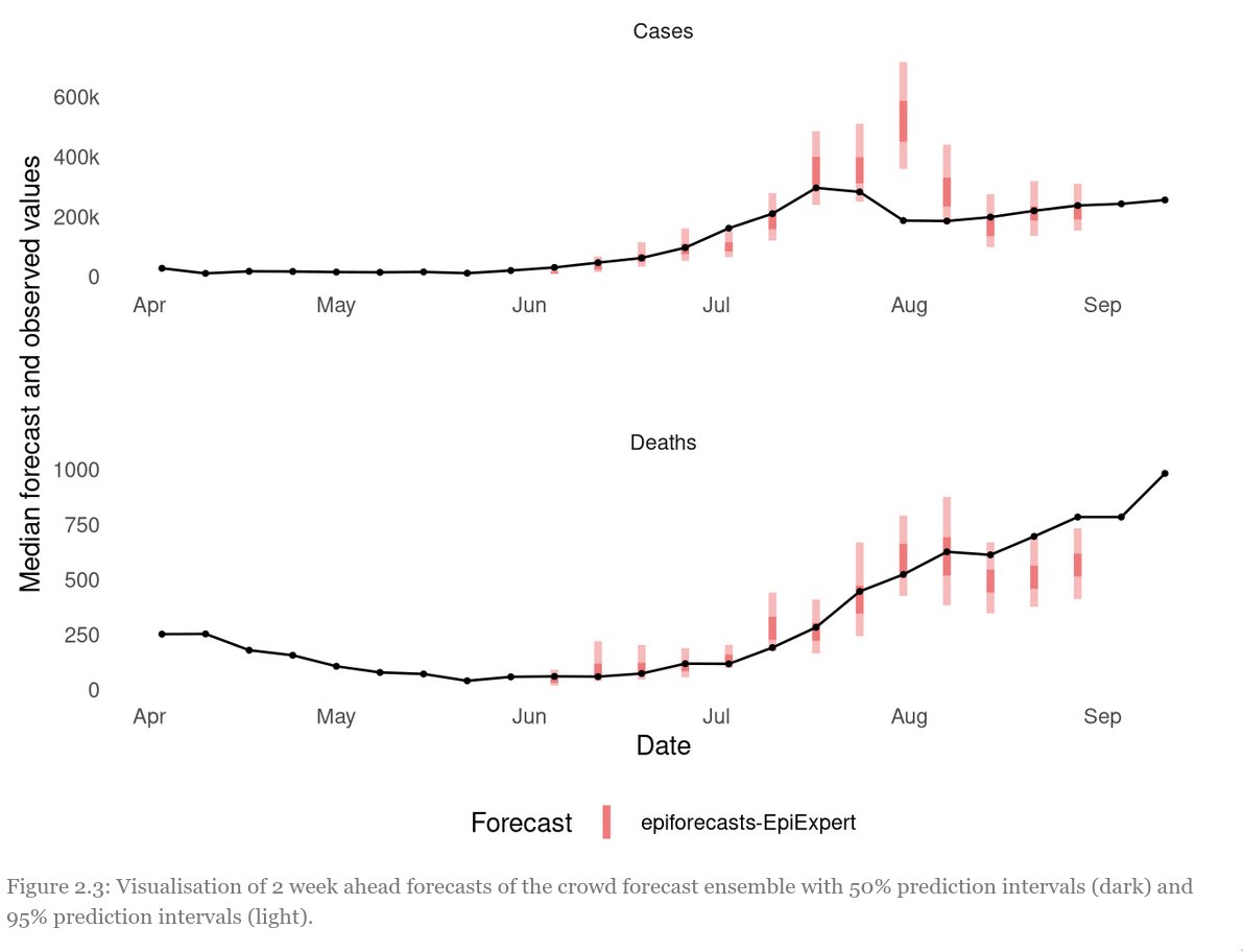
Let’s start with the data. The UK Forecasting Challenge spanned a long period of exponential growth as well as a sudden drop in cases at the end of July 3

Especially this peak was hard to predict and no forecaster really saw it coming. Red: aggregated forecast from different weeks, grey: individual participants. The second picture shows the range for which participants were 50% and 95% confident they would cover the true value

….

So what have we learned? – Human forecasts can be valuable to inform public health policy and can sometimes even beat computer models – Ensembles almost always perform better than individuals – Non-experts can be just as good as experts – recruiting participants is hard

Author(s): Nikos Bosse

Publication Date: Accessed 17 Oct 2021, twitter thread 15 Oct 21

Publication Site: Crowdforecastr

Here’s the Gender Pay Gap at 10,000 U.K. Employers

Link:https://www.bloomberg.com/graphics/2021-uk-gender-pay-gap/

Graphic:

Excerpt:

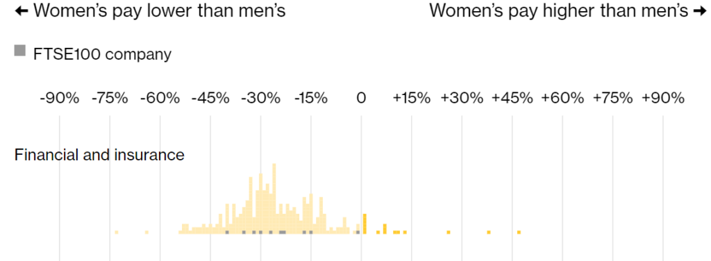
Women in finance in the U.K. still make significantly less than men. While the gender pay gap at financial firms in the country narrowed slightly last year, overall the industry continues to have the biggest disparity.

Men working in finance and insurance made 25% more than women last year, down from 28% in 2019, a Bloomberg News analysis of government data shows. The pay gap is especially wide in investment banking, where some of the highest-paid employees work.

It is the fourth straight year that finance has led the industry rankings, showing that executives are finding it difficult to shrink the gap. Mining and quarrying had the second-biggest pay gap at 23% as the commodity boom boosted the income of workers, who are largely male.

Author(s): Neil Callahan

Publication Date: 6 Oct 2021

Publication Site: Bloomberg

Charles Booth’s London Poverty Maps

Link: https://booth.lse.ac.uk/map/12/-0.0421/51.5132/100/0

Graphic:

Additional: https://booth.lse.ac.uk/learn-more/what-were-the-poverty-maps

Excerpt:

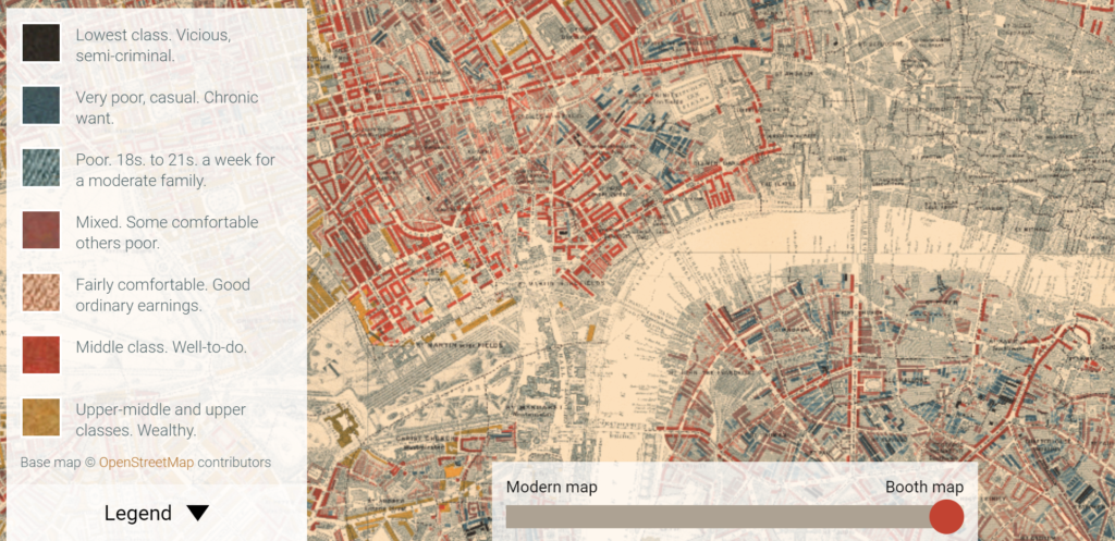
The Maps Descriptive of London Poverty are perhaps the most distinctive product of Charles Booth’s Inquiry into Life and Labour in London (1886-1903). An early example of social cartography, each street is coloured to indicate the income and social class of its inhabitants.

….

Descriptive Map of London Poverty 1889

The first edition of the poverty maps was based on information gathered from School Board visitors. A first sheet covering the East End was published in the first volume of Labour and Life of the People, Volume 1: East London (London: Macmillan, 1889) as the Descriptive Map of East End Poverty. The map was expanded in 1891 to four sheets – covering an area from Kensington in the west to Poplar in the east, and from Kentish Town in the north to Stockwell in the south – and published in subsequent volumes of the survey. These maps are collectively known as the Descriptive Map of London Poverty 1889. They use Stanford’s Library Map of London and Suburbs at a scale of 6 inches to 1 mile (1:10560) as their base. A digital image of the 1889 map has been made by the University of Michigan.

The original working maps from this first edition of the poverty maps are held at the Museum of London. These are hand-coloured and use the 1869 Ordnance Survey 1:2500 maps as their base.

Download the maps: https://booth.lse.ac.uk/learn-more/download-maps

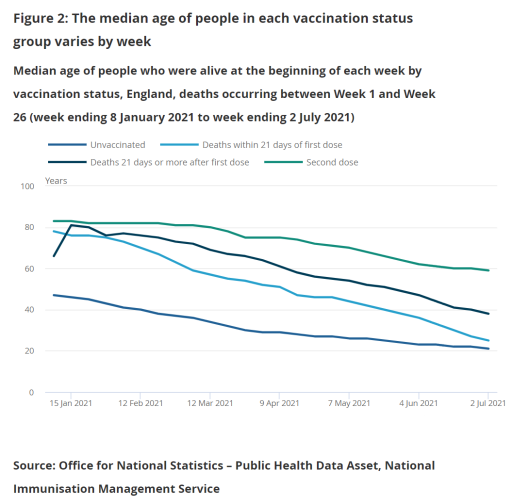
Weekly COVID-19 age-standardised mortality rates by vaccination status, England: methodology

Link:https://www.ons.gov.uk/peoplepopulationandcommunity/birthsdeathsandmarriages/deaths/methodologies/weeklycovid19agestandardisedmortalityratesbyvaccinationstatusenglandmethodology#age-standardised-mortality-rates

Graphic:

Excerpt:

Age-standardised mortality rates are calculated for vaccination status groups using the Public Health Data Asset (PHDA) dataset. The PHDA is a linked dataset combining the 2011 Census, the General Practice Extraction Service (GPES) data for pandemic planning and research, and the Hospital Episode Statistics (HES). We linked vaccination data from the National Immunisation Management Service (NIMS) to the PHDA based on NHS number, and linked data on positive coronavirus (COVID-19) Polymerase Chain Reaction (PCR) tests from Test and Trace to the PHDA, also based on NHS number.

The PHDA dataset contains a subset of the population and allows for analyses to be carried out that require a known living population with known characteristics. These characteristics include age-standardised mortality rates (ASMRs) by vaccination status and the use of variables such as health conditions and census characteristics.

Author(s): UK government, ONS

Publication Date: Accessed 27 Sept 2021

Publication Site: Office of National Statistics

Thousands more people than usual are dying … but it’s not from Covid

Link:https://www.yahoo.com/news/analysis-thousands-more-usual-dying-170117640.html

:

Excerpt:

While focus remains firmly fixed on Covid-19, a second health crisis is quietly emerging in Britain. Since the beginning of July, there have been thousands of excess deaths that were not caused by coronavirus.

According to health experts, this is highly unusual for the summer. Although excess deaths are expected during the winter months, when cold weather and seasonal infections combine to place pressure on the NHS, summer generally sees a lull.

….

Data from Public Health England (PHE) shows that during that period there were 2,103 extra death registrations with ischemic heart disease, 1,552 with heart failure, as well as an extra 760 deaths with cerebrovascular diseases such as stroke and aneurysm and 3,915 with other circulatory diseases.

Acute and chronic respiratory infections were also up with 3,416 more mentions on death certificates than expected since the start of July, while there have been 1,234 extra urinary system disease deaths, 324 with cirrhosis and liver disease and 1,905 with diabetes.

Alarmingly, many of these conditions saw the biggest drops in diagnosis in 2020, as the NHS struggled to cope with the pandemic.

Author(s): Sarah Knapton

Publication Date: 24 Sept 2021

Publication Site: Yahoo News

British pension funds plough more cash into China

Link: https://finance.yahoo.com/news/british-pension-funds-plough-more-155119851.html

Excerpt:

British pension funds are ramping up their investment in Chinese companies despite growing tensions between the West and the Communist state.

According to a new report by Hong Kong Watch, a pro-democracy advocacy group, the amount of cash invested by Western pension funds and other institutional investors in China has hit a record high in recent months.

It comes amid rising criticism in the West about China’s human rights record, including its brutal treatment of Uighur Muslims and its suppression of democracy campaigners in Hong Kong.

…..

The report cites the Universities Superannuation Scheme (USS), one of the UK’s largest private pension schemes, and Legal & General, Britain’s biggest pensions manager, as two British firms with “problematic” investments in China.

It found that L&G’s China fund was previously investing UK pensions in Zhejiang Dahua Technology, which is alleged to produce facial recognition software for the Communist Party that detects the race of individuals and alerts the police when it identifies Uighur Muslims.

L&G has since divested from Zhejiang Dahua Technology.

Author(s): Simon Foy

Publication Date: 22 Sept 2021

Publication Site: Yahoo Finance

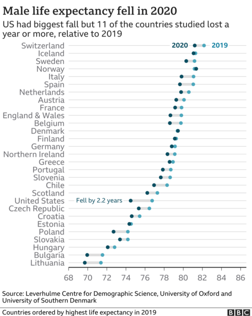
Covid-19: Life expectancy is down but what does this mean?

Link:https://www.bbc.com/news/health-58659717

Graphic:

Excerpt:

Despite the name, these life expectancy figures, known as “period life expectancy”, do not predict an actual lifespan.

Instead, they show the average age a newborn would live to if current death rates continued for their whole life.

And as Covid death rates are unlikely to continue long-term, the new estimates do not mean a boy born in 2020 will have a shorter life than one born in 2019.

But they do provide a snapshot of the effect of the pandemic that can be compared over time and between countries and different populations.

Author(s): Christine Jeavans

Publication Date: 23 Sept 2021

Publication Site: BBC