Data visualisation by hand: drawing data for your next story

Link: https://datajournalism.com/read/longreads/data-visualisation-by-hand

Graphic:

Excerpt:

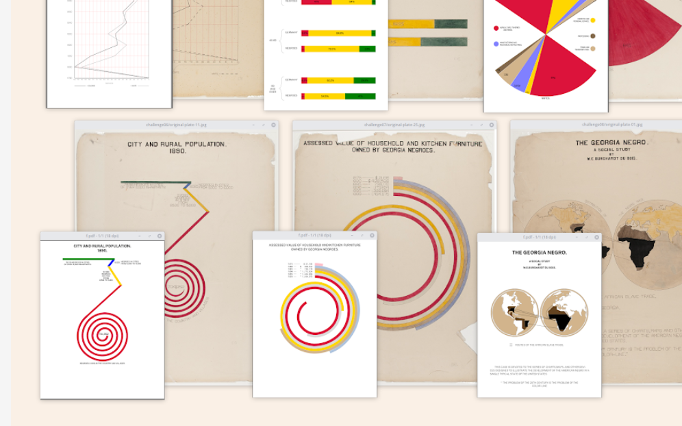
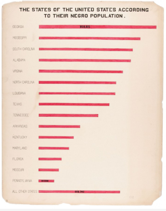
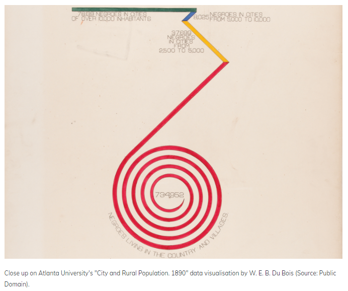
We live in a world where data visualisations are done through intricate code and graphic design. From Tableau to Datawrapper and Python and R, numerous possibilities exist for visualising compelling stories. But in the beginning, all data visualisation was done by hand. Visualisation pioneers like W. E. B. Du Bois and Florence Nightingale hand-drew their visualisations because there was simply no other way to make them.

For Du Bois it was his team of black sociologists who explained institutionalised racism to the world using data visualisations, while for Nightingale it was her diagram showing the causes of mortality.

And, even as computers developed, it was often easier to visualise using analogue means. This article will explore the history of hand-drawn visualisations and the case for presenting them in this style. It will also show examples from experts who have opted for the pencil over the screen. You’ll also learn some top tips to help get you started.

Author(s): Amelia McNamara

Publication Date: 24 March 2021

Publication Site: DataJournalism.com

Anthony Starks on Recreating Du Bois’s Iconic Style

Graphic:

Excerpt:

When Sekou and I met with Anthony to discuss his Du Bois recreations, he explained that he was “immediately struck” by Howard Wainer’s presentation on “Historical Development of W.E.B. Du Bois Graphical Narrative.” This was back in May 2017 at a Data Visualization New York meetup hosted by data viz pioneer Naomi Robbins. He was in awe of the existence and artistry of Du Bois’s work. The thought that immediately came to his mind was, “How can I reproduce this?”

Author(s): Allen Hillery

Publication Date: 25 February 2021

Publication Site: Data Literacy

How W.E.B Du Bois Used Data Visualization to Debunk Social Darwinism and Tell A Story of Resilience

Graphic:

Excerpt:

Du Bois was a professor of history, sociology and economics at Atlanta University. He established a sociology program in 1897, now recognized as the first school of American sociology. It was here that he led a team of students to produce 60 full-color charts, graphs, maps and tables on what had changed for African Americans since slavery. This collection was generated from a mix of existing records and empirical data collected by his sociological laboratory. The visualizations stressed one narrative; that the African American community had made progress.  The colorful, hand-drawn illustrations showed that literacy rates for African Americans were rising and that African American ownership of property and land was increasing. African American businesses were growing and so were the number of patents for inventions. 

Author(s): Allen Hillery

Publication Date: 1 February 2021

Publication Site: Data Literacy