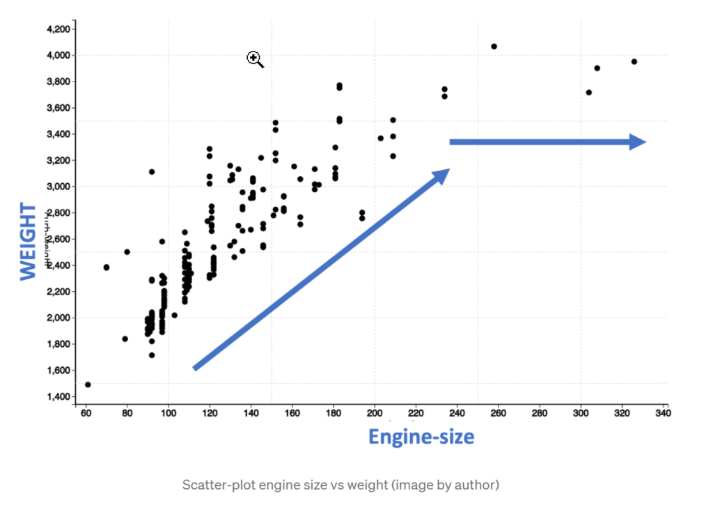
Just looking at these dots, we see that for engine size between 60 and 200, there is a linear increase in the weight. However, after an engine size of 200, the weight does not increase linearly but is leveling. So, this means that the relation between engine size and weight is not strictly linear.
We can also confirm the non-linear nature by performing a linear curve fit as shown below with a blue line. You will observe that the points marked in the red circle are completely off the straight line indicating that a linear line does not correctly capture the pattern.
We started by looking at the color of the cell which indicated a strong correlation. However, we concluded that it is not true when we looked at the scatter plot. So where is the catch?
The problem is in the name of the technique. As it is titled a correlation matrix, we tend to use it to interpret all types of correlation. The technique is based on Pearson correlation, which is strictly measuring only linear correlation. So the more appropriate name of the technique should be linear correlation matrix.
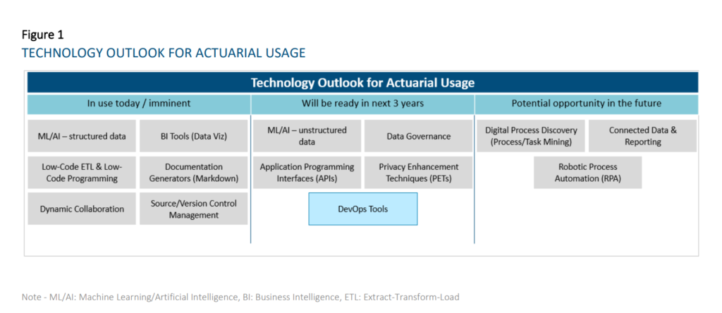
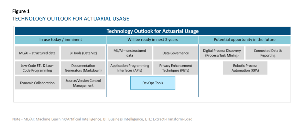
This research evaluates the current state and future outlook of emerging technologies on the actuarial profession over a three-year horizon. For the purpose of this report, a technology is considered to be a practical application of knowledge (as opposed to a specific vendor) and is considered emerging when the use of the particular technology is not already widespread across the actuarial profession. This report looks to evaluate prospective tools that actuaries can use across all aspects and domains of work spanning Life and Annuities, Health, P&C, and Pensions in relation to insurance risk. We researched and grouped similar technologies together for ease of reading and understanding. As a result, we identified the six following technology groups:
Machine Learning and Artificial Intelligence
Business Intelligence Tools and Report Generators
Extract-Transform-Load (ETL) / Data Integration and Low-Code Automation Platforms
Collaboration and Connected Data
Data Governance and Sharing
Digital Process Discovery (Process Mining / Task Mining)
Author(s):
Nicole Cervi, Deloitte Arthur da Silva, FSA, ACIA, Deloitte Paul Downes, FIA, FCIA, Deloitte Marwah Khalid, Deloitte Chenyi Liu, Deloitte Prakash Rajgopal, Deloitte Jean-Yves Rioux, FSA, CERA, FCIA, Deloitte Thomas Smith, Deloitte Yvonne Zhang, FSA, FCIA, Deloitte
Publication Date: October 2021
Publication Site: Society of Actuaries, SOA Research Institute
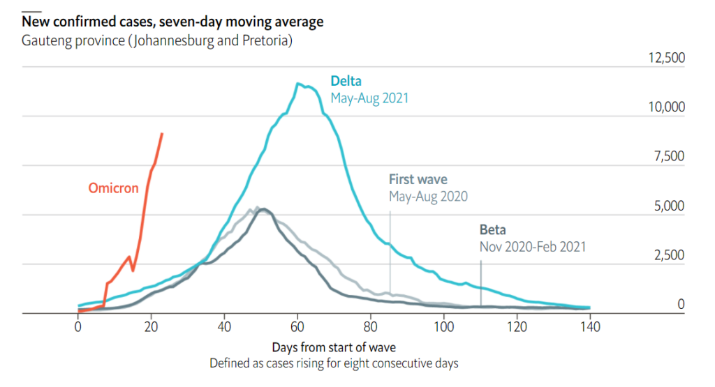
Two weeks after the Omicron variant was identified, hospitals are bracing for a covid-19 tsunami. In South Africa, where it has displaced Delta, cases are rising faster than in earlier waves. Each person with Omicron may infect 3-3.5 others. Delta’s most recent rate in the country was 0.8.
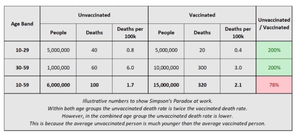
On Monday, December 6, 2021, I gave a talk with the title “COVID Data Follies: Vaccination Rates, Relative Risk, and Simpson’s Paradox”, to the Actuarial Science program at Illinois State University (thanks for the t-shirt, y’all!):
You may have heard statistics in the news that most of the people testing positive for COVID, currently, in a particular location, or most of the people hospitalized for COVID, or even most of the people dying of COVID were vaccinated! How can that be? Does that prove that the vaccines are ineffective? Using real-world data, the speaker, Mary Pat Campbell, will show how these statistics can both be true and misleading. Simpson’s Paradox is involved, which has to do with comparing differences between subgroups with very different sizes and average results. Simpson’s Paradox actually appears quite often in the insurance world.
I will embed a recording of the event, copies of the slides, the spreadsheets, and the links from the talk.
So what the chart in the tweet linked above is really showing is that, within the 10-59 age band, the average unvaccinated person is much younger than the average vaccinated person, and therefore has a lower death rate. Any benefit from the vaccines is swamped by the increase in all-cause mortality rates with age.
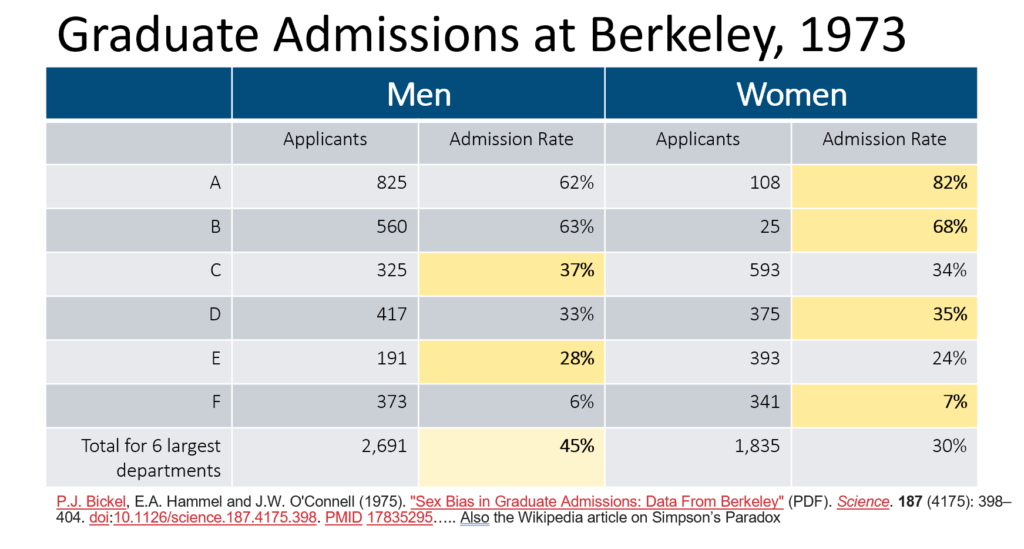
I have mocked up some illustrative numbers in the table below to hopefully show Simpson’s Paradox in action here. I’ve split the 10-59 age band into 10-29 and 30-59. Within each group the death rate for unvaccinated people is twice as high as for vaccinated people. However, within the combined group this reverses – the vaccinated group have higher death rates on average!
I and others have written to ONS, altering them to the concerns that this data is causing. It appears from a new blog they have released that they are aware of the issue and will use narrower age bands in the next release.
Author(s): Stuart Macdonald
Publication Date: 22 Nov 2021
Publication Site: COVID-19 Actuaries Response Group
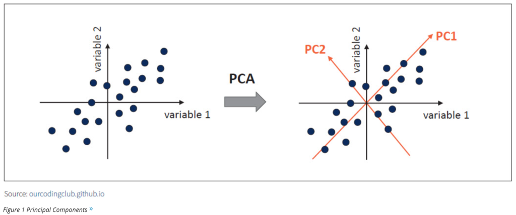
In simple words, PCA is a method of extracting important variables (in the form of components) from a large set of variables available in a data set. PCA is a type of unsupervised linear transformation where we take a dataset with too many variables and untangle the original variables into a smaller set of variables, which we called “principal components.” It is especially useful when dealing with three or higher dimensional data. It enables the analysts to explain the variability of that dataset using fewer variables.
About ten years ago, when the replication crisis started, we learned a certain set of tools for examining studies.
Check for selection bias. Distrust “adjusting for confounders”. Check for p-hacking and forking paths. Make teams preregister their analyses. Do forest plots to find publication bias. Stop accepting p-values of 0.049. Wait for replications. Trust reviews and meta-analyses, instead of individual small studies.
These were good tools. Having them was infinitely better than not having them. But even in 2014, I was writing about how many bad studies seemed to slip through the cracks even when we pushed this toolbox to its limits. We needed new tools.
I think the methods that Meyerowitz-Katz, Sheldrake, Heathers, Brown, Lawrence and others brought to the limelight this year are some of the new tools we were waiting for.
Part of this new toolset is to check for fraud. About 10 – 15% of the seemingly-good studies on ivermectin ended up extremely suspicious for fraud. Elgazzar, Carvallo, Niaee, Cadegiani, Samaha. There are ways to check for this even when you don’t have the raw data. Like:
The Carlisle-Stouffer-Fisher method: Check some large group of comparisons, usually the Table 1 of an RCT where they compare the demographic characteristics of the control and experimental groups, for reasonable p-values. Real data will have p-values all over the map; one in every ten comparisons will have a p-value of 0.1 or less. Fakers seem bad at this and usually give everything a nice safe p-value like 0.8 or 0.9.
GRIM – make sure means are possible given the number of numbers involved. For example, if a paper reports analyzing 10 patients and finding that 27% of them recovered, something has gone wrong. One possible thing that could have gone wrong is that the data are made up. Another possible thing is that they’re not giving the full story about how many patients dropped out when. But something is wrong.
But having the raw data is much better, and lets you notice if, for example, there are just ten patients who have been copy-pasted over and over again to make a hundred patients. Or if the distribution of values in a certain variable is unrealistic, like the Ariely study where cars drove a number of miles that was perfectly evenly distributed from 0 to 50,000 and then never above 50,000.
A 2020 Washington Post article examined the correlation between police spending and crime. It concluded that, “A review of spending on state and local police over the past 60 years…shows no correlation nationally between spending and crime rates.” This correlation is misleading. An important driver of police spending is the current level of crime, which creates a chicken and egg scenario. Causal research has, in fact, shown that more police lead to a reduction in crime.
….
Yelp overcame a similar challenge in 2015. A consulting report found that companies that advertised on the platform ended up earning more business through Yelp than those that didn’t advertise on the platform. But here’s the problem: Companies that get more business through Yelp may be more likely to advertise. The former COO and I discussed this challenge and we decided to run a large-scale experiment that gave packages of advertisements to thousands of randomly selected businesses. The key to successfully executing this experiment was determining which factors were driving the correlation. We found that Yelp ads did have a positive effect on sales, and it provided Yelp with new insight into the effect of ads.
The inaugural coffee chat of my YouTube channel features two research scholars from scientific community who shared their perspectives on how data plays a crucial role in research area.
By watching this video you will gather information on the following topics:
a) the importance of data in scientific research,
b) valuable insights about the data handling practices in research areas related to molecular biology, genetics, organic chemistry, radiology and biomedical imaging,
c) future of AI and machine learning in scientific research.
Author(s):
Efrosini Tsouko, PhD from Baylor College of Medicine; Mausam Kalita, PhD from Stanford University; Soumava Dey
Publication Date: 26 Sept 2021
Publication Site: Data Science with Sam at YouTube
Technologies that have reached widespread adoption today: o Dynamic Collaboration Tools – e.g., Microsoft Teams, Slack, Miro – Most companies are now using this type of technology. Some are using the different functionalities (e.g., digital whiteboarding, project management tools, etc.) more fully than others at this time. • Technologies that are reaching early majority adoption today: o Business Intelligence Tools (Data Visualization component) – e.g., Tableau, Power BI — Most respondents have started their journey in using these tools, with many having implemented solutions. While a few respondents are lagging in its adoption, some companies have scaled applications of this technology to all actuaries. BI tools will change and accelerate the way actuaries diagnose results, understand results, and communicate insights to stakeholders. o ML/AI on structured data – e.g., R, Python – Most respondents have started their journey in using these techniques, but the level of maturity varies widely. The average maturity is beyond the piloting phase amongst our respondents. These are used for a wide range of applications in actuarial functions, including pricing business, modeling demand, performing experience studies, predicting lapses to support sales and marketing, producing individual claims reserves in P&C, supporting accelerated underwriting and portfolio scoring on inforce blocks. o Documentation Generators (Markdown) – e.g., R Markdown, Sphinx – Many respondents have started using these tools, but maturity level varies widely. The average maturity for those who have started amongst our respondents is beyond the piloting phase. As the use of R/Python becomes more prolific amongst actuaries, the ability to simultaneously generate documentation and reports for developed applications and processes will increase in importance. o Low-Code ETL and Low-Code Programming — e.g., Alteryx, Azure Data Factory – Amongst respondents who provided responses, most have started their journey in using these tools, but the level of maturity varies widely. The average maturity is beyond the piloting phase with our respondents. Low-code ETL tools will be useful where traditional ETL tools requiring IT support are not sufficient for business needs (e.g., too difficult to learn quickly for users or reviewers, ad-hoc processes) or where IT is not able to provision views of data quickly enough. o Source Control Management – e.g., Git, SVN – A sizeable proportion of the respondents are currently using these technologies. Amongst these respondents, solutions have already been implemented. These technologies will become more important in the context of maintaining code quality for programming-based models and tools such as those developed in R/Python. The value of the technology will be further enhanced with the adoption of DevOps practices and tools, which blur the lines between Development and Operations teams to accelerate the deployment of applications/programs
Author(s):
Nicole Cervi, Deloitte Arthur da Silva, FSA, ACIA, Deloitte Paul Downes, FIA, FCIA, Deloitte Marwah Khalid, Deloitte Chenyi Liu, Deloitte Prakash Rajgopal, Deloitte Jean-Yves Rioux, FSA, CERA, FCIA, Deloitte Thomas Smith, Deloitte Yvonne Zhang, FSA, FCIA, Deloitte
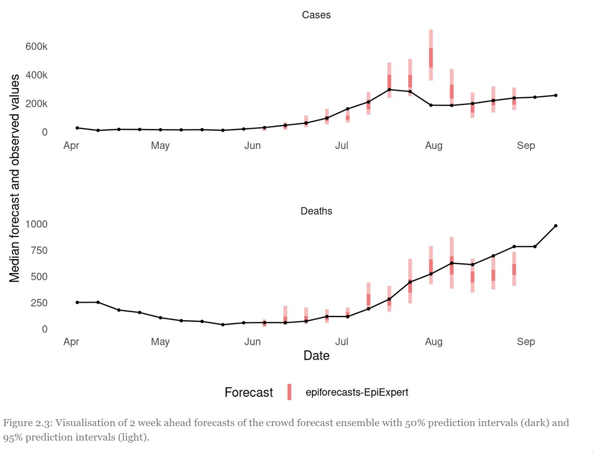
Let’s start with the data. The UK Forecasting Challenge spanned a long period of exponential growth as well as a sudden drop in cases at the end of July 3
Especially this peak was hard to predict and no forecaster really saw it coming. Red: aggregated forecast from different weeks, grey: individual participants. The second picture shows the range for which participants were 50% and 95% confident they would cover the true value
….
So what have we learned? – Human forecasts can be valuable to inform public health policy and can sometimes even beat computer models – Ensembles almost always perform better than individuals – Non-experts can be just as good as experts – recruiting participants is hard
Author(s): Nikos Bosse
Publication Date: Accessed 17 Oct 2021, twitter thread 15 Oct 21
This file describes analysis that was done by the Resource Watch team for Facebook to be used to display increased temperatures for select countries in their newly launched Climate Science Information Center. The goal of this analysis is to calculate the average monthly and annual temperatures in numerous countries at the national and state/provincial level and globally from 1950 through 2020.
Check out the Climate Science Information Center (CSIC) for up to date information on climate data in your area from trusted sources. And go to Resource Watch to explore over 300 datasets covering topics from food, forests, water, oceans, cities, energy, climate, and society. This analysis was originally performed by Kristine Lister and was QC’d by Weiqi Zhou.