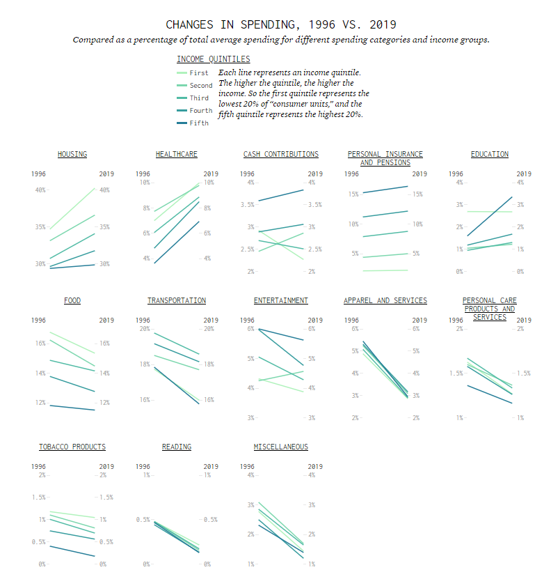
The categories are roughly ordered from increased spending to decreased spending. So you see by how much the cost of housing and healthcare has gone up over a couple of decades, especially for the lower income groups.
For the lowest income quintile, housing and healthcare make up more than half of spending on average.
In contrast, the higher income groups are spending more in retirement savings, education, and entertainment, and their cost of housing changed little.
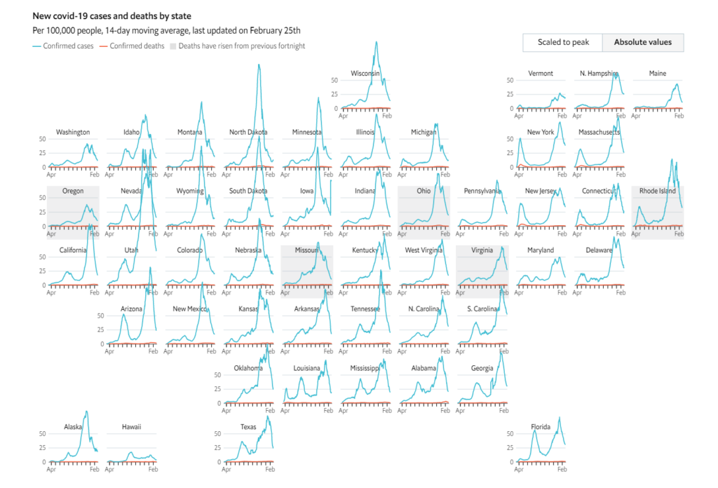
However, herd immunity will take months to achieve, and the sheer scale of infections in America dictates that covid-19 will not be under control for some time. In order to see where the pandemic is currently most severe across the nation, we have created an interactive map of covid-19 cases and deaths. It divides America into 500 areas. For each of these it shows cases and deaths per 100,000 people, so that infection and death rates in, say, New York City and its surrounds (population 40m) can be compared with those in Ironwood, Michigan (population 27,000).
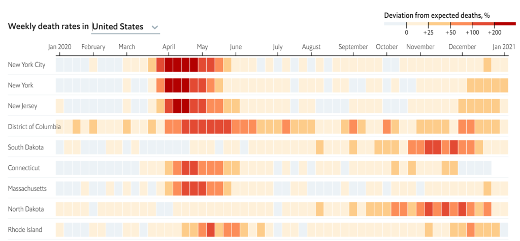
As covid-19 has spread around the world, people have become grimly familiar with the death tolls that their governments publish each day. Unfortunately, the total number of fatalities caused by the pandemic may be even higher, for several reasons. First, the official statistics in many countries exclude victims who did not test positive for coronavirus before dying—which can be a substantial majority in places with little capacity for testing. Second, hospitals and civil registries may not process death certificates for several days, or even weeks, which creates lags in the data. And third, the pandemic has made it harder for doctors to treat other conditions and discouraged people from going to hospital, which may have indirectly caused an increase in fatalities from diseases other than covid-19.
One way to account for these methodological problems is to use a simpler measure, known as “excess deaths”: take the number of people who die from any cause in a given region and period, and then compare it with a historical baseline from recent years. We have used statistical models to create our baselines, by predicting the number of deaths each region would normally have recorded in 2020.
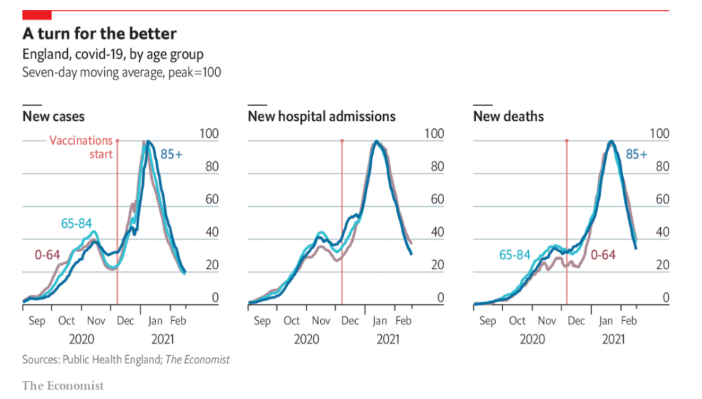
THE SECOND wave of the pandemic has been devastating in much of the world. Since September 1st covid-19 has claimed the lives of 1.6m people, compared with 850,000 in the preceding nine months. In America alone, the death toll passed 500,000 on February 22nd. What is more, new variants that may be more transmissible, more deadly or better at evading the body’s immune response are spreading.
At last, some optimism is budding. More than 200m doses of covid-19 vaccine have been administered across 92 countries. After a slow start, America’s programme is gathering speed: 16% of adults have received a first shot, and President Joe Biden is on target to meet his goal of 150m doses by his 100th day in office. The number of infections in the country is falling by half every 14 days.
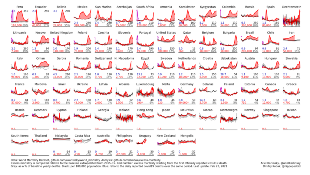
The data are sourced from the World Mortality Dataset. Excess mortality is computed relative to the baseline obtained using linear extrapolation of the 2015–19 trend. In the figure below, gray lines are 2015–19, black line is baseline for 2020, red line is 2020, purple line is 2021. Countries are sorted by the % increase over the baseline.
Red number: excess mortality starting from the first officially reported Covid-19 death. Gray number: excess mortality as a % of the annual baseline deaths. Black number: excess mortality per 100,000 population. Blue number: ratio to the daily reported Covid-19 deaths over the same period (sourced from JHU).
Data visualizations and graphs are increasingly common in both scientific and mass media settings. While graphs are useful tools for communicating patterns in data, they also have the potential to mislead viewers. In five studies, we provide empirical evidence that y-axis truncation leads viewers to perceive illustrated differences as larger (i.e., a truncation effect). This effect persisted after viewers were taught about the effects of y-axis truncation and was robust across participants, with 83.5% of participants across these 5 studies showing a truncation effect. We also found that individual differences in graph literacy failed to predict the size of individuals’ truncation effects. PhD students in both quantitative fields and the humanities were susceptible to the truncation effect, but quantitative PhD students were slightly more resistant when no warning about truncated axes was provided. We discuss the implications of these results for the underlying mechanisms and make practical recommendations for training critical consumers and creators of graphs.
Author(s): Brenda W. Yang, Camila Vargas Restrepo, Matthew L. Stanley, Elizabeth J. Marsha
Publication Date: 16 February 2021
Publication Site: Journal of Applied Research in Memory and Cognition
We are not born knowing instinctively how to read a bar chart or line chart or pie chart. Most of us learn those basic chart types in grade school. But there is a vast array of graphic types available that can effectively communicate your work to your audience.
To get you started, here are five graphs that perhaps you’ve never used before but that you should consider. They either do a better job showing certain types of data or they are more engaging and interesting than basic chart types.
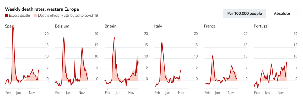
At the same time that covid-19 was devastating New York, cities in western Europe were also suffering severe outbreaks. Britain, Spain, Italy and Belgium have some of the highest national excess-death rates in the world, after adjusting for the size of their populations. France and Portugal locked down comparatively early, given the number of positive tests at the time. However, a second wave of covid-19 in winter has caused excess mortality to rise again across the region. (Some countries also recorded a small spike of non-covid fatalities during a heat wave in August.)
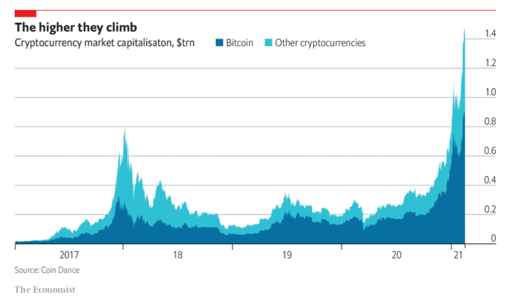
IT IS HARD to think of anything that has baffled financial analysts as much as the rise of bitcoin. When the digital currency lost over 80% of its value in 2018, many wondered if the crypto bubble had burst. But in the second half of last year bitcoin and other cryptocurrencies began to climb again. The price of the popular digital token has now passed $50,000, about five times as much as a year ago.
Recently, I came to the realization that 0 of my 58 published data visualizations on my Tableau Public profile provide equal access of their data and storylines for all users, mostly excluding those with disabilities. I have read and studied a lot about developing visuals with care for color blindness, but not so much for blindness itself, or low vision, or users who cannot use a mouse, or many other disabled users. A recent Twitter thread by our colleague Frank Elavsky hits on this topic. It is through these realizations that I decided to join and contribute to the dataviza11y group. A quick plug that we have a great group of people, looking to do some exciting things in this space, so do check out and follow that group and it’s member’s activities if you are interested. A wonderful and recent example is the talk Frank, Sarah Fossheim and Larene Le Gassick presented at Outlier.
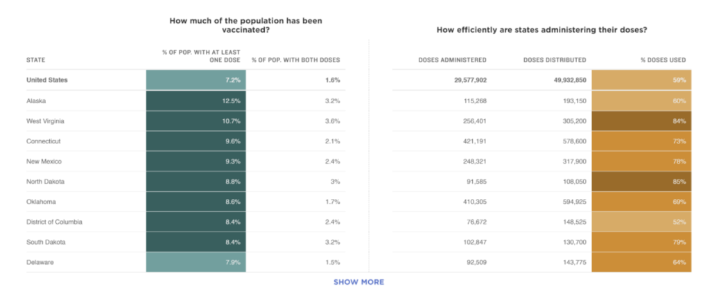
3. Display distribution (supply) and administration (demand) data together for a more complete picture of the vaccine rollout.
To make sense of what was happening with COVID cases, charts from groups like the COVID-19 Tracking Project clustered trends on testing, cases, hospitalizations, and deaths for a more complete picture. Similarly, we can’t look at data on doses administered in isolation to understand how a country or state is performing on vaccine rollout.
The New York Times displays a combination of the percent of people given at least one shot or two shots and information about the doses distributed and the share of doses used. Together, these metrics give a high level snapshot of information about supply distributed and administered. Note that understanding demand requires knowing more than how many people received shots though, which is likely influenced by supply.