Link: https://github.com/dkobak/excess-mortality
Graphic:
Excerpt:
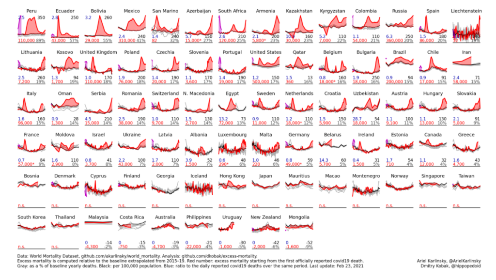
The data are sourced from the World Mortality Dataset. Excess mortality is computed relative to the baseline obtained using linear extrapolation of the 2015–19 trend. In the figure below, gray lines are 2015–19, black line is baseline for 2020, red line is 2020, purple line is 2021. Countries are sorted by the % increase over the baseline.
Red number: excess mortality starting from the first officially reported Covid-19 death.
Gray number: excess mortality as a % of the annual baseline deaths.
Black number: excess mortality per 100,000 population.
Blue number: ratio to the daily reported Covid-19 deaths over the same period (sourced from JHU).
Author(s): Dmitry Kobak
Date Accessed: 24 February 2021
Publication Site: github