Link: https://psyarxiv.com/4huvw
Graphic:
Abstract:
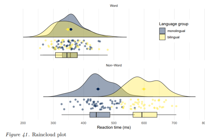
In addition to benefiting reproducibility and transparency, one of the advantages of using R is that researchers have a much larger range of fully customisable data visualisations options than are typically available in point and-click software, due to the open-source nature of R. These visualisation options not only look attractive, but can increase transparency about the distribution of the underlying data rather than relying on commonly used visualisations of aggregations such as bar charts of means. In this tutorial, we provide a practical introduction to data visualisation using R, specifically aimed at researchers who have little to no prior experience of using R. First we detail the rationale for using R for data visualisation and introduce the “grammar of graphics” that underlies data visualisation using the ggplot package. The tutorial then walks the reader through how to replicate plots that are commonly available in point-and-click software such as histograms and boxplots, as well as showing how the code for these “basic” plots can be easily extended to less commonly available options such as violin-boxplots. The dataset and code used in this tutorial as well as an interactive version with activity solutions, additional resources and advanced plotting options is available at https://osf.io/bj83f/. This is a pre-submission manuscript and tutorial and has not yet undergone peer review. We welcome user feedback which you can provide using this form: https://forms.office.com/r/ba1UvyykYR. Please note that this tutorial is likely to undergo changes before it is accepted for publication and we would encourage you to check for updates before citing.
Nordmann, Emily, Phil McAleer, Wilhelmiina Toivo, Helena Paterson, and Lisa M. DeBruine. 2021. “Data Visualisation Using R, for Researchers Who Don’t Use R.” PsyArXiv. June 21. doi:10.31234/osf.io/4huvw.
Additional materials: https://osf.io/bj83f/wiki/home/
Author(s): Emily Nordmann, Phil McAleer, Wilhelmiina Toivo, Helena Paterson, Lisa M. DeBruine
Publication Date: 21 June 2021
Publication Site: PsyArXiv