Link: https://policyviz.com/2021/05/11/fourplus-ways-to-visualize-geographic-time-data/
Graphic:
Excerpt:
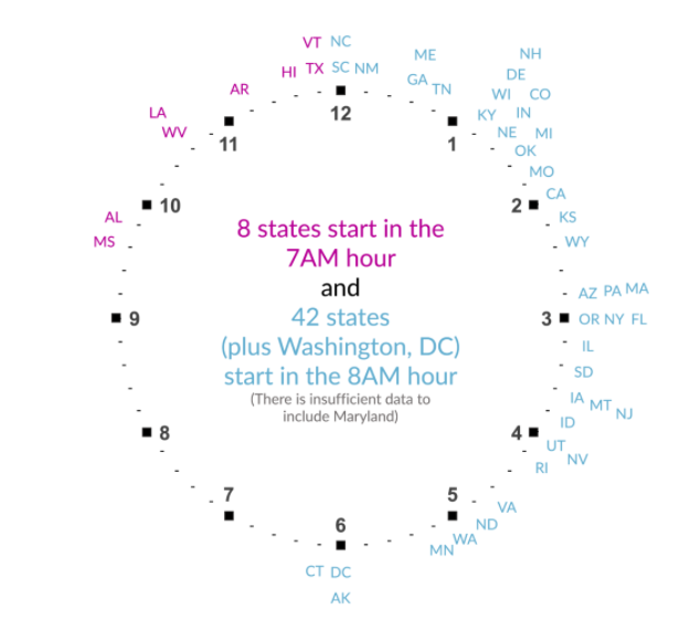
The last visualization I tried was to really embrace the idea of time in the data. Instead of a map or bar chart or something else, I placed the state abbreviations around two clock faces. I know it sounds weird, but take a look at the final version.
I think this is a fun visualization, and it communicates more precisely the exact average starting times than the previous graphs. The two clocks could be combined to one, but I worry it’s not quite as clear, so I tried using the different colors to differentiate the two hours.
Author(s): Jon Schwabish
Publication Date: 11 May 2021
Publication Site: PolicyViz