The Fed’s Dot Plot of Interest Rate Projections Show It’s Totally Confused

Link: https://mishtalk.com/economics/the-feds-dot-plot-of-interest-rate-projections-show-its-totally-confused

Graphic:

Excerpt:

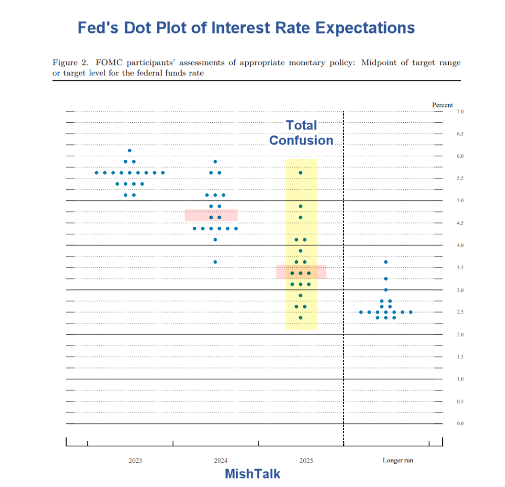
The Fed’s Summary of Economic projections is far more interesting. I highlighted the median economic forecast in pink. Each dot represents the position of someone at the meeting.

Looking ahead to 2025, the Fed is clueless. 

Actually, that’s not a bad thing. Someone on the committee is likely to be correct.

Moreover, the results look like one of my favorite sayings: I don’t know and no one else does either, especially the Fed.

Author(s): Mike Shedlock

Publication Date: 14 Jun 2023

Publication Site: Mish Talk
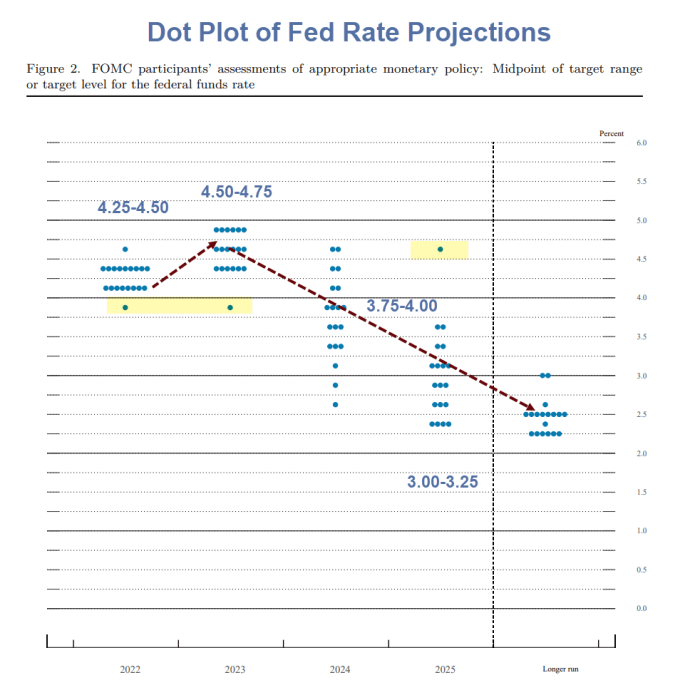
Dot Plot Show Fed Anticipates More Hikes in 2023 to 4.50 Percent

Link: https://mishtalk.com/economics/dot-plot-show-fed-anticipates-more-hikes-in-2023-to-4-50-percent

Graphic:

Excerpt:

Hikes Come Hell or High Water? 

  • The Fed participants have a median expectation of 4.25 to 4.50 percent for the end of 2022
  • That’s another 1.25 percentage points more this year.
  • The Fed then anticipates one more hike in 2023 to 4.50 to 4.75 percent.

I have to admit that a year ago I did not foresee this. But here we are. 

The key question is not where we’ve been but where we are headed. I Highly doubt the Fed hikes another 1.25 percentage points this year or gets anywhere close to 4.50 to 4.75 percent in 2023.

Author(s): Mike Shedlock

Publication Date: 21 Sept 2022

Publication Site: Mish Talk

Fed Hikes Rates 75 Basis Points; Powell Says 75 or 50 Likely in July

Link: https://www.thinkadvisor.com/2022/06/15/fed-hikes-rates-75-bps-intensifying-inflation-fight/

Graphic:

Excerpt:

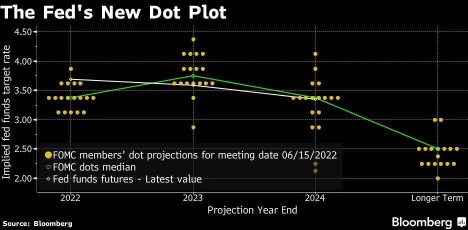
The Federal Reserve raised interest rates by 75 basis points — the biggest increase since 1994 — and Chair Jerome Powell said officials could move by that much again next month or make a smaller half-point increase to get inflation under control.

Slammed by critics for not anticipating the fastest price gains in four decades and then for being too slow to respond to them, Chairman Jerome Powell and colleagues on Wednesday intensified their effort to cool prices by lifting the target range for the federal funds rate to 1.5% to 1.75%.

“I do not expect moves of this size to be common,” he said at a press conference in Washington after the decision, referring to the larger increase. “Either a 50 basis point or a 75 basis-point increase seems most likely at our next meeting. We will, however, make our decisions meeting by meeting.”

Author(s): Craig Torres

Publication Date: 15 June 2022

Publication Site: Think Advisor

Major Divergences: ECB Says No Hikes in 2022, Fed Sees 3 Hikes, BOE Hiked Today

Link:https://mishtalk.com/economics/major-divergences-ecb-says-no-hikes-in-2022-fed-sees-3-hikes-boe-hiked-today

Graphic:

Excerpt:

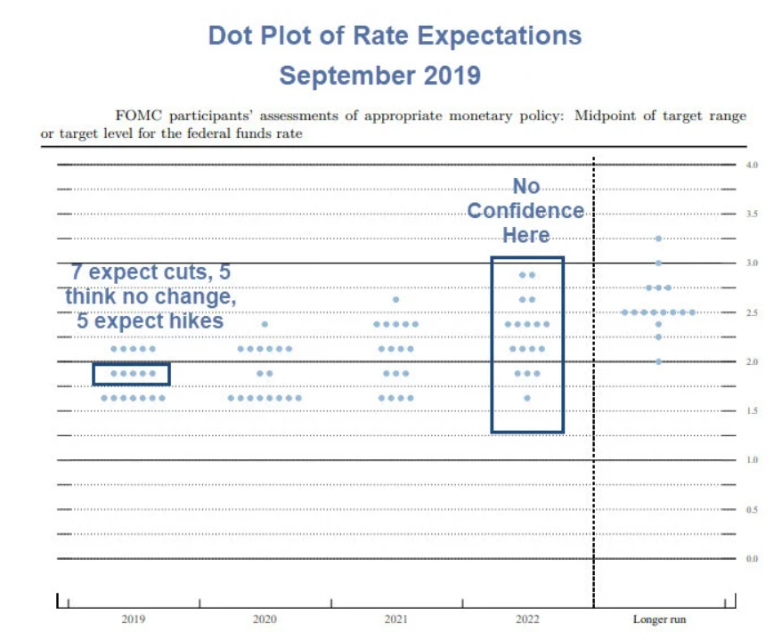
How many rate hikes are coming? The Fed thinks 6 by the end of 2023. I am unconvinced the Fed gets in any hikes in 2022 and certainly not 6 by the end of 2023.

These ridiculous predictions assume there will not be another recession in “the longer run”. 

Central banks like to pretend they will hike, but by the time comes, they have delayed so long they find an excuse to no do so. 

Possible excuses: A recession, stock market plunge, another pandemic, global warming, global cooling, or an asteroid crash. 

Central banks will find some excuse to delay hikes. But the most likely excuse is a recession or stock market crash. 

Author(s): Mike Shedlock

Publication Date: 16 Dec 2021

Publication Site: Mish Talk

Four(plus) Ways to Visualize Geographic Time Data

Link: https://policyviz.com/2021/05/11/fourplus-ways-to-visualize-geographic-time-data/

Graphic:

Excerpt:

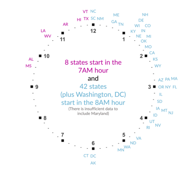
The last visualization I tried was to really embrace the idea of time in the data. Instead of a map or bar chart or something else, I placed the state abbreviations around two clock faces. I know it sounds weird, but take a look at the final version.

I think this is a fun visualization, and it communicates more precisely the exact average starting times than the previous graphs. The two clocks could be combined to one, but I worry it’s not quite as clear, so I tried using the different colors to differentiate the two hours.

Author(s): Jon Schwabish

Publication Date: 11 May 2021

Publication Site: PolicyViz

Five Charts You’ve Never Used but Should

Link: https://policyviz.com/2021/02/08/five-charts-youve-never-used-but-should/

Graphic:

Excerpt:

We are not born knowing instinctively how to read a bar chart or line chart or pie chart. Most of us learn those basic chart types in grade school. But there is a vast array of graphic types available that can effectively communicate your work to your audience.

In my new book, Better Data Visualizations: A Guide for Scholars, Researchers, and Wonks, I survey more than eighty visualization types, everything from histograms to horizon charts, ridgeline plots to choropleth maps, and explain how each has its place in the visual toolkit.

To get you started, here are five graphs that perhaps you’ve never used before but that you should consider. They either do a better job showing certain types of data or they are more engaging and interesting than basic chart types.

Author(s): Jonathan Schwabish

Publication Date: 8 February 2021

Publication Site: PolicyViz