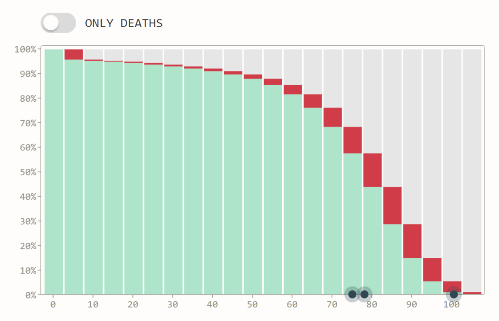
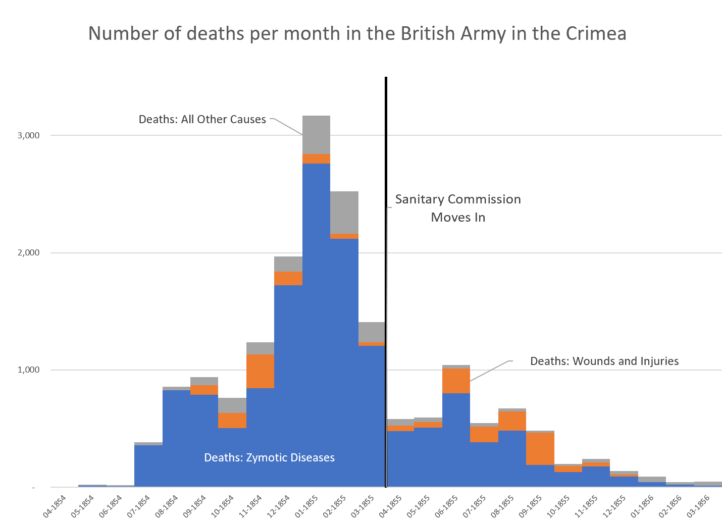
Florence Nightingale is a Design Hero

Link: https://medium.com/nightingale/florence-nightingale-is-a-design-hero-8bf6e5f2147

Graphic:

Excerpt:

On trips through Europe, Nightingale displayed a natural inclination to record data: distance and times traveled were neatly cataloged in her journal. She hoarded information pamphlets, especially those concerning laws, social conditions, and benevolent institutions. In a Parisian salon, Mary Clarke showed Nightingale how bold, independent, intelligent, and equal to men a woman can be.

In Egypt, Nightingale cruised the Nile and discovered ancient mysticism. Near Thebes, God called Florence Nightingale to nursing. God called me in the morning and asked me would I do good for him alone without reputation. But rich kids do not become nurses. Nursing was below Nightingale’s class. Her family disapproved.

Author(s): RJ Andrews

Publication Date: 15 July 2019

Publication Site: Nightingale at Medium

Survival Curves

Link: https://labs.minutelabs.io/survival-curves/#/

Graphic:

Excerpt:

Every green block shows the fraction of individuals that are still alive when they reach that age. The red blocks show the fraction that died since the previous age group.

LIFE EXPECTANCY AT BIRTH

If we add up all the areas of the red blocks (deaths) and divide by 100%, we get the expected age an individual would die at (aka: life expectancy at birth). Humans mostly live around 75 years after birth.

Author(s): Jasper Palfree

Date Accessed: 15 March 2021

Publication Site: Minutelabs.io

The COVID-19 Pandemic – One Year In

Graphic:

Excerpt:

Exactly one year ago today, the World Health Organization (WHO) officially declared COVID-19 to be a global pandemic. 

In the days that followed, the ripple effects would be felt across society, impacting almost every aspect of everyday life. Although rising case and death counts, lockdowns, job losses, and crashing markets have been at the forefront of the news cycle, the full breadth and scale of events taking place over the last year are worth reflecting on in more detail.

To commemorate the one-year anniversary of the onset of COVID-19, we’ve compiled a number of original visual resources to help put the pandemic in perspective. This includes our mega COVID-19 timeline as well as many other interesting visualizations we link to below. 

Author(s): Jeff Desjardins

Publication Date: 11 March 2021

Publication Site: Visual Capitalist

Graphing the pandemic

Link: https://www.axios.com/graphing-the-pandemic-6b62e35a-8481-4287-bcab-70d4b2fc2091.html

Graphic:

Excerpt:

2020: The year the y-axis broke

Why it matters: Changes that typically take months or years to show up on a trend line started happening in weeks — resulting in a year of numerical outliers that will be breaking the axis for decades to come.

The result was two-fold:

Y-axes need to be continually adjusted to accommodate ever-higher numbers.

Longer term, there’s now a year of graphical outliers that future charts will have to account for.

Author(s): Mike Allen

Publication Date: 13 March 2021

Publication Site: Axios

Why humans love pie charts

Link: https://blog.usejournal.com/why-humans-love-pie-charts-9cd346000bdc

Graphic:

Excerpt:

We might think of the pie chart as a fairly recent invention, with arguably more flaws than benefits, in regards to the statistical portrayal of data. However, if we look deep into history we realize this popular chart is only a recent manifestation of an ancient visual motif that carried meaning to numerous civilizations over space and time. A graphical construct of radiating lines enclosed by a circle, this motif is also a powerful perceptual recipe. If we look deep into ourselves we uncover a strong proclivity for such a visual pattern, despite the final message it might carry. As one of the oldest archetypes of the circular diagram, the sectioned circle will certainly outlast all of us, and indifferent to criticism, I suspect, so will the pie chart.

Author(s): Manuel Lima

Publication Date: 23 July 2018

Publication Site: Noteworthy – the Journal blog

Geeking Out: Florence Nightingale, Data Visualization Pioneer – and Redoing Her Famous Graph

Link: https://marypatcampbell.substack.com/p/geeking-out-florence-nightingale

Graphic:

Excerpt:

There is a problem with the table, which a fellow actuary pointed out to me. I will explain that after I fix the graph.

Let’s start with the simplest graph: total deaths by type (zymotic disease, wounds, and battle fatalities)

I switched up the order of items and changed my presentation for the stacked column graph version:

Author(s): Mary Pat Campbell

Publication Date: 10 March 2021

Publication Site: STUMP on Substack

five questions for better data communications

Link: https://www.storytellingwithdata.com/blog/2021/1/10/lets-improve-this-graph-yt9xj

Graphic:

Excerpt:

Although we don’t have the full context behind this example, let’s assume that the audience is a new senior product manager developing next year’s promotional strategy and needs to understand recent changes in the marketplace. I’ll use the Big Idea worksheet to form my single-sentence main message:

To offset a 24% sales decline due to COVID-19 and increase market share next year, consider how customers are opting for different purchase types as we form our new promotional strategy.

The action my audience needs to take is to use their newfound understanding of shifting purchase types to develop future promotional strategies. Having identified the next step, I can now choose which graph(s) will best drive this discussion. I’ll opt for the line graph to show the historical total sales decline, paired with the slopegraph to emphasize the shift in purchase types:

Author(s): Elizabeth Ricks

Publication Date: 8 March 2021

Publication Site: storytelling with data

QUESTION 2: Am I using color intentionally?

Link: http://www.storytellingwithdata.com/blog/2021/1/11/the-most-important-dataviz-decision-you-make

Graphic:

Excerpt:

To create more impactful explanatory visuals, develop the habit of using color in a purposeful way. When applied thoughtfully, color is arguably the most important decision you make when focusing your audience’s attention where you want it. 

One way to start is by overriding the default color palette of your data viz tool and start with nothing emphasized.

Author(s): Elizabeth Ricks

Publication Date: 11 January 2021

Publication Site: storytelling with data

Three Things You Can do to Make Your Data Tables More Visual

Link: https://policyviz.com/2021/03/02/three-things-you-can-do-to-make-your-data-tables-more-visual/

Graphic:

Excerpt:

One last option is to add sparklines. Sparklines are small line charts that are typically used in data-rich tables, often at the end of a row or column. The purpose of sparklines is not necessarily to help the reader find specific values but instead to show general patterns and trends. Here, the sparklines show all five years of data, which allows us to omit three columns of numbers, lightening and simplifying the table. This approach lets us show the full time series in the sparklines while just showing the two endpoints in the table cells.

Author(s): Jon Schwabish

Publication Date: 2 March 2021

Publication Site: PolicyViz

Style Guides

Link: https://policyviz.com/2016/11/30/style-guides/

Excerpt:

In the previous iteration of this site, I reserved a special page dedicated to collecting Data Visualization Style Guides. I’m republishing that collection here as a blog post with the rekindled hope that readers will add their own or their organization’s guides to the collection.

The original idea was developed at the Responsible Data Forum in New York City on January 11, 2016. It’s simply a list of data visualization style guides provided in no particular order. The idea is to build a collection of guides that layout style, formatting, and perhaps some other basic recommendations. These should not necessarily be documents that describe “best practices” or “dos and don’ts”.

My hope is that this post will serve as a repository for guides from around the world that others can use to develop their own guides and best practices. The list was originally published in January 2016, started small, and has grown to more than 15 documents. But I’m sure there is more, so please send me your suggestions and links using the comment box below, via the Contact form, or on Twitter.

Author(s): Jon Schwabish

Date Accessed: 8 March 2021

Publication Site: PolicyViz

Pandemic’s Racial Disparities Persist in Vaccine Rollout

Link: https://www.nytimes.com/interactive/2021/03/05/us/vaccine-racial-disparities.html

Graphics:

Excerpt:

As of March 3, 38 states publicly shared race and ethnicity data for vaccinated people. The jurisdictions define race and ethnicity categories in slightly different ways, and with different levels of completeness — in some states as much as a third of vaccinations are missing race and ethnicity data.

Public health experts have said that despite these data limitations, the patterns emerging across states are clear.

“People of color are getting vaccinated at rates below their representation of the general population,” Dr. Marcella Nunez-Smith, the chair of President Biden’s coronavirus equity task force, said at a recent forum on the vaccine. “This narrative can be changed. It must be changed.”

Author(s): Amy Schoenfeld Walker, Anjali Singhvi, Josh Holder, Robert Gebeloff, Yuriria Avila

Publication Date: 5 March 2021

Publication Site: New York Times

The Violin Plot

Graphic:

Excerpt:

How to interpret a violin plot? While they may look a bit overwhelming at first sight to understand, violin plots are easy to read. I created a graph that shows the anatomy of the volin plot. The top, bottom and middle of the violin are the highest, lowest and middle value point respectively, while the widest part of the violin shows the highest probability. The widest part of the violin can appear on any spectrum of its height, it can be close to the highest, lowest or mid value point.

Author(s): stelayordanova

Publication Date: 3 March 2021

Publication Site: stelayordanova