Link: https://www.storytellingwithdata.com/blog/2021/1/10/lets-improve-this-graph-yt9xj
Graphic:
Excerpt:
Although we don’t have the full context behind this example, let’s assume that the audience is a new senior product manager developing next year’s promotional strategy and needs to understand recent changes in the marketplace. I’ll use the Big Idea worksheet to form my single-sentence main message:
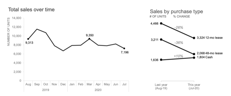
To offset a 24% sales decline due to COVID-19 and increase market share next year, consider how customers are opting for different purchase types as we form our new promotional strategy.
The action my audience needs to take is to use their newfound understanding of shifting purchase types to develop future promotional strategies. Having identified the next step, I can now choose which graph(s) will best drive this discussion. I’ll opt for the line graph to show the historical total sales decline, paired with the slopegraph to emphasize the shift in purchase types:
Author(s): Elizabeth Ricks
Publication Date: 8 March 2021
Publication Site: storytelling with data