What to consider when using text in data visualizations

Link: https://blog.datawrapper.de/text-in-data-visualizations/

Graphic:

Excerpt:

Text is maybe the most underrated element in any data visualization. There’s a lot of text in any chart or map — titles, descriptions, notes, sources, bylines, logos, annotations, labels, color keys, tooltips, axis labels — but often, it’s an afterthought in the design process. This article explains how to use text to make your visualizations easier to read and nicer to look at.

Show information where readers need it
01 Label directly
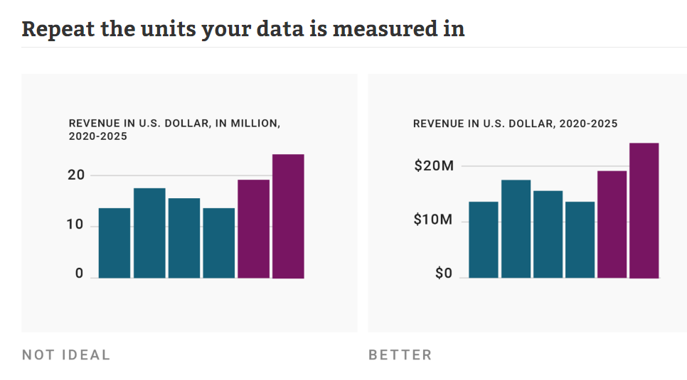
02 Repeat the units your data is measured in
03 Remind people what they’re looking at in tooltips
04 Move the axis ticks where they’re needed
05 Emphasize and explain with annotations

Design for readability
06 Use a font that’s easy to read
07 Lead the eye with font sizes, styles, and colors
08 Limit the number of font sizes in your visualization
09 Don’t center-align your text
10 Don’t make your readers turn their heads
11 Use a text outline

Phrase for readability
12 Use straightforward phrasings
13 Be conversational first and precise later
14 Choose a suitable number format

Author(s): Lisa Charlotte Muth

Publication Date: 28 Sept 2022

Publication Site: Datawrapper

Data visualisation by hand: drawing data for your next story

Link: https://datajournalism.com/read/longreads/data-visualisation-by-hand

Graphic:

Excerpt:

We live in a world where data visualisations are done through intricate code and graphic design. From Tableau to Datawrapper and Python and R, numerous possibilities exist for visualising compelling stories. But in the beginning, all data visualisation was done by hand. Visualisation pioneers like W. E. B. Du Bois and Florence Nightingale hand-drew their visualisations because there was simply no other way to make them.

For Du Bois it was his team of black sociologists who explained institutionalised racism to the world using data visualisations, while for Nightingale it was her diagram showing the causes of mortality.

And, even as computers developed, it was often easier to visualise using analogue means. This article will explore the history of hand-drawn visualisations and the case for presenting them in this style. It will also show examples from experts who have opted for the pencil over the screen. You’ll also learn some top tips to help get you started.

Author(s): Amelia McNamara

Publication Date: 24 March 2021

Publication Site: DataJournalism.com

five questions for better data communications

Link: https://www.storytellingwithdata.com/blog/2021/1/10/lets-improve-this-graph-yt9xj

Graphic:

Excerpt:

Although we don’t have the full context behind this example, let’s assume that the audience is a new senior product manager developing next year’s promotional strategy and needs to understand recent changes in the marketplace. I’ll use the Big Idea worksheet to form my single-sentence main message:

To offset a 24% sales decline due to COVID-19 and increase market share next year, consider how customers are opting for different purchase types as we form our new promotional strategy.

The action my audience needs to take is to use their newfound understanding of shifting purchase types to develop future promotional strategies. Having identified the next step, I can now choose which graph(s) will best drive this discussion. I’ll opt for the line graph to show the historical total sales decline, paired with the slopegraph to emphasize the shift in purchase types:

Author(s): Elizabeth Ricks

Publication Date: 8 March 2021

Publication Site: storytelling with data