All of US: a dot density map of the United States

Link: https://all-of-us.benschmidt.org/

Graphic:

Excerpt:

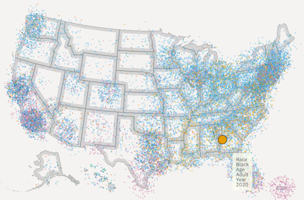
One point per person in the US for the 2010 and 2020 censuses, fully zoomable and interactive using WebGL and [Deepscatter](https://github.com/CreatingData/deepscatter). Since this uses WebGL individual point rendering and quadtiled data, it can be far more responsive than raster-based maps you may have seen in 2010. Plus, if you zoom all the way in in some views it has little person glyphs!

Author(s): Ben Schmidt

Publication Date: accessed 2 Dec 2022

Publication Site: Ben Schmidt’s personal site

Mapped: A Decade of Population Growth and Decline in U.S. Counties

Link: https://www.visualcapitalist.com/mapping-a-decade-of-us-population-growth/

Graphic:

Excerpt:

If an area sees a high number of migrants, along with a strong birth rate and low death rate, then its population is bound to increase over time. On the flip side, if more people are leaving the area than coming in, and the region’s birth rate is low, then its population will likely decline.

Which areas in the United States are seeing the most growth, and which places are seeing their populations dwindle?

This map, using data from the U.S. Census Bureau, shows a decade of population movement across U.S. counties, painting a detailed picture of U.S. population growth between 2010 and 2020.

Author(s): Nick Routley
Article/Editing: Carmen Ang

Publication Date: 16 Jun 2022

Publication Site: Visual Capitalist

More than Half of U.S. Counties Were Smaller in 2020 Than in 2010

Link: https://www.census.gov/library/stories/2021/08/more-than-half-of-united-states-counties-were-smaller-in-2020-than-in-2010.html

Graphic:

Excerpt:

Almost half (47%) of U.S. counties or equivalents gained population between 2010 and 2020 (Figure 1).

Five counties (metro areas in parentheses) gained at least 300,000 people during that period: Harris County, Texas (Houston-The Woodlands-Sugar Land); Maricopa County, Arizona (Phoenix-Mesa-Chandler); King County, Washington (Seattle-Tacoma-Bellevue); Clark County, Nevada (Las Vegas-Henderson-Paradise); and Tarrant County, Texas (Dallas-Fort Worth-Arlington).

California’s Los Angeles County remained the largest county in 2020, crossing the 10.0 million-person mark between 2010 and 2020.

Author(s): PAUL MACKUN, JOSHUA COMENETZ, AND LINDSAY SPELL

Publication Date: 12 August 2021

Publication Site: U.S. Census Bureau

We’re Going The Wrong Way

Link: https://www.dailyposter.com/were-going-the-wrong-way/

Graphic:

Excerpt:

Science has provided America with a decent idea of which areas of our country will be most devastated by climate change, and which areas will be most insulated from the worst effects. Unfortunately, it seems that population flows are going in the wrong direction — today’s new Census data shows a nation moving out of the safer areas and into some of the most dangerous places of all.

…..

Some of the examples are genuinely mind-boggling. For instance, upstate New York is considered one of the country’s most insulated regions in the climate crisis — and yet almost all of upstate New York saw population either nearly flat or declining. At the same time, there were big population increases in and around the Texas gulf coast, which is threatened by extreme heat and coastal flooding.

Similarly, the city of Philadelphia is comparatively well situated in the climate crisis — but it saw only modest population growth of 5 percent. It was surpassed on the list of biggest cities by Phoenix, which saw an 11 percent population growth, despite that city facing some of the worst forms of extreme heat and drought in the entire country.

Author(s): David Sirota, Julia Rock

Publication Date: 12 August 2021

Publication Site: The Daily Poster

Population Growth Sputters in Midwestern, Eastern States

Link: https://www.pewtrusts.org/en/research-and-analysis/articles/2021/07/27/population-growth-sputters-in-midwestern-eastern-states

Graphic:

Excerpt:

Apart from states with declines—West Virginia, Mississippi, and Illinois—the slowest population growth rates were recorded in Connecticut (0.09%); Michigan (0.19%); and Ohio, Wyoming, and Pennsylvania (0.23% each).

States experiencing their slowest decade of growth ever were Illinois, Connecticut, and six others: Missouri (0.27%), Wisconsin (0.36%), California (0.60%), Hawaii (0.68%), Arizona (1.13%), and Florida (1.37%).

After Utah, Idaho, and Texas, the next fastest-growing states over the past decade were North Dakota (1.48%), Nevada (1.40%), Colorado (1.39%), and Washington and Florida (both 1.37%).

Growth was faster in the 2010s than in the 2000s in only 12 states: Iowa, Louisiana, Massachusetts, Michigan, Nebraska, New Jersey, New York, North Dakota, Ohio, Rhode Island, South Dakota, and Washington.

Author(s): Barb Rosewicz, Melissa Maynard, Alexandre Fall

Publication Date: 27 July 2021

Publication Site: Pew

A Preliminary Analysis of U.S. and State-Level Results From the 2020 Census

Link: https://www.census.gov/library/working-papers/2021/demo/POP-twps0104.html

Graphic:

Choropleth of change in population by state (plus DC & Puerto Rico), 2010-2020

Description:

This paper considers the 2020 Census national and state-level resident population counts in historical and evaluative contexts. By comparing the first results of the 2020 Census against benchmark data sources, we examine how the nation has changed at the highest levels and set the stage for the comprehensive analyses still to come.

Link to paper: https://www.census.gov/content/dam/Census/library/working-papers/2021/demo/pop-twps0104.pdf

Publication Date: 26 April 2021

Publication Site: Census Bureau

Census To Release 1st Results That Shift Electoral College, House Seats

Link: https://www.npr.org/2021/04/26/983082132/census-to-release-1st-results-that-shift-electoral-college-house-seats

Graphic:

Excerpt:

Based on the bureau’s estimates, the latest tally is likely to show that the growth in the number of people living in the U.S. has slowed to the lowest rate the country has seen since the 1940 census was conducted in the wake of the Great Depression. Disruptions from COVID-19 during last year’s counting, however, have made shifts in each state’s population particularly hard to predict.

Last year’s tally was the country’s 24th census — a once-a-decade tradition required by the Constitution since 1790 — and it is the ninth count for which the U.S. government has attempted to include every person living in the country in the numbers used for reapportioning seats in Congress. Before the 1940 census, the phrase “excluding Indians not taxed” in the Constitution excluded some American Indians from the apportionment counts.

Author(s): Hansi Lo Wang

Publication Date: 26 April 2021

Publication Site: Morning Edition on NPR

Geeking Out: House of Representatives Apportionment Visualization 1910-2010

Link: https://marypatcampbell.substack.com/p/geeking-out-house-of-representatives

Graphic:

Excerpt:

So you can see how the dominating states change in the House of Representatives:

in 1910, it was Illinois, Ohio, Pennsylvania, and New York

in 2010, it was New York, California, Texas, and Florida

While New York was a large state throughout this visualization, Ohio, Pennsylvania, and Illinois dropped out and California, Texas, and Florida rose up.

Author(s): Mary Pat Campbell

Publication Date: 24 March 2021

Publication Site: STUMP at Substack

Finding ‘Anomalies’ Illustrates 2020 Census Quality Checks Are Working

Link: https://www.census.gov/newsroom/blogs/random-samplings/2021/03/finding_anomalies.html?utm_campaign=20210309msc20s1ccpuprs&utm_medium=email&utm_source=govdelivery

Excerpt:

So far in 2020 Census processing, 27 of the 33 anomalies we’ve found are of this type. Let me give a couple of examples.

Miscalculating age for missing birthdays. We found that our system was miscalculating ages for people who included their year of birth but left their birthday and month blank. We fixed this with a simple code correction. Making sure ages calculate correctly helps us with other data processing steps for matching and removing duplicate responses.

Incorrectly sorting out self-responses from group quarters residents. The 2020 Census allowed people to respond online or by phone without using the pre-assigned Census ID that links their response to their address. As a result, some people who live in group quarters facilities, such as nursing homes, were able to respond on their own even though they were also counted through the separate Group Quarters Enumeration operation. This also makes their address show up as a duplicate — as both a group quarters facility and a housing unit. Our business rules sort out these duplicate responses and addresses by accepting the response coming from the group quarters operation and removing the response and address appearing as a housing unit. We found an error in how this rule was being carried out. The code was correctly removing the duplicate address but wasn’t removing the duplicate response. We fixed this with another code correction, which enables us to avoid overcounting these residents. 

Author(s): MICHAEL THIEME, ASSISTANT DIRECTOR FOR DECENNIAL CENSUS PROGRAMS, SYSTEMS AND CONTRACTS

Publication Date: 9 March 2021

Publication Site: U.S. Census Bureau