Young women would have to work nearly 40 years longer than men to build up the same retirement pot, according to a report highlighting the pensions gender gap.
The average woman in her 20s can expect to have £100,000 less in her pension pot than a man of the same age as a result of earning less, working part-time, and taking time out of paid employment to care for family members.
The calculations, made by pensions company Scottish Widows to coincide with International Women’s Day, showed that a female saver would typically save £2,200 annually for the first 15 years of her career, compared with £3,300 for a young man. The average woman in her 20s today would have to work 37 years longer than a man of the same age to reach retirement parity.
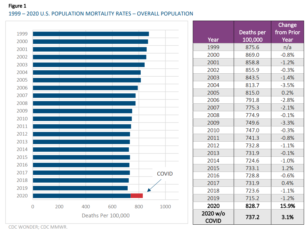
The overall age-adjusted mortality rate for 2020 was 828.7 deaths per 100,000 of population. This rate was 15.9% greater than the 2019 overall age-adjusted mortality rate. This high level of mortality has not been experienced in the U.S. since 2003.
If deaths coded as COVID (COVID deaths)3 were excluded, the overall age-adjusted 2020 mortality rate would have been 737.2 per 100,000 or 3.1% higher than the 2019 rate. This increase excluding COVID deaths is also noteworthy because it reverses the two previous calendar years of decreasing mortality; however, some or all of this may be due to the misclassification of CODs as discussed in Section 6.
2020 mortality rates increased in both sexes, with the male rates increasing more than the female rates. The differences in the increases between males and females were about 3% when all causes of death (CODs) are included and about 1% when COVID deaths are excluded.
The slope of the 2020 COVID mortality curve by age group is not as steep as the slope of the non-COVID deaths, indicating that COVID impacts younger ages more evenly across age groups that all other non-COVID CODs combined.
In the review of the 2020 mortality rates by age group, it is interesting to see that the highest percentage increases were in the younger adult ages, not at the very old ages. When COVID deaths were removed, ages 15-44 saw the largest increases in mortality rates.
The aim of this site is to give comprehensible information about trends for cause-specific mortality in different population. Charts may be viewed or downloaded after choice of population, age group and cause of death group. The measures shown in the charts have been calculated using open data from WHO (2017), but the WHO are not responsible for any content on the site. For some countries where population is not available from WHO (2017) for recent years, estimates from United Nations Department of Economic and Social Affairs, Population Division (2015) is used instead.
There are several other websites with visualizations of mortality trends. One of the most advanced is IHME (2015), which contains data for all countries in the world, and uses complicated algorithms to adjust for uncertainties in the underlying data. On this website, the charts are generated dynamically, and the sites may sometimes be slow. Moreover, the visualizations do not go further back in time than 1980, while WHO (2017) has data available from 1950, for several populations. Whitlock (2012) is a website with a great number of static charts based on WHO (2017). This website is no longer maintained, however, because its creator has died.
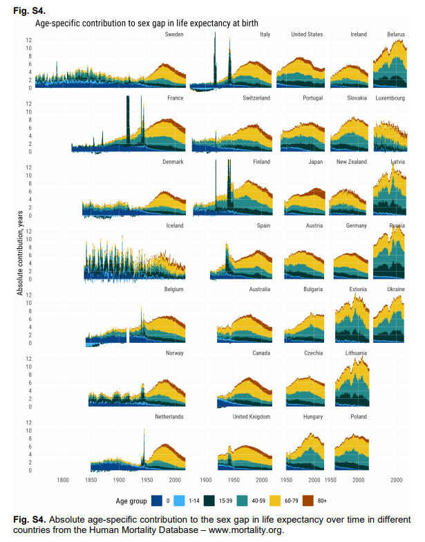
Female life expectancy exceeds male life expectancy. Males at ages 15 to 40 die at rates that are often three times female levels, but this excess mortality is not the main cause of the life expectancy gap. Few deaths occur at younger adult ages compared with mortality after age 60 or, historically, among newborns. Our demographic analysis shows that, up through the early decades of the 20th century, the life expectancy gap largely resulted from excess deaths of infant boys. Afterward, higher mortality among men 60+ became crucial. The higher mortality of males at ages 15 to 40 has played a modest role.
Author(s): Virginia Zarulli, Ilya Kashnitsky, James W. Vaupel
“Labor force participation—defined as all civilians working full or part time, as well as those who are unemployed but looking for work—fell dramatically for both genders between March and April 2020,” noted Gallup. In April 2020, men’s labor force participation was at 97.8 percent of its February 2020 level and women’s labor force participation was 96.9 percent of its February 2020 level—a gender gap of just 0.9* percentage points.
By February 2021, labor force participation for both sexes had ticked back up somewhat. And while women were still seeing a less full recovery, the gap was again less than one percentage point. Compared to February 2020, men’s February 2021 labor force participation was 2.2 percent smaller and women’s was 3.1 percent smaller.
That’s not nothing—“the gap in labor force changes amounts to roughly 493,000 more women than men being absent from the labor force since the pandemic began,” Gallup pointed out in early March. But it’s also not evidence that women have been uniquely devastated by pandemic-related job losses, especially when—contra previous economic downturns—many of the circumstances that initially created the job losses will remedy quickly as life returns to a more normal pace.
Black and Hispanic women disproportionately work in industries — such as leisure and hospitality — that were most negatively affected by the pandemic, said Valerie Wilson, director of the Economic Policy Institute’s Program on Race, Ethnicity and the Economy.
Since February of last year, participation rates for white women, including mothers, haven’t dropped more than 3.2 percentage points. Rates for women of color — especially Black and Hispanic mothers with children under 5 — have at times fallen more.
Large numbers of Black and Hispanic women work in essential sectors — most notably healthcare — that have seen increased demand in the past year. But in those industries, according to Dr. Wilson, they tend to hold jobs that offer comparatively low pay and flexibility.
The average number of hours men and women work per week has varied more widely since the start of the pandemic than in recent years. People have worked fewer hours overall, with men’s time dropping more significantly. That has narrowed — but not closed — the gap between hours worked by men and women.
The difference between the mean retirement income of men and women aged 65 and over currently stands at an average of 26% across OECD countries, however in the United Kingdom it is even higher than that at somewhere between 34% and 43%.
There are many reasons for this gap, both economic and societal, and the report gamely provides an analysis of them all. Ultimately however, the greatest impact is down to the differences in work patterns between male and female employees. Women in the OECD have on average a career which is a third shorter than that of men and are much more likely to be working part time. On top of this they are paid less for the work they do, with the gender pay gap standing at 13%, a difference that, unsurprisingly, starts to appear between the ages of 24 and 35 when women are most likely to take a career break in order to raise a family.
Third tier pension contributions are strongly correlated with earnings and so women tend to save lower amounts and for less time.
Given these advances in understanding the theoretical methods of evaluating multiple, related mortality data sets, it is particularly promising that the Human Mortality Database, with the SOA’s sponsorship, has recently made available mortality data for the United States at the level of the individual county. Moreover, Professor Magali Barbieri of University of California, Berkeley in January 2021 published an SOA Research Report[3] on “Mortality by Socio-economic Category in the United States” using this data series. Professor Barbieri is one of the directors of the HMD project, which is jointly run by UC Berkeley and the Max Planck Institute for Demographic Research in Rostock, Germany and support from the Center on the Economics and Development of Aging (CEDA) and the French Institute for Demographic Studies (INED). In her paper, Barbieri studies socio-economic differences linked to mortality differentials by county, based on information available at the county level regarding education, occupation, employment, income, and housing. The gap between the highest and lowest county decile is huge and growing. In 2018, the qx-rate for 45-year-old men in counties with the lowest Socioeconomic Index Score (SIS) was 2.5 times that for men of that age in counties with the highest SIS. This gap is even greater than the difference between smokers and non-smokers. Professor Barbieri’s report shows the widening trend between the different socio-economic strata which she captures by grouping the counties into deciles by SIS. While the highest SIS score is associated with a life expectancy that matches or even beats the OECD average, people living in counties with the lowest SIS have hardly seen any improvement in their life expectancy over the last four decades. Comparing the average life expectancy at birth within the highest decile of counties to the lowest, there was a gap of 3.0 years in 1982, the first year for which consistent data was available. This gap has more than doubled since then, rolling in at 6.6 years difference in life expectancy in 2018. That is an increase of 120 percent. Worse still, the gender gap once again manifests itself in the mortality trends, with females showing an increase of the socio-economic mortality gap of 260 percent over the 36-year period, compared to 76 percent for males.
Author(s): Kai Kaufhold
Publication Date: March 2021
Publication Site: Reinsurance News at the Society of Actuaries
About 2.3 million women have exited the U.S. labor force since the pandemic began, compared with about 1.8 million men, according to government data. Many were driven out by layoffs in food service, health care, and hospitality — sectors that employ a majority of women and that have been most affected by the economic slowdown. Others left their jobs voluntarily, forced to stay home and care for children suddenly unable to attend school or daycare.
As a result, female participation in the workforce has dropped to 57%, a level not seen since 1988. The situation is dire enough that U.S. President Joe Biden called it “a national emergency.” With schools reopening and vaccines becoming more widely available, there is light at the end of the pandemic tunnel, but questions remain about whether working women will recover from such a deep setback.
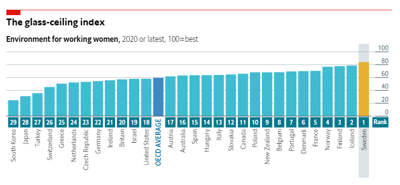
WALL STREET’S glass ceiling cracked at last on March 1st, as Jane Fraser took charge of Citigroup, becoming the first woman to head a big American bank. That cracking sound has also been echoing across the rest of America Inc. Last year Carol Tomé became boss of UPS, a package-delivery giant. In January Rosalind Brewer became only the third black woman ever to run a Fortune 500 company (Walgreens Boots Alliance, a pharmacy chain). A month later Thasunda Brown Duckett was picked to run TIAA, a big pension fund.
Yet despite progress for women in the workplace, America still has a long way to go according to The Economist’s latest glass-ceiling index, which ranks conditions for working women across 29 countries. As usual, Nordic countries performed best overall in our ranking, with Sweden, Iceland, Finland and Norway taking the top four spots. At the bottom is South Korea, which scored just 25 out of 100 on our index, less than half the average for the OECD club of industrialised countries.
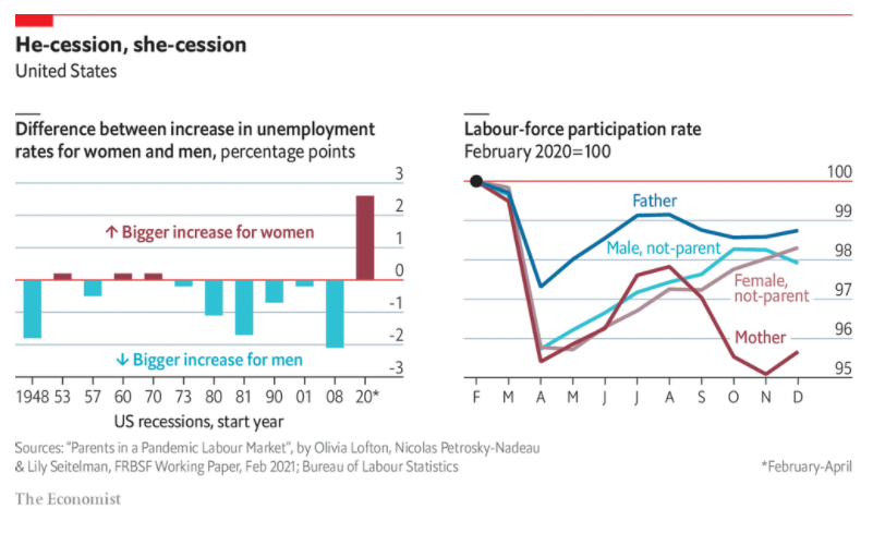
RECESSIONS TYPICALLY hit men harder than women, not least because they tend to disproportionately affect male-dominated industries, such as construction and manufacturing. In the recession of 2008-09, for example, men accounted for some three-quarters of American job losses. The most recent downturn, by contrast, has weighed on female-dominated sectors, such as retail and hospitality. Last year the share of women on American payrolls fell from 50% in March 2020 to 49.1% two months later, before inching back up to 49.8% today.
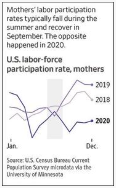
A recent paper by three economists at the Federal Reserve Bank of San Francisco suggests that some of the disparity can be explained by differences in parental responsibilities. Using monthly data from the Census Bureau’s Current Population Survey, the researchers analysed the labour-market outcomes of four groups of prime-age workers (those aged from 25 to 54): mothers; fathers; women without children; and men without children. They found that women suffered more than men in the wake of the pandemic but mothers fared worst of all. Between February and December the employment rate of mums dropped by 7% and their labour-force participation rate fell by 4%. Fathers, by comparison, suffered the least among the four groups—even less than childless men. Their employment and labour-force participation rates fell by 4% and 1%, respectively. Another recent study from the Federal Reserve Bank of Minneapolis found that that the effect was biggest for mothers with children under five.