Bellwether Education Partners is a “national nonprofit focused on dramatically changing education and life outcomes for underserved children. [They] do this by helping education organizations accelerate their impact and by working to improve policy and practice.” And making good money* doing whatever that means.
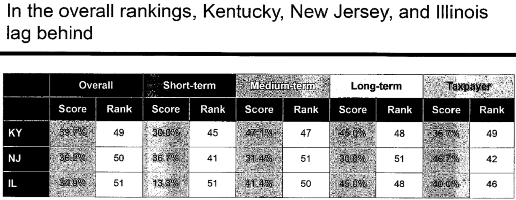
Apparently this think tank got some interns to go through official teacher pension data reported by the 50 states and the District of Columbia to come up with rankings. New Jersey was not last overall (probably on account of the ARP money that went into the pension this year) but Medium-term and Long-term New Jersey did come in last…..and by a lot.
Right now on the American Rescue Plan (ARP) website:
Status of Applications [.xls] – Coming Soon
Until those spreadsheets start popping up we have no clue as to why, by whom, and how these bailout applications are being made but, before seeing any numbers, one thing bothers me.
A footnote on that ARP website reads:
**MPRA plans can restore benefits under 26 CFR 1.432(e)(9)-1(e)(3) at any time, including before applying for SFA.
So why aren’t plan participants like Carol Podesta-Smallen in the MarketWatch story not having their monthly pension amounts restored to pre-MPRA levels and getting large checks to make up for past reductions? It would reduce asset values in those plans but isn’t that a good thing when applying for bailout money?
A law passed in Congress earlier this year promised to reverse some of that damage by offering taxpayer-funded financial assistance to certain troubled pension plans like Podesta-Smallen’s, allowing them to restore benefits to retirees who suffered cuts. But the implementation of the rescue plan has been met with a barrage of criticism from plan trustees, participants and members of Congress who say it’s too tight-fisted with the financial assistance and could leave some plans in a worse financial position than they are in now.
….
When the American Rescue Plan was signed into law in March, many of these struggling plans and retirees with sharply reduced benefits thought their troubles were over. The law is expected to provide about $94 billion to eligible multiemployer plans through a financial assistance program designed to stabilize the plans for decades to come and reinstate previously reduced benefits.
The sense of relief was short-lived, plan trustees and participants say. The Pension Benefit Guaranty Corp., the federal agency charged with protecting the retirement incomes of participants in private-sector defined-benefit pension plans, in early July released regulations detailing the formula for calculating the financial assistance for troubled plans.
In interviews and more than 100 comment letters to the PBGC, plan trustees, consultants, participants and lawmakers say that the rule’s stringent approach to calculating financial assistance means that many plans receiving the assistance won’t make it through the next 30 years as Congress intended, and some won’t even get enough money to cover the benefits they must restore as a condition of getting the cash.
This year, Social Security’s deficit is unusually high due to lower revenues and higher benefits: 1.75%. In 2040, the deficit climbs to 3.70% rather than 3.54%. In 2080, the deficit stands at 4.87% rather than 4.59%.
Put another way, if there were no Trust Fund accounting mechanism now, the OASI program would have been able to pay 93% of benefits. This would drop to 76% in 2035 – 2040 – 2045, then drop further to being able to pay 70% of benefits.
What’s more, this year, the actuaries changed several assumptions. They assume that by the year 2036, fertility rates will increase to 2.00 children per woman, an increase from the 2020 report’s assumption of 1.95. They also assume a long-term unemployment rate of 4.5% rather than 5%. At the same time, they calculate alternate projections with more pessimistic assumptions, including a continuingly low fertility rate (1.69), a higher rate of mortality improvement (that is, longer-lived recipients), a higher rate of unemployment (5.5%), and others. In these alternate calculations, the 2040 deficit becomes 6.47% rather than 3.7% (benefits 64% payable), and the 2080 deficit becomes 12.39% rather than 4.87% (benefits 50% payable).
Also consider that, at the moment, there are 2.7 workers for each Social Security recipient (2.8 in 2020). This is forecast to drop to 2.2 in 2040 and ultimately down to 2.1. But if the population trends are those of the pessimistic scenario, then that 2.1 would drop to 1.5 by the year 2080.
But we also have Meng’s unreported stock trades. And Meng’s arrival happened to coincide with a big spike in personal trading violations, which CalPERS attempted to minimize by saying they came mainly from one person.
What if it turns out that the Olson report showed that Meng was a very active trader the entire time he was there? There is no way CalPERS could suppress this information, since it was required to have been reported on the Forms 700.
This would be hugely embarrassing to CalPERS, in that it would show it had hired a CIO who didn’t have his full attention on his very big ticket say job. And it would be vastly worse if Meng as head of the investment operation had been routinely violating SEC requirements for trade pre-approvals to prevent insider trading.
This possibility seems even more likely when you look at the board transcript below. Marlene Timberlake D’Adamo droned on and on and on trying to justify CalPERS not having reviewed Meng’s Form 700 to see if it looked internally consistent and/or matched up with his trading records. At first I thought this was to exhaust the board and dissipate their energy so they’d not be as persistent about their issues when they finally got the mike. But it may also be that the compliance department was clearly remiss in not reviewing Meng’s Form 700 by virtue of him being an active trader. And if he indeed was the person who’d made the big personal trading violations, that would almost mandate reviewing his Form 700.
The downloadable data sets on cases and deaths included the report date as well as the date a person died or got sick, allowing journalists and independent researchers to select the best metric for their purposes. The daily reports showed additional cases and deaths added from one day to the next.
In June, as case numbers dropped and vaccination rates continued to rise, the health department discontinued the dashboard and changed to a weekly report. The only near-daily data was submitted by the health department to the CDC and published on the CDC Trend Tracker website.
At first, the data on the CDC website was updated in a largely predictable manner, similar to the way that the DOH had reported daily changes throughout the pandemic. Then on Aug. 10, without warning or any explanation from the health department or the CDC, the data for nearly every day of the previous year changed. Neither agency immediately explained the changes.
Author(s): Sarah Blaskey, Ana Claudio Chacin and Devoun Cetoute, McClatchy Washington Bureau
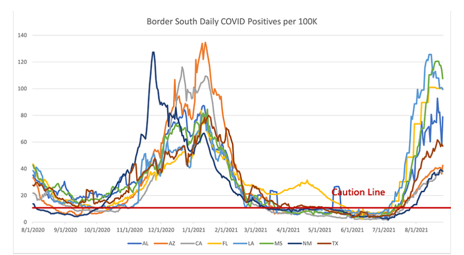
This region has been the tough one. It looks like we’re on the other side of the case surge in the worst hit states (LA, MS, FL, AL). Daily cases went up much higher than I would have expected, even higher than the winter surge. What has been truly surprising is that Florida is substantially more vaccinated than those other states, about 15-20% higher in adult vaccination and up at 95% vaccinated for seniors. That should shrink their pool of COVID-vulnerable individuals massively and reduce their death rate substantially.
And, while Florida’s death rate is lower than LA and MS, it’s not nearly at the levels we would have hoped or expected. I’m at a loss to explain this. Certain proposals have been tossed around: Florida is an older state, so more of their population is vulnerable. But their vaccination rates (nearly universal coverage among the elderly!) really should suppress this enormously. If a particular age group had +90% vaccination rates, I would expect that group’s COVID deaths to be reduced by at least 70%. Instead, the elderly are still making up the vast majority of COVID deaths in Florida.
Author(s): PoliMath, aka Matt Shapiro
Publication Date: 31 August 2021
Publication Site: Marginally Compelling at substack
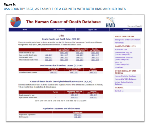
Work accomplished under the 2019 agreement between the Human Mortality Database (HMD) team and the Society of Actuaries (SOA) was divided between two main projects: 1) the continuous development of the United States Mortality Database (USMDB) and 2) the publication of cause-specific mortality series for selected HMD countries. Due to administrative delays at both the University of California, Berkeley, and the Society of Actuaries, work on these projects did not begin until July 2019. Furthermore, due to restriction in data access associated with the Covid-19 pandemic, a no-cost extension was requested by Magali Barbieri, the Principal Investigator for the projects, and accepted by the SOA to extend the project beyond the initial December 31, 2019 deadline.
Author(s): Magali Barbieri, Ph.D University of California-Berkeley
Trustees for the Social Security trust fund in an annual report released Tuesday said the program is expected to pay benefits that exceed its income in 2021, the same as it anticipated last year at the outset of the pandemic.
The trustees now project elevated mortality rates related to the pandemic through 2023, and expect lower immigration and child-bearing this year and next, compared with their 2020 estimates. They also expect the pandemic has lowered worker productivity and thus economic output permanently.
Best and Worst States for Pensions by Joel Anderson. In this article for Yahoo! Finance, Anderson ranks the “best” and “worst” states for public pensions based on their unfunded liabilities. As we’ve written before, judging states based on their funded status is highly misleading. An unfunded liability is merely the difference between “the total amount of benefits owed to ALL current employees & retirees and the value of the financial assets the pension plan manages.” A pension system never needs all of that money at once because a fund has a long time to earn investment returns from what employers and employees contribute. Furthermore, each pension plan provides a Comprehensive Annual Financial Report (CAFR) that shows the vast majority of retired public employees stay in the state they worked in during their career, which means they are reinvesting their pension benefits into their local economies. Stories like this are best viewed skeptically compared with the facts about public pensions.
Author(s): Tristan Fitzpatrick
Publication Date: 27 August 2021
Publication Site: National Public Pension Coalition
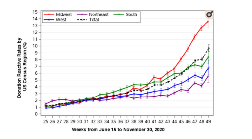
In the United States, many blood collection organizations initiated programs to test all blood donors for antibodies to SARS-CoV-2, as a measure to increase donations and to assist in the identification of potential donors of COVID-19 convalescent plasma (CCP). As a result, it was possible to investigate the characteristics of healthy blood donors who had previously been infected with SARS-CoV-2. We report the findings from all blood donations collected by the American Red Cross, representing 40% of the national blood supply covering 44 States, in order to characterize the seroepidemiology of SARS-CoV-2 infection among blood donors in the United States, prior to authorized vaccine availability. We performed an observational cohort study from June 15th to November 30th, 2020 on a population of 1.531 million blood donors tested for antibodies to the S1 spike antigen of SARS-CoV-2 by person, place, time, ABO group and dynamics of test reactivity, with additional information from a survey of a subset of those with reactive test results. The overall seroreactivity was 4.22% increasing from 1.18 to 9.67% (June 2020 – November 2020); estimated incidence was 11.6 per hundred person-years, 1.86-times higher than that based upon reported cases in the general population over the same period. In multivariable analyses, seroreactivity was highest in the Midwest (5.21%), followed by the South (4.43%), West (3.43%) and Northeast (2.90%). Seroreactivity was highest among donors aged 18-24 (Odds Ratio 3.02 [95% Confidence Interval 2.80-3.26] vs age >55), African-Americans and Hispanics (1.50 [1.24-1.80] and 2.12 [1.89-2.36], respectively, vs Caucasian). Group O frequency was 51.5% among nonreactive, but 46.1% among seroreactive donors (P< .0001). Of surveyed donors, 45% reported no COVID-19-related symptoms, but 73% among those unaware of testing. Signal levels of antibody tests were stable over 120 days or more and there was little evidence of reinfection. Evaluation of a large population of healthy, voluntary blood donors provided evidence of widespread and increasing SARS-CoV-2 seroprevalence and demonstrated that at least 45% of those previously infected were asymptomatic. Epidemiologic findings were similar to those among clinically reported cases.
Author(s): Roger Y Dodd, Bryan R Spencer, Meng Xu 1, Gregory A Foster 1, Paula Saá 1, Jaye P Brodsky 2, Susan L Stramer 3
In the United States, many blood collection organizations initiated programs to test all blood donors for antibodies to SARS-CoV-2, as a measure to increase donations and to assist in the identification of potential donors of COVID-19 convalescent plasma (CCP). As a result, it was possible to investigate the characteristics of healthy blood donors who had previously been infected with SARS-CoV-2. We report the findings from all blood donations collected by the American Red Cross, representing 40% of the national blood supply covering 44 States, in order to characterize the seroepidemiology of SARS-CoV-2 infection among blood donors in the United States, prior to authorized vaccine availability. We performed an observational cohort study from June 15th to November 30th, 2020 on a population of 1.531 million blood donors tested for antibodies to the S1 spike antigen of SARS-CoV-2 by person, place, time, ABO group and dynamics of test reactivity, with additional information from a survey of a subset of those with reactive test results. The overall seroreactivity was 4.22% increasing from 1.18 to 9.67% (June 2020 – November 2020); estimated incidence was 11.6 per hundred person-years, 1.86-times higher than that based upon reported cases in the general population over the same period. In multivariable analyses, seroreactivity was highest in the Midwest (5.21%), followed by the South (4.43%), West (3.43%) and Northeast (2.90%). Seroreactivity was highest among donors aged 18-24 (Odds Ratio 3.02 [95% Confidence Interval 2.80-3.26] vs age >55), African-Americans and Hispanics (1.50 [1.24-1.80] and 2.12 [1.89-2.36], respectively, vs Caucasian). Group O frequency was 51.5% among nonreactive, but 46.1% among seroreactive donors (P< .0001). Of surveyed donors, 45% reported no COVID-19-related symptoms, but 73% among those unaware of testing. Signal levels of antibody tests were stable over 120 days or more and there was little evidence of reinfection. Evaluation of a large population of healthy, voluntary blood donors provided evidence of widespread and increasing SARS-CoV-2 seroprevalence and demonstrated that at least 45% of those previously infected were asymptomatic. Epidemiologic findings were similar to those among clinically reported cases.
Author(s): Roger Y Dodd, Bryan R Spencer, Meng Xu 1, Gregory A Foster 1, Paula Saá 1, Jaye P Brodsky 2, Susan L Stramer 3