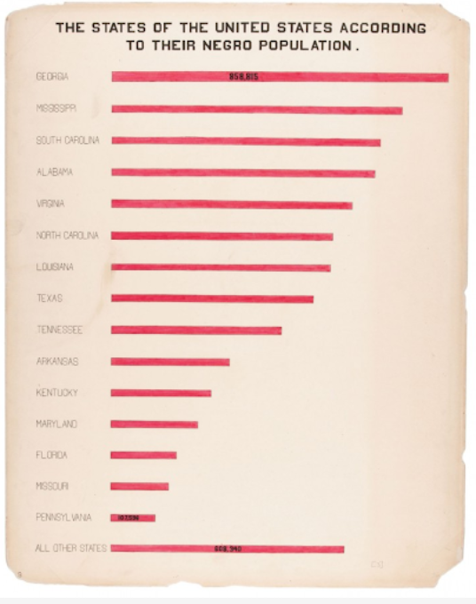
Du Bois was a professor of history, sociology and economics at Atlanta University. He established a sociology program in 1897, now recognized as the first school of American sociology. It was here that he led a team of students to produce 60 full-color charts, graphs, maps and tables on what had changed for African Americans since slavery. This collection was generated from a mix of existing records and empirical data collected by his sociological laboratory. The visualizations stressed one narrative; that the African American community had made progress. The colorful, hand-drawn illustrations showed that literacy rates for African Americans were rising and that African American ownership of property and land was increasing. African American businesses were growing and so were the number of patents for inventions.
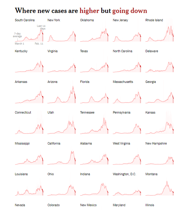
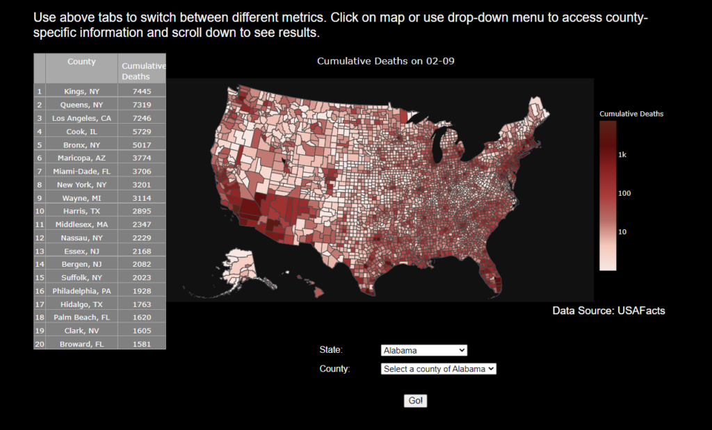
At least 3,878 new coronavirus deaths and 105,515 new cases were reported in the United States on Feb. 11. Over the past week, there has been an average of 101,655 cases per day, a decrease of 36 percent from the average two weeks earlier. As of Friday morning, more than 27,433,900 people in the United States have been infected with the coronavirus according to a New York Times database.
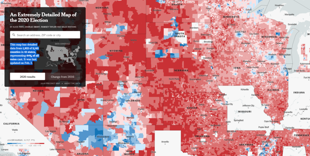
Author(s): Jordan Allen, Sarah Almukhtar, Aliza Aufrichtig, Anne Barnard, Matthew Bloch, Sarah Cahalan, Weiyi Cai, Julia Calderone, Keith Collins, Matthew Conlen, Lindsey Cook, Gabriel Gianordoli, Amy Harmon, Rich Harris, Adeel Hassan, Jon Huang, Danya Issawi, Danielle Ivory, K.K. Rebecca Lai, Alex Lemonides, Eleanor Lutz, Allison McCann, Richard A. Oppel Jr., Jugal K. Patel, Alison Saldanha, Kirk Semple, Julie Walton Shaver, Anjali Singhvi, Charlie Smart, Mitch Smith, Albert Sun, Derek Watkins, Timothy Williams, Jin Wu and Karen Yourish. · Reporting was contributed by Jeff Arnold, Ian Austen, Mike Baker, Brillian Bao, Ellen Barry, Samone Blair, Nicholas Bogel-Burroughs, Aurelien Breeden, Elisha Brown, Emma Bubola, Maddie Burakoff, Alyssa Burr, Christopher Calabrese, Zak Cassel, Robert Chiarito, Izzy Colón, Matt Craig, Yves De Jesus, Brendon Derr, Brandon Dupré, Melissa Eddy, John Eligon, Timmy Facciola, Bianca Fortis, Matt Furber, Robert Gebeloff, Thomas Gibbons-Neff, Matthew Goldstein, Grace Gorenflo, Rebecca Griesbach, Benjamin Guggenheim, Barbara Harvey, Lauryn Higgins, Josh Holder, Jake Holland, Jon Huang, Anna Joyce, John Keefe, Ann Hinga Klein, Jacob LaGesse, Alex Lim, Alex Matthews, Patricia Mazzei, Jesse McKinley, Miles McKinley, K.B. Mensah, Sarah Mervosh, Jacob Meschke, Lauren Messman, Andrea Michelson, Jaylynn Moffat-Mowatt, Steven Moity, Paul Moon, Derek M. Norman, Anahad O’Connor, Ashlyn O’Hara, Azi Paybarah, Elian Peltier, Sean Plambeck, Laney Pope, Elisabetta Povoledo, Cierra S. Queen, Savannah Redl, Scott Reinhard, Thomas Rivas, Frances Robles, Natasha Rodriguez, Jess Ruderman, Kai Schultz, Alex Schwartz, Emily Schwing, Libby Seline, Sarena Snider, Brandon Thorp, Alex Traub, Maura Turcotte, Tracey Tully, Lisa Waananen Jones, Amy Schoenfeld Walker, Jeremy White, Kristine White, Bonnie G. Wong, Tiffany Wong, Sameer Yasir and John Yoon. · Data acquisition and additional work contributed by Will Houp, Andrew Chavez, Michael Strickland, Tiff Fehr, Miles Watkins, Josh Williams, Shelly Seroussi, Rumsey Taylor, Nina Pavlich, Carmen Cincotti, Ben Smithgall, Andrew Fischer, Rachel Shorey, Blacki Migliozzi, Alastair Coote, Jaymin Patel, John-Michael Murphy, Isaac White, Steven Speicher, Hugh Mandeville, Robin Berjon, Thu Trinh, Carolyn Price, James G. Robinson, Phil Wells, Yanxing Yang, Michael Beswetherick, Michael Robles, Nikhil Baradwaj, Ariana Giorgi, Bella Virgilio, Dylan Momplaisir, Avery Dews, Bea Malsky and Ilana Marcus
[MPC here: I am not tagging all these people. Sorry, y’all]
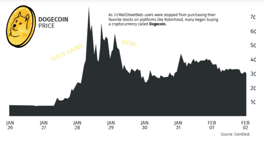
Gamestop’s stock has been on a wild roller coaster ride, rising by roughly 640% from the start of last week to its peak. After Robinhood and other brokers initializing trading restrictions due to the heightened market activity, the stock has since fallen more than 80% to $90 per share.
But the stock’s volatile price action doesn’t come close to telling the story of how this market frenzy began on the Reddit community r/wallstreetbets, the hedge funds that suffered when GameStop share price rose dramatically, and why Robinhood halted trading last week.
This is a list of data visualization catalogs and collections. It is inspired by the lists published by Yuri Engelhardt and others. It is provided for your use and reference. • 6 Ways to Visualize Graphs | https://www.twosixlabs.com/6-ways-visualizegraphs • 9 Ways to Visualize Proportions | http://flowingdata.com/2009/11/25/9-waysto-visualize-proportions-a-guide/ • 45 Ways to Communicate Two Quantities | https://www.scribblelive.com/blog/2012/07/27/45-ways-to-communicatetwo-quantities/
The Yu Group at UC Berkeley Statistics / EECS / CCB is working to help forecast the severity of the epidemic for individual counties and hospitals in the US. We develop interpretable models (updated daily) and curate data to predict the trajectory of COVID-19-related deaths. This website provides access to those predictions, in the form of interactive visualizations. We are collaborating with Response4Life to blunt the effect of COVID-19 through the production and appropriate distribution of PPE, medical equipment, and medical personnel to healthcare facilities across the United States.
For hospital level prediction, please go to our hospitalization prediction page where one can upload data for a specific hospital and download prediction results for the given hospital. The uploaded data will only be temporarily used for prediction and will not be collected.GITHUB
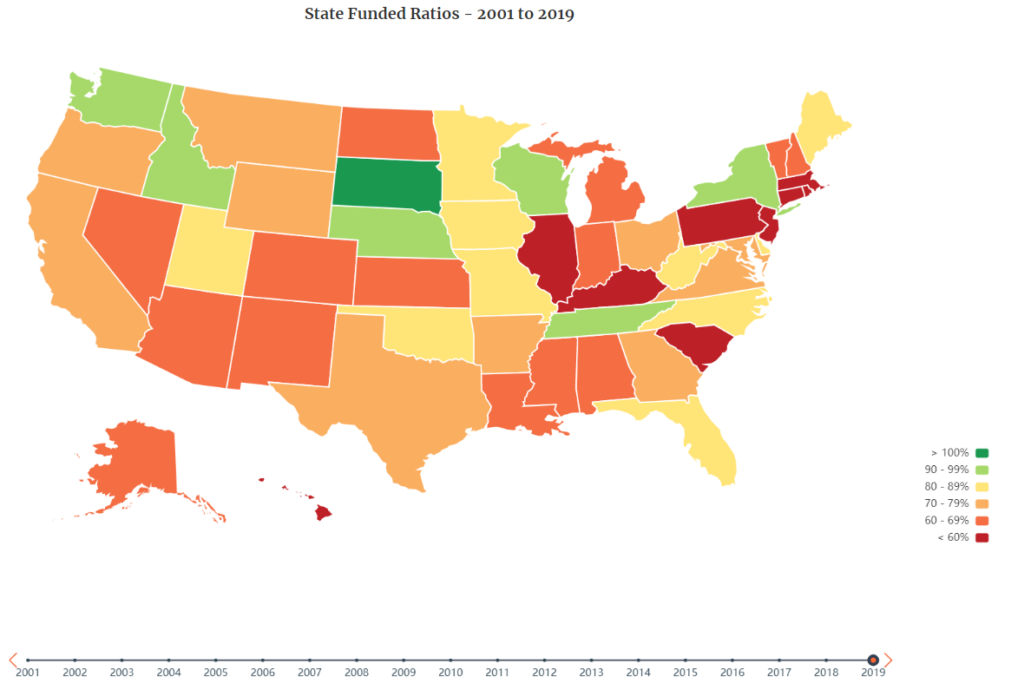
Over time, changes in a pension plan’s funded ratio, also referred to as a pension’s funded status, can show the rate at which the plan’s debt is growing.
In 2001, West Virginia was the only state where public pension plans had an aggregate funded ratio of less than 60 percent. However, 18 years later, in 2019, nine states faced aggregate funded ratios below 60 percent.
In that same time period, the number of states with funded ratios below 70 percent (but above 60 percent) grew from three to 14. Together, these numbers show that, as of 2019, 23 states had less than 70 percent of the assets on hand that they need to be able to pay for promised future retirement benefits.
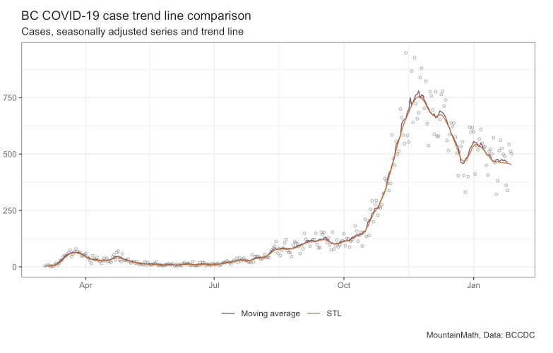
Data is inherently noisy, trend lines are a way to filter out noise and focus on the main movements of a time series. “Are we trending up or down?” is a simple yet important question, but it can be hard to answer by just looking at the raw data. In that sense a trend line is simply a way to de-noise the data.
But how do we distinguish noise from the “real” signal in the data? First we need to understand the “data generating process”. In case of COVID-19 timelines that’s viral growth, so we expect the main signal of our time series to be exponential growth with periods of constant growth rates, with noise added on top of that. (This can also be tested directly by running tests on the COVID-19 cases time series.)
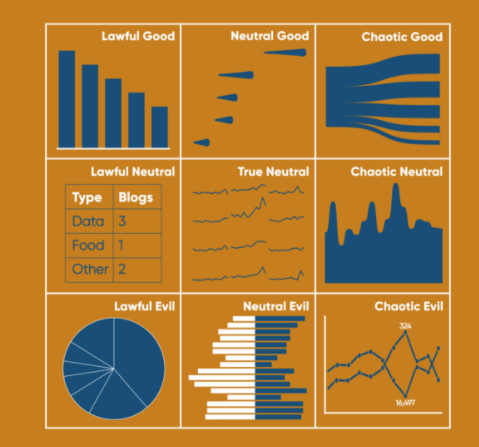
For this specific application, when I think of lawfulness, I am going to mainly assess the likelihood to be misused. And for good versus evil, I’ll be looking at how well they can typically help the user understand the data.
Lawful Good: Bar Chart
This is the best alignment you can be. In traditional use, lawful good applies to people that both follow the rules and help others. Here I’m applying it to a chart that I think is often used well and is easy to read. Name a better liked and more used chart than the bar chart – you can’t. 10/10 analysts would recommend.
Description: Exhibit of historical data visualization examples
There is a magic in information graphics. Maps float you above the land for a bird’s eye view. Timelines arrange memories on the page for all to see. Diagrams reveal the parts inside without requiring disassembly, or incision.* ❡ Data visualization leapt from its Enlightenment origins and into the minds of the general public in the 1760s. It cast more powerful spells throughout the following century. By 1900, modern science, technology, and social movements had all benefited from this new quantitative art. Its inventions include the timeline, bar chart, and thematic map. Together, these innovations changed how we understand the world and our place within it. Data visualization helped a new imagination emerge, wired to navigate a reality much bigger than any single person’s lived experience. ❡ The sections in this exhibition examine information graphics that show space, time, nature, and society. Many are beautiful. Each is a unique way of seeing still worth our attention. —RJ Andrews, guest curator