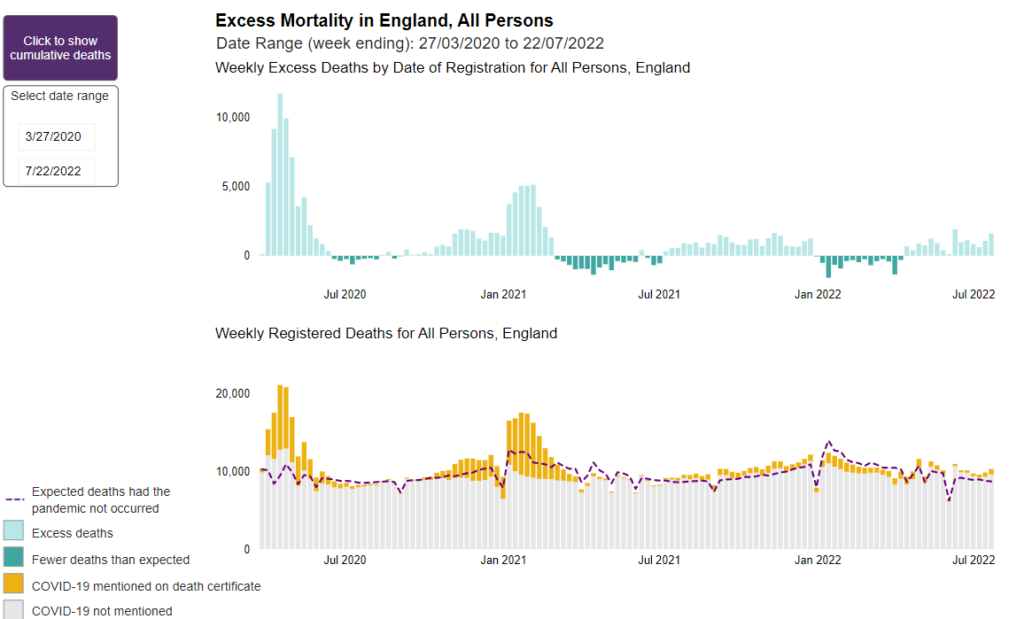
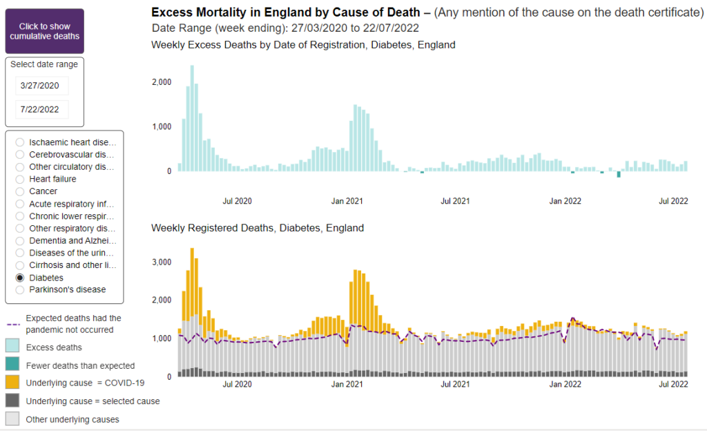
The numbers of expected deaths are estimated using statistical models and based on previous 5 years’ (2015 to 2019) mortality rates. Weekly monitoring of excess mortality from all causes throughout the COVID-19 pandemic provides an objective and comparable measure of the scale of the pandemic [reference 1]. Measuring excess mortality from all causes, instead of focusing solely on mortality from COVID-19, overcomes the issues of variation in testing and differential coding of cause of death between individuals and over time [reference 1].
In the weekly reports, estimates of excess deaths are presented by week of registration at national and subnational level, for subgroups of the population (age groups, sex, deprivation groups, ethnic groups) and by cause of death and place of death.
Heart attacks and other cardiovascular issues are a major source of recent excess deaths.
For anti-racist dataviz, our most effective tool is context. The way that data is framed can make a very real impact on how it’s interpreted. For example, this case study from the New York Times shows two different framings of the same economic data and how, depending on where the author starts the X-Axis, it can tell 2 very different — but both accurate — stories about the subject.
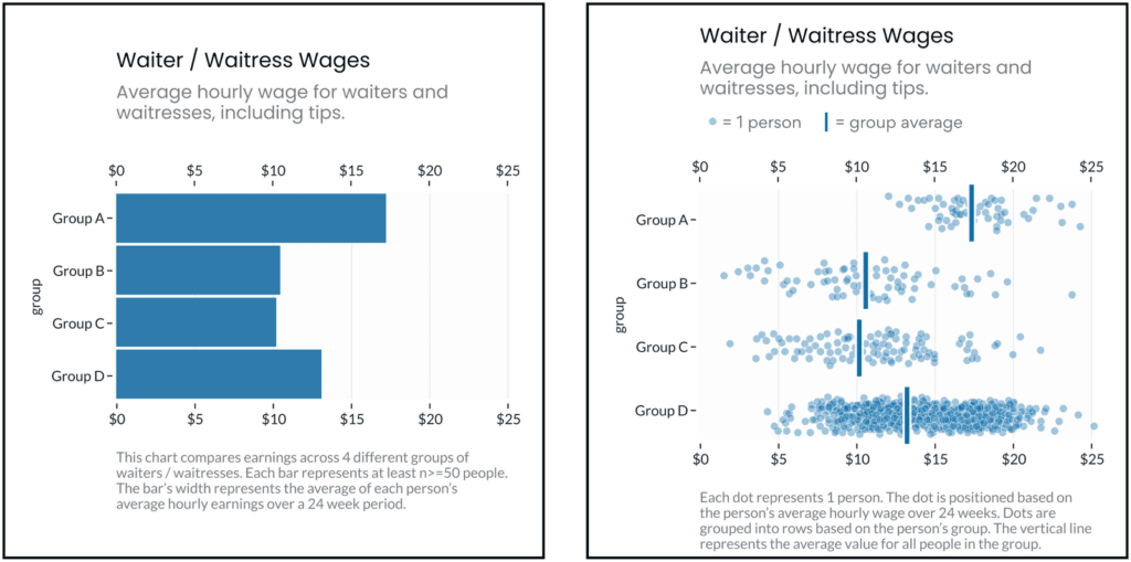
As Pieta previously highlighted, dataviz in spaces that address race / ethnicity are sensitive to “deficit framing.” That is, when it’s presented in a way that over-emphasizes differences between groups (while hiding the diversity of outcomes within groups), it promotes deficit thinking (see below) and can reinforce stereotypes about the (often minoritized) groups in focus.
In a follow up study, Eli and Cindy Xiong (of UMass’ HCI-VIS Lab) confirmed Pieta’s arguments, showing that even “neutral” data visualizations of outcome disparities can lead to deficit thinking (and therefore stereotyping) and that the way visualizations are designed can significantly impact these harmful tendencies.
The same dataset, visualized two different ways. The left fixates on between-group differences, which can encourage stereotyping. The right shows both between and within group differences, which may discourage viewers’ tendencies to stereotype the groups being visualized.
Excerpt:
Ignoring or deemphasizing uncertainty in dataviz can create false impressions of group homogeneity (low outcome variance). If stereotypes stem from false impressions of group homogeneity, then the way visualizations represent uncertainty (or choose to ignore it) could exacerbate these false impressions of homogeneity and mislead viewers toward stereotyping.
If this is the case, then social-outcome-disparity visualizations that hide within-group variability (e.g. a bar chart without error bars) would elicit more harmful stereotyping than visualizations that emphasize within-group variance (e.g. a jitter plot).
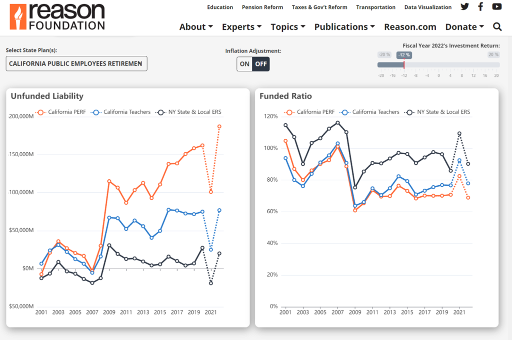
According to forecasting by Reason Foundation’s Pension Integrity Project, when the fiscal year 2022 pension financial reports roll in, the unfunded liabilities of the 118 state public pension plans are expected to again exceed $1 trillion in 2022. After a record-breaking year of investment returns in 2021, which helped reduce a lot of longstanding pension debt, the experience of public pension assets has swung drastically in the other direction over the last 12 months. Early indicators point to investment returns averaging around -6% for the 2022 fiscal year, which ended on June 30, 2022, for many public pension systems.
Based on a -6% return for fiscal 2022, the aggregate unfunded liability of state-run public pension plans will be $1.3 trillion, up from $783 billion in 2021, the Pension Integrity Project finds. With a -6% return in 2022, the aggregate funded ratio for these state pension plans would fall from 85% funded in 2021 to 75% funded in 2022.
Author(s): Truong Bui, Jordan Campbell, Zachary Christensen
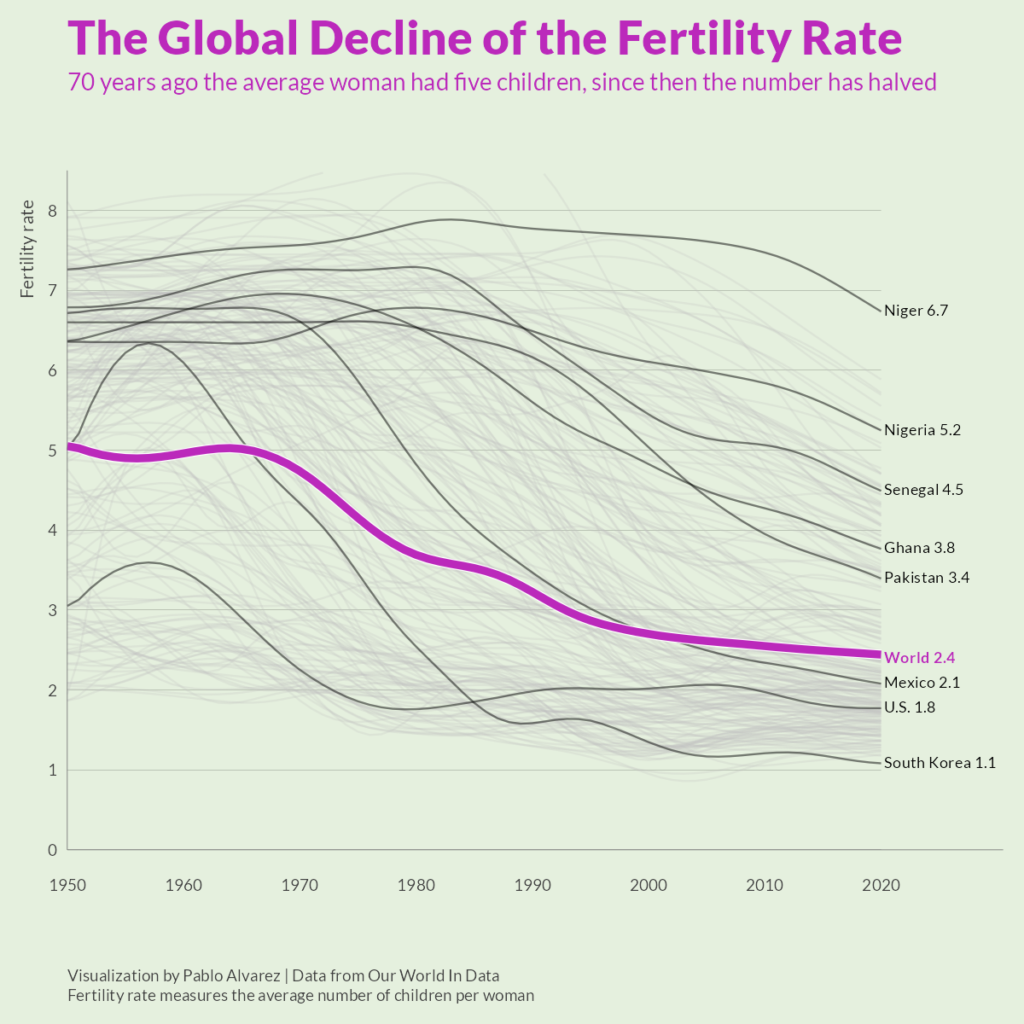
Over the last 50 years, fertility rates have dropped drastically around the world. In 1952, the average global family had five children—now, they have less than three.
This graphic by Pablo Alvarez uses tracked fertility rates from Our World in Data to show how rates have evolved (and largely fallen) over the past decades.
What’s The Difference Between Fertility Rates and Birth Rates?
Though both measures relate to population growth, a country’s birth rate and fertility rate are noticeably different:
Birth Rate: The total number of births in a year per 1,000 individuals.
Fertility Rate: The total number of births in a year per 1,000 women of reproductive age in a population.
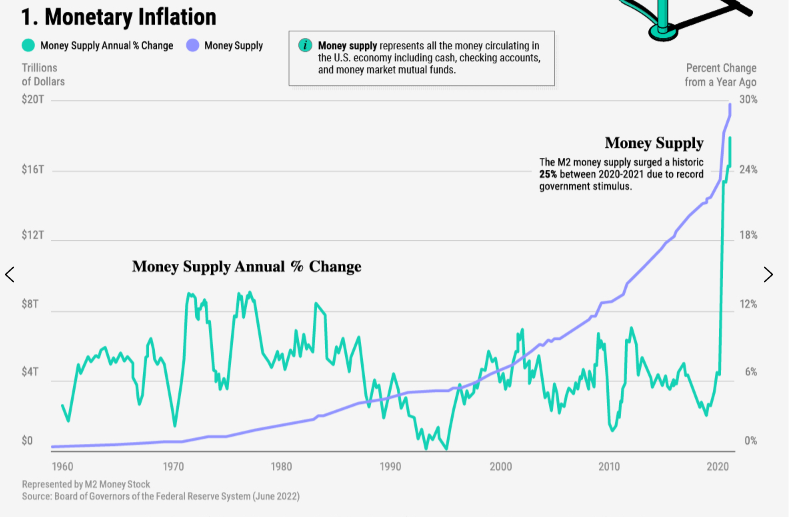
Monetary inflation occurs when the U.S. money supply increases over time. This represents both physical and digital money circulating in the economy including cash, checking accounts, and money market mutual funds.
The U.S. central bank typically influences the money supply by printing money, buying bonds, or changing bank reserve requirements. The central bank controls the money supply in order to boost the economy or tame inflation and keep prices stable.
Between 2020-2021, the money supply increased roughly 25%—a historic record—in response to the COVID-19 crisis. Since then, the Federal Reserve began tapering its bond purchases as the economy showed signs of strength.
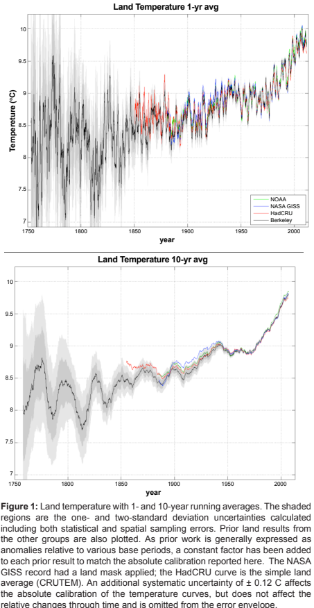
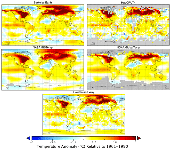
We report an estimate of the Earth’s average land surface temperature for the period 1753 to 2011. To address issues of potential station selection bias, we used a larger sampling of stations than had prior studies. For the period post 1880, our estimate is similar to those previously reported by other groups, although we report smaller uncertainties. The land temperature rise from the 1950s decade to the 2000s decade is 0.90 ± 0.05°C (95% confidence). Both maximum and minimum temperatures have increased during the last century. Diurnal variations decreased from 1900 to 1987 and then increased; this increase is significant but not understood. The period of 1753 to 1850 is marked by sudden drops in land surface temperature that are coincident with known volcanism; the response function is approximately 1.5 ± 0.5°C per 100 Tg of atmospheric sulfate. This volcanism, combined with a simple proxy for anthropogenic effects (logarithm of the CO2 addition of a solar forcing term. Thus, for this very simple model, solar forcing does not appear to contribute to the observed global warming of the past 250 years; the entire change can be modeled by a sum of volcanism and a single anthropogenic proxy. The residual variations include interannual and multi-decadal variability very similar to that of the Atlantic Multidecadal Oscillation (AMO).
Robert Rohde1 , Richard A. Muller1,2,3 *, Robert Jacobsen2,3 , Elizabeth Muller1 , Saul Perlmutter2,3 , Arthur Rosenfeld2,3 , Jonathan Wurtele2,3 , Donald Groom3 and Charlotte Wickham4
Citation:
Rohde et al., Geoinfor Geostat: An Overview 2013, 1:1 http://dx.doi.org/10.4172/2327-4581.1000101
Publication Date: 2013
Publication Site: Geoinformatics & Geostatistics: An Overview
A global land–ocean temperature record has been created by combining the Berkeley Earth monthly land temperature field with spatially kriged version of the HadSST3 dataset. This combined product spans the period from 1850 to present and covers the majority of the Earth’s surface: approximately 57 % in 1850, 75 % in 1880, 95 % in 1960, and 99.9 % by 2015. It includes average temperatures in 1∘×1∘ lat–long grid cells for each month when available. It provides a global mean temperature record quite similar to records from Hadley’s HadCRUT4, NASA’s GISTEMP, NOAA’s GlobalTemp, and Cowtan and Way and provides a spatially complete and homogeneous temperature field. Two versions of the record are provided, treating areas with sea ice cover as either air temperature over sea ice or sea surface temperature under sea ice, the former being preferred for most applications. The choice of how to assess the temperature of areas with sea ice coverage has a notable impact on global anomalies over past decades due to rapid warming of air temperatures in the Arctic. Accounting for rapid warming of Arctic air suggests ∼ 0.1 ∘C additional global-average temperature rise since the 19th century than temperature series that do not capture the changes in the Arctic. Updated versions of this dataset will be presented each month at the Berkeley Earth website (http://berkeleyearth.org/data/, last access: November 2020), and a convenience copy of the version discussed in this paper has been archived and is freely available at https://doi.org/10.5281/zenodo.3634713 (Rohde and Hausfather, 2020).
Author(s): Robert A. Rohde1 and Zeke Hausfather1,2
Citation: Rohde, R. A. and Hausfather, Z.: The Berkeley Earth Land/Ocean Temperature Record, Earth Syst. Sci. Data, 12, 3469–3479, https://doi.org/10.5194/essd-12-3469-2020, 2020.
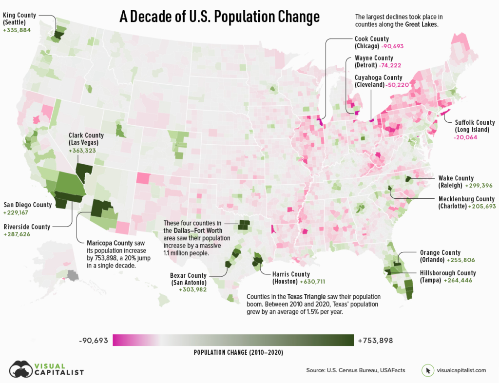
If an area sees a high number of migrants, along with a strong birth rate and low death rate, then its population is bound to increase over time. On the flip side, if more people are leaving the area than coming in, and the region’s birth rate is low, then its population will likely decline.
Which areas in the United States are seeing the most growth, and which places are seeing their populations dwindle?
This map, using data from the U.S. Census Bureau, shows a decade of population movement across U.S. counties, painting a detailed picture of U.S. population growth between 2010 and 2020.
Author(s): Nick Routley Article/Editing: Carmen Ang
China is expected to surpass the U.S. by the year 2030. A faster than expected recovery in the U.S. in 2021, and China’s struggles under the “Zero-COVID” policies have delayed the country taking the top spot by about two years.
China has maintained its positive GDP growth due to the stability provided by domestic demand. This has proven crucial in sustaining the country’s economic growth. China’s fiscal and economic policy had focused on this prior to the pandemic over fears of growing Western trade restrictions.
Stripe’s dashboards use graphs to visualize data. While the color palettes we use are certainly passable, the team is always trying to improve them. A colleague was working on creating updated color palettes, and we discussed the challenges he was working through. The problem boiled down to this: how do I pick nice-looking colors that cover a broad set of use cases for categorical data while meeting accessibility goals?
The domain of this problem is categorical data — data that can be compared by grouping it into two or more sets. In Stripe’s case, we’re often comparing payments from different sources, comparing the volume of payments between multiple time periods, or breaking down revenue by product.
The criteria for success are threefold:
The colors should look nice. In my case, they need to be similar to Stripe’s brand colors.
The colors should cover a broad set of use cases. In short, I need lots of colors in case I have lots of categories.
The colors should meet accessibility goals. WCAG 2.2 dictates that non-text elements like chart bars or lines should have a color contrast ratio of at least 3:1 with adjacent colors.
Our population statistics cover age, sex, race, Hispanic origin, migration, ancestry, language use, veterans, as well as population estimates and projections.