Graphic:
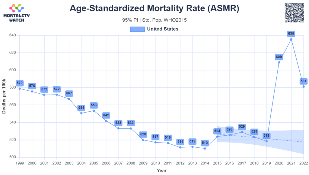
substack: https://usmortality.substack.com/
Publication Date: accessed 23 Apr 2023
Publication Site: Mortality Watch
All about risk
Graphic:
substack: https://usmortality.substack.com/
Publication Date: accessed 23 Apr 2023
Publication Site: Mortality Watch
Link: https://www.gunviolencearchive.org/
Graphic:
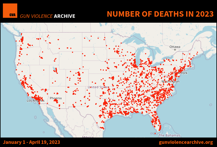
Excerpt:
PUBLISHED DATE: April 20, 2023
Gun violence and crime incidents are collected/validated from 7,500 sources daily – Incident Reports and their source data are found at the gunviolencearchive.org website.
Footnotes
All numbers are subject to change or incidents recategorized as new evidence is established and verified.
METHODOLOGY & DEFINITIONS AVAILABLE AT:
https://www.gunviolencearchive.org/methodology
www.gunviolencearchive.org
www.facebook.com/gunviolencearchive
On Twitter @gundeaths
Publication Date: accessed 20 April 2023
Publication Site: Gun Violence Archive
Link: https://nightingaledvs.com/data-visualization-using-chatgpt-to-code/
Graphic:
Excerpt:
Data visualization is cool but at the same time it’s bit daunting that I need to know lots of tech stacks to actually implement it.
I totally agree that even when I was studying data visualization, I spent a pretty substantial amount of time learning how to code, handle web hosting, work with Python, SQL, and more, all while absorbing knowledge on information visualization.
Thankfully, we no longer need to deep dive into technical gatekeepers in this field. This doesn’t mean that technical knowledge is not valuable, but rather that we no longer need to be intimidated by technology because AI can spoon-feed us knowledge and do the heavy lifting for us. Are you excited? Let’s get started!
I’m going to build the data visualization that one of my students posted on weekly write-up homework.
Author(s): Soonk Paik
Publication Date: 4 April 2023
Publication Site: Nightingale
Link: https://www.wsj.com/articles/the-banking-sector-turmoil-in-charts-52bb6095?mod=e2twg
Graphic:
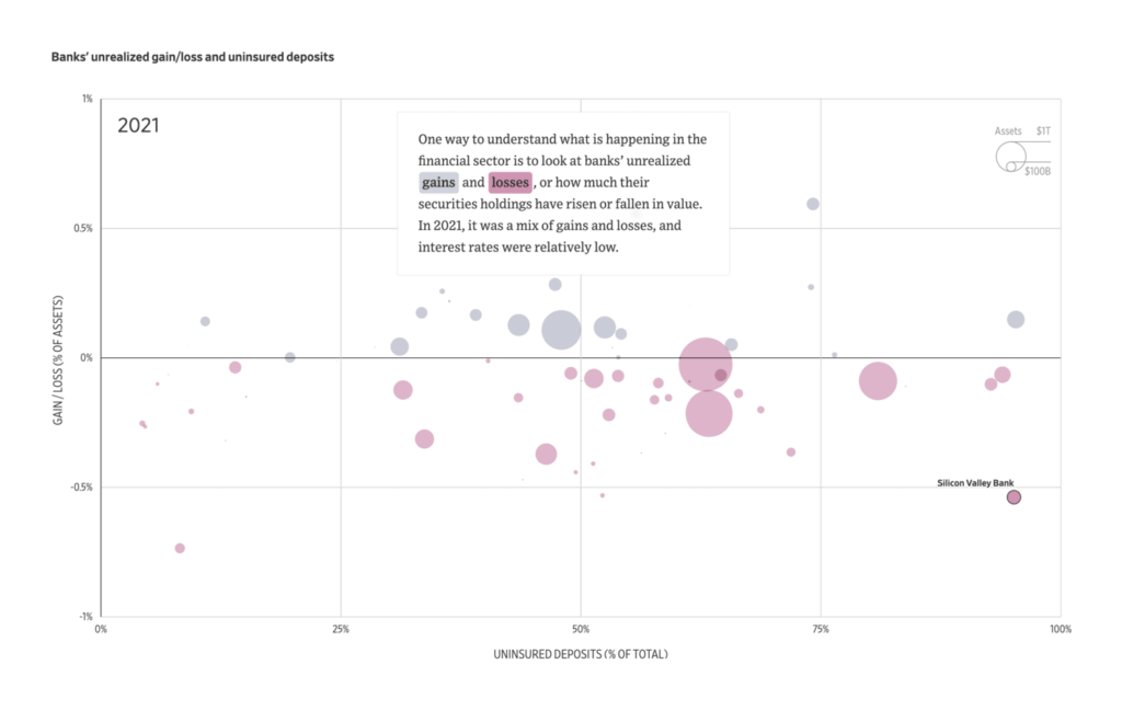
Excerpt:
It has been a wild ride for banks. Silicon Valley Bank, which catered to venture capitalists and startups, collapsed March 10 after a run on deposits that was preceded by a plunging share price and a money-losing bond sale as the bank tried to raise capital. Two days later, Signature Bank SBNY -22.87%decrease; red down pointing triangle was closed by federal regulators following a run. Then, First Republic Bank FRC 29.47%increase; green up pointing triangle, at risk of a run as its share price plummeted, was flooded with cash in an extraordinary action by some of the largest U.S. banks—but its shares resumed their plunge a day later.
Here is how some banks ended up in the market’s crosshairs.
Author(s): Nate Rattner, Alana Pipe
Publication Date: 18 Mar 2023
Publication Site: WSJ
Link:https://blog.datawrapper.de/data-vis-dispatch-january-31-2023/
Graphic:
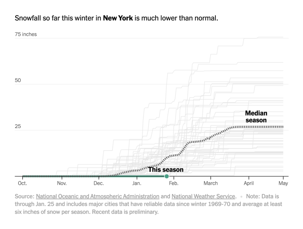
Excerpt:
Welcome back to the 79th edition of Data Vis Dispatch! Every week, we’ll be publishing a collection of the best small and large data visualizations we find, especially from news organizations — to celebrate data journalism, data visualization, simple charts, elaborate maps, and their creators.
Recurring topics this week include wintery weather, social inequality, and inflation.
Author(s):Veronika Halamková
Publication Date: 31 JAN 2023
Publication Site: Datawrapper
Link: https://all-of-us.benschmidt.org/
Graphic:
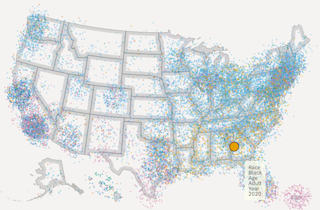
Excerpt:
One point per person in the US for the 2010 and 2020 censuses, fully zoomable and interactive using WebGL and [Deepscatter](https://github.com/CreatingData/deepscatter). Since this uses WebGL individual point rendering and quadtiled data, it can be far more responsive than raster-based maps you may have seen in 2010. Plus, if you zoom all the way in in some views it has little person glyphs!
Author(s): Ben Schmidt
Publication Date: accessed 2 Dec 2022
Publication Site: Ben Schmidt’s personal site
Link: https://www.washingtonpost.com/business/2022/09/29/chain-restaurant-capitals/
Graphic:
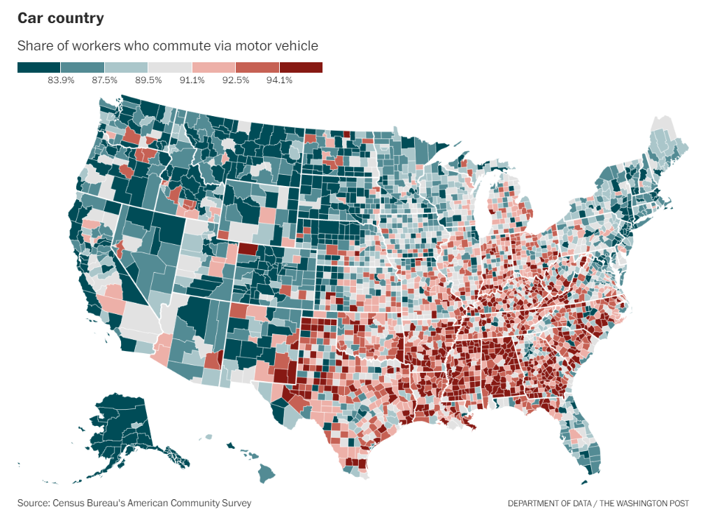
Excerpt:
The places that drive the most tend to have the same high share of chain restaurants regardless of whether they voted for Trump or Biden. As car commuting decreases, chain restaurants decrease at roughly the same rate, no matter which candidate most residents supported.
If the link between cars and chains transcends partisanship, why does it look like Trump counties have more chain restaurants? It’s at least in part because he won more of the places with the most car commuters!
About 83 percent of workers commute by car nationally, but only 80 percent of folks in Biden counties do so, compared with 90 percent of workers in Trump counties. The share of car commuters ranges from 55 percent in the deep-blue New York City metro area to 96 percent around bright red Decatur, Ala.
Author(s): Andrew Van Dam
Publication Date: 1 Oct 2022
Publication Site: WaPo
Link: https://taxfoundation.org/property-taxes-by-state-county-2022/
Graphic:
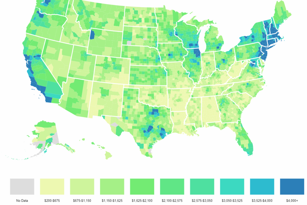
Excerpt:
Median property taxes paid vary widely across (and within) the 50 states. The lowest bills in the country are in six counties or county equivalents with median property taxes of less than $200 a year:
(*Significant parts of Alaska have no property taxes, though most of these areas have such small populations that they are excluded from federal surveys.)
The next-lowest median property tax of $201 is found in Allen Parish, near the middle of Louisiana, followed by $218 in McDowell County, West Virginia, in the southernmost part of the state.
The eight counties with the highest median property tax payments all have bills exceeding $10,000:
All but Falls Church are near New York City, as is the next highest, Passaic County, New Jersey ($9,999).
Author(s): Janelle Fritts
Publication Date: 13 Sept 2022
Publication Site: Tax Foundation
Link: https://blog.datawrapper.de/text-in-data-visualizations/
Graphic:
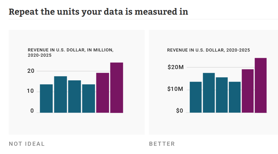
Excerpt:
Text is maybe the most underrated element in any data visualization. There’s a lot of text in any chart or map — titles, descriptions, notes, sources, bylines, logos, annotations, labels, color keys, tooltips, axis labels — but often, it’s an afterthought in the design process. This article explains how to use text to make your visualizations easier to read and nicer to look at.
Show information where readers need it
01 Label directly
02 Repeat the units your data is measured in
03 Remind people what they’re looking at in tooltips
04 Move the axis ticks where they’re needed
05 Emphasize and explain with annotations
Design for readability
06 Use a font that’s easy to read
07 Lead the eye with font sizes, styles, and colors
08 Limit the number of font sizes in your visualization
09 Don’t center-align your text
10 Don’t make your readers turn their heads
11 Use a text outline
Phrase for readability
12 Use straightforward phrasings
13 Be conversational first and precise later
14 Choose a suitable number format
Author(s): Lisa Charlotte Muth
Publication Date: 28 Sept 2022
Publication Site: Datawrapper
Link: https://nightingaledvs.com/reasons-to-visualise-the-same-data-differently/
Graphic:
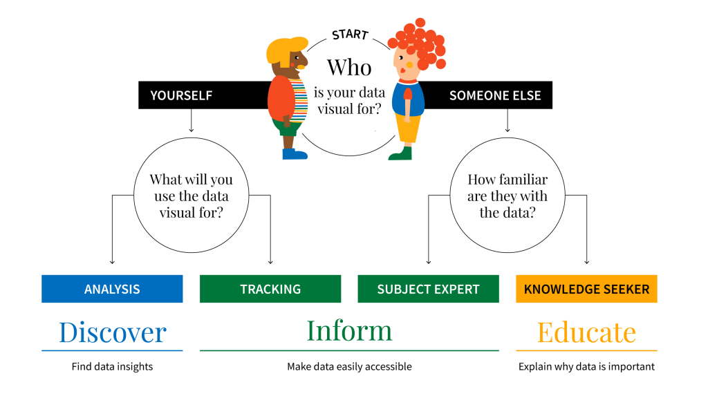
Excerpt:
To quote Andy Kirk, “we can look at data, but we cannot really see it. To see data, we need to represent it in a different, visual form.” So, in an attempt to make data more accessible, you may create more visual representations – dots, lines, shapes, and colours. These building blocks combine to create all sorts of charts and pictures helping readers understand numbers.
Although the purpose of visualising data is clear (and universal), the reasons can be different. The reason you visualise data, will help you determine the appropriate visual.
Author(s): Kat Greenbrook
Publication Date: 8 Sept 2022
Publication Site: Nightingale
Link: https://nightingaledvs.com/dataviz-horror-story-how-i-crashed-the-top-execs-email/
Graphic:
Video:
Excerpt:
In my case, the graphs I made looked just fine—it’s just that I didn’t understand how copy/pasting graphs between Excel and Word worked (at the time). This was in the mid-2000s, when memory wasn’t quite so plentiful, so many corporate email accounts had memory quotas. If you hit that quota, you would be locked out of your email account. You had to call IT and actually talk to a person!
I was a lowly entry-level person at a financial services company and had done some Monte Carlo modeling involving 1,000,000 scenarios. We were developing a new mutual fund project, based on changing allocations over time as people moved towards retirement, and the company wanted me to model outcomes for different allocation trajectories. After a “full” model run of one million scenarios, I made diagnostic graphs showing the distribution of key metrics (such as the annual accumulation of the fund, how many times the fund decreased while the owner was in retirement, and whether – and when – the money in the fund ran out) so that we could analyze different potential fund strategies. The graphs themselves were fairly simple.
Author(s): Mary Pat Campbell
Publication Date: 31 Aug 2022
Publication Site: Nightingale
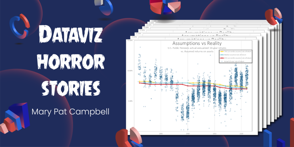
Link: https://marypatcampbell.substack.com/p/data-visualization-lessons-jitter
Video:
Excerpt:
Jitter charts are my new favorite tool for displaying how distributions change over time.
I used them to great effect in my recent post One Bad Year? Comparing the Long-Term Public Pension Fund Returns Against Assumptions.
I’m often looking at distributions, and wanting to communicate something about how those distributions change over time, or how distributions compare. Often, I have to simply pick out key percentiles in those distributions, or key aspects, such as mean and standard deviation.
But why not graph all the points in one’s sample directly, if one has them?
That’s where jitter charts can help.
Author(s): Mary Pat Campbell
Publication Date: 16 Sep 2022
Publication Site: STUMP at substack