Link:https://www.bbc.com/news/uk-15024436
Graphic:
Excerpt:
The life experience of British people born between the years 1925 and 1934 has long had demographers and insurance companies scratching their heads.
For reasons which remain unclear, individuals within this slice of the UK population have been living longer and healthier lives than groups both older and younger.
Today the Office for National Statistics returns to the mystery of the so-called “golden cohort”, trying to understand better why the members of the generation born in the midst of the Great Depression have been enjoying higher rates of mortality improvement throughout their adult lives.
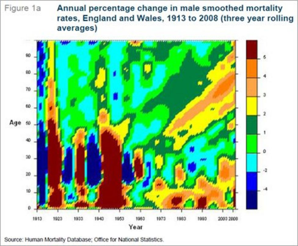
One tool used to track the golden cohort is a heat chart which, in this case, looks at annual mortality improvements for men and women. It takes a bit of explaining, but the diagrams reflect the social history of Britain over the last century or so.
Starting with men (Figure 1a), the most obvious feature of the heat chart are the vertical bands of blue and brown in the bottom left corner. Blue represents worsening mortality and brown improving, so the blue slice closest furthest to the left is the cohort decimated by World War I and the influenza pandemic.
Author(s):
Publication Date: 23 Sep 2011
Publication Site: BBC