Link: https://marypatcampbell.substack.com/p/geography-of-mortality-state-ranking
Graphic:
Video:
Excerpt:
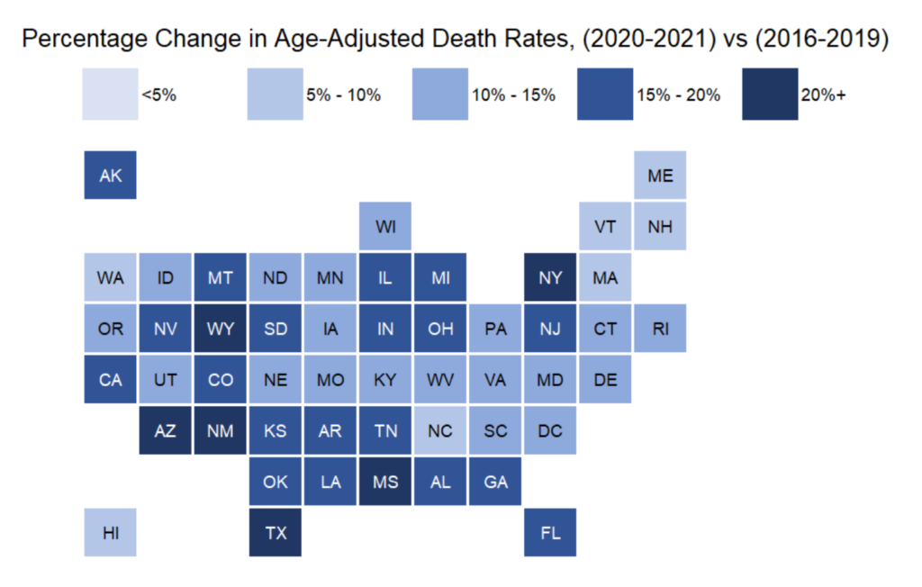
With this tile grid map, we can see that the two-year mortality experience has been horrible, even on an age-adjusted basis. I will be using age-adjusted death rates [using the standard 2000-reference-age-adjustment] for all the comparisons. The methodology is at the end of the post.
I warn against taking any meaning from North Carolina, as it has a data-reporting problem. Hawaii, however, really does have a low increase in mortality, and I believe it is credible that the mortality increase of the northeast is also low. I am not sure how credibly to take the increase in mortality of Wyoming, given its relatively small population.
However, we can see some patterns. In general, one has a “hot spot”, and then the increase falls off as you retreat from that peak. The large pattern is the high increase along the southern border — Arizona, New Mexico, Texas, Mississippi — and then the next layer above is less bad, and so forth. There is the Wyoming peak, falls off around there. There is the midwest cluster – Illinois, Michigan, Indiana, Ohio. And then New York/New Jersey.
As well we know, the excess mortality is driven primarily by COVID, which I will get to in the next major section, but let me share some ranking tables.
Author(s): Mary Pat Campbell
Publication Date: 23 Feb 2022
Publication Site: STUMP at substack